
Our Go-To Paint Colors
With paint colors, I'm a minimalist. When I find a color I love, we use it over and over again. In fact, one paint color covers about 75% of the last 3 homes (update: 5 homes) we've renovated, and I'll share that color in a minute. Not only is my color minimalism an if-it-ain't-broken-don't-fix-it situation, but we've also found that sticking to just a few colors in our homes takes the guess work out of touchup. There's always a gallon of paint on hand!

With all of our renovations, we have longevity and rentability in mind. That means I stick with classic paint colors: whites, warm neutrals, navy, and black. You don't see bright yellows or bold reds on our walls, and probably never will. We use classic colors that look good in a variety of lighting situations and with lots of decor styles. Here are five hard-working colors that take the decision-making out of paint selection.
psst: if you want to see more photos of any room, you can find them under the ‘home tour’ tab at the top of the blog (I’ve noted which house it is under each photo set). And if you want to find out where we bought anything, check out the ‘home sources’ tab.
Benjamin Moore Simply White


photos of: Ravenna House, Farmhouse, Farmhouse
This is our white. It's a little warm and it looks good in most natural lighting situations, although the brighter the better. This is the color that covers the majority of the walls in our last 3 (update: 5) remodels. You can see how the color changes with the light between a Winter, north-facing room (our Farmhouse kitchen) and a Spring south-facing room (Daphne’s bedroom) above.
Pro Tip: don't get this one color matched by Sherwin Williams, it turns out a little too yellow.
Benjamin Moore Hale Navy
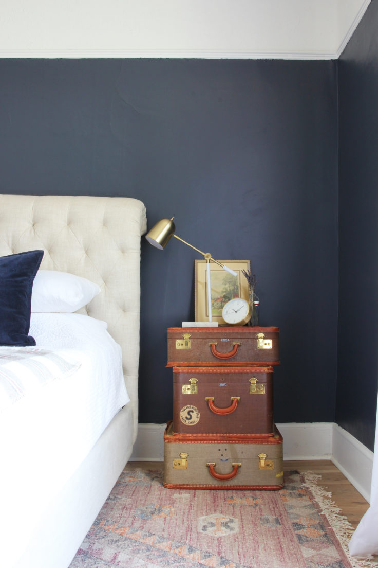


Photos of: the Porch House, Porch House, Farmhouse
This is a classic navy that is dark and rich and really beautiful. We used this color on the exterior of the Porch House (with Simply White on the trim and Revere Pewter on the deck) and get complimented on it all the time. It feels both classic and fresh and always looks beautiful.
Benjamin Moore Revere Pewter


Photos of: Ravenna House, Farmhouse
This is our go-to warm beige and it always looks good. We often ask the paint store to tint it to 50% (meaning they use half of the amount of pigment they usually would), which is nice for rooms with low light. Either way, pair this color with Simply White trim and you can't go wrong.
C2 Vex


Photos of: the Porch House
We painted the Porch House kitchen cabinets and trim in this soft, warm neutral with a hint of green. It's a really beautiful hue that changes with the light - sometimes reading green and sometimes reading gray. It always looks fresh next to white (BM Simply White shown here) or, say, navy blue wallpaper.
Benjamin Moore Onyx

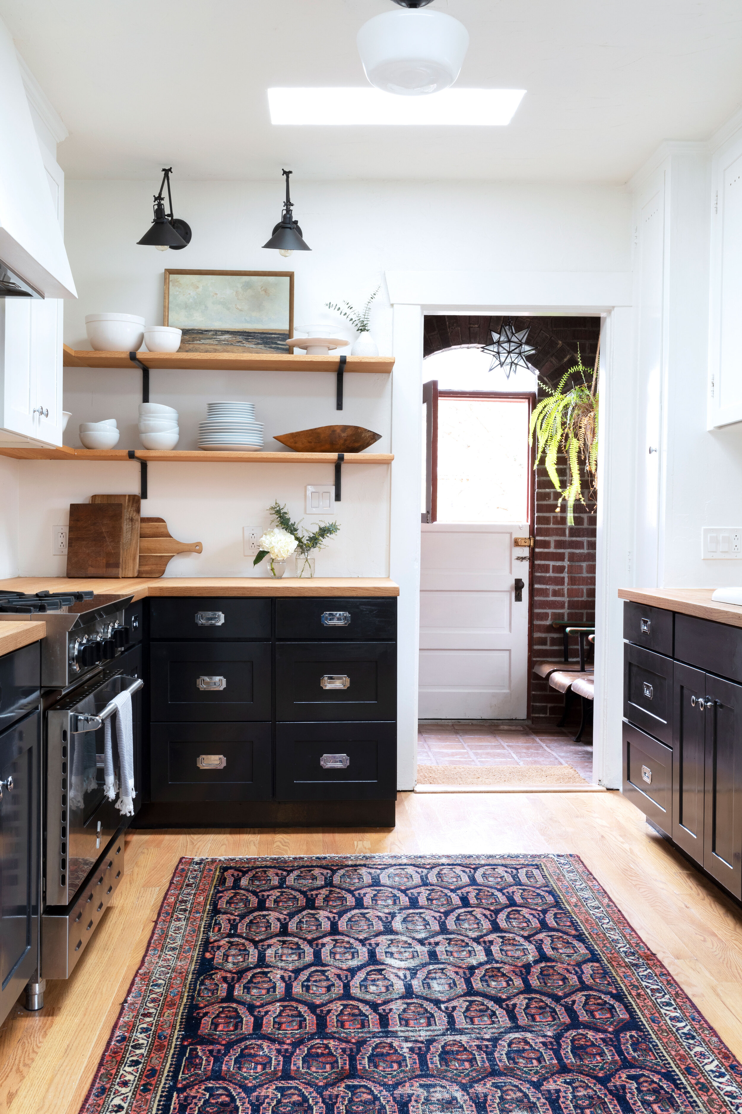
Photo of: the Dexter House
This is the black that we used at the Dexter House on the kitchen cabinets and a few walls. I love it because it reads true - as in not blue and not purple - and is refreshingly crisp when paired with Simply White.
Pro Tip - I like to save dark colors for small accents or private, cozy spaces like bedrooms and offices. They’re great for making a poorly-lit space feel more cozy.
Those are our 5 work-horse colors that work in most spaces. Do you have any stand-bys?
*updated 5/11/2020