We Picked a Wallpaper!
THE FARMHOUSE
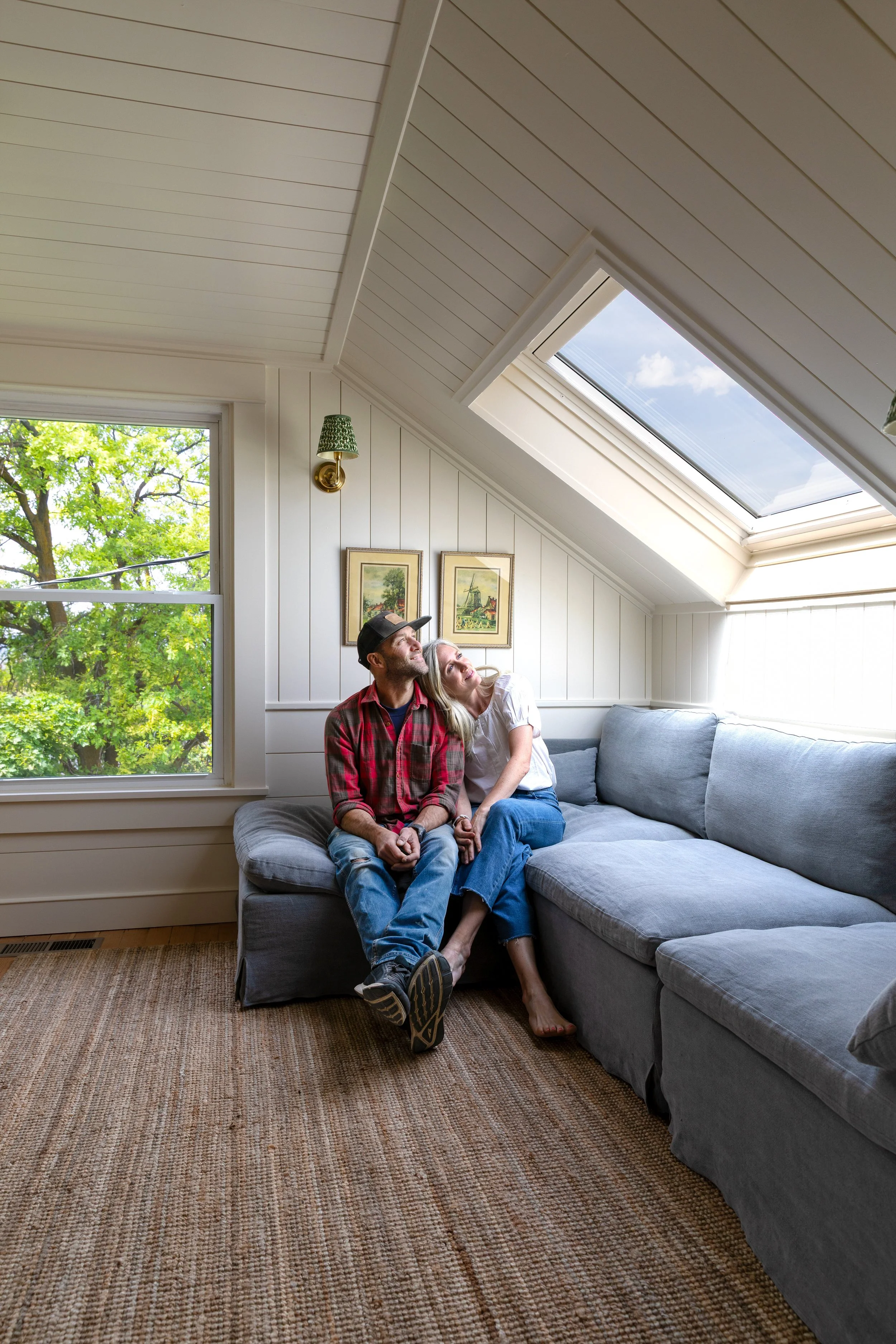
You guys! We were blown away by all the messages/comments/shares on our wallpaper dilemma. Thank you! You guys made the process of picking a paper for our primary nook SO much more fun! We tallied the votes (turns out our favorite was your favorite!) and wanted to share those today along with some inspiration for the wallpapers we loved. And, of course, share the paper that’s going to be on our nook walls!
But first, here’s a reminder of the 9 Morris wallpapers we considered…


Pimpernell! I’ve loved this print for SO long (especially in this color way). The fact that it’s been so popular in the design world and I haven’t gotten sick of it yet really speaks to its longevity. The bold, rich print should look great in the nook next to our simple white/wood/marble primary bathroom. And your guys’ love of the paper really gave me confidence to pull the trigger on ordering 5 rolls.
For those that are curious, we tallied the votes from the blog comments and here are the rankings…
Pimpernel (#6) - 164 votes
Arbutus (#8) - 107 votes
Willow boughs in willow/ecru (#4) - 87 votes
Willow boughs in Delft (#5) - 57 votes
Meadow Sweet (#1) - 51 votes
Willow boughs in green (#3) - 15 votes
Fruit (#2) - 12 votes
Lemon Tree in wedgewood (#7) - 11 votes
Lemon Tree in sage (#9) - 1 vote
You can see the papers rendered in our space here, but I shared some real rooms with these papers over on Instagram stories the other day and that might have been even more helpful. Here they are…
1 Meadow Sweet in Gold/Slate
For the record, I’m dying to use this paper in our house. It feels so “me” and I love the whimsy of it. Maybe the office?
2 Fruit
This paper would have been really beautiful, but Garrett doesn’t really care for it. I’m surprised it didn’t get more votes, but many folks felt like it wasn’t the right place for it.
3, 4, 5 Willow Boughs
I love the simplicity of willow boughs and the Delft blue color really stuck out in this space. But ultimately I wanted something a little warmer and a little bolder.
6 Pimpernel
Forever going to be a favorite! It may be really popular right now, but I’m not letting that hold me back :)
7 , 9 Lemon Tree
Like so many of you mentioned, these seemed better suited for a kitchen or pantry.
8 Arbutus
This paper was a big surprise for me - I LOVE it! Hoping to find a spot for it in our lives :)
I love all these papers, and some may still appear in our life (looking at you Meadow Sweet), but we’ll see. For now, I’m really excited to finally use Pimpernel! Thanks for all the thoughts, opinions, and votes you guys shared with us!!