Picking a light blue paint color for our guest bedroom
THE FARMHOUSE
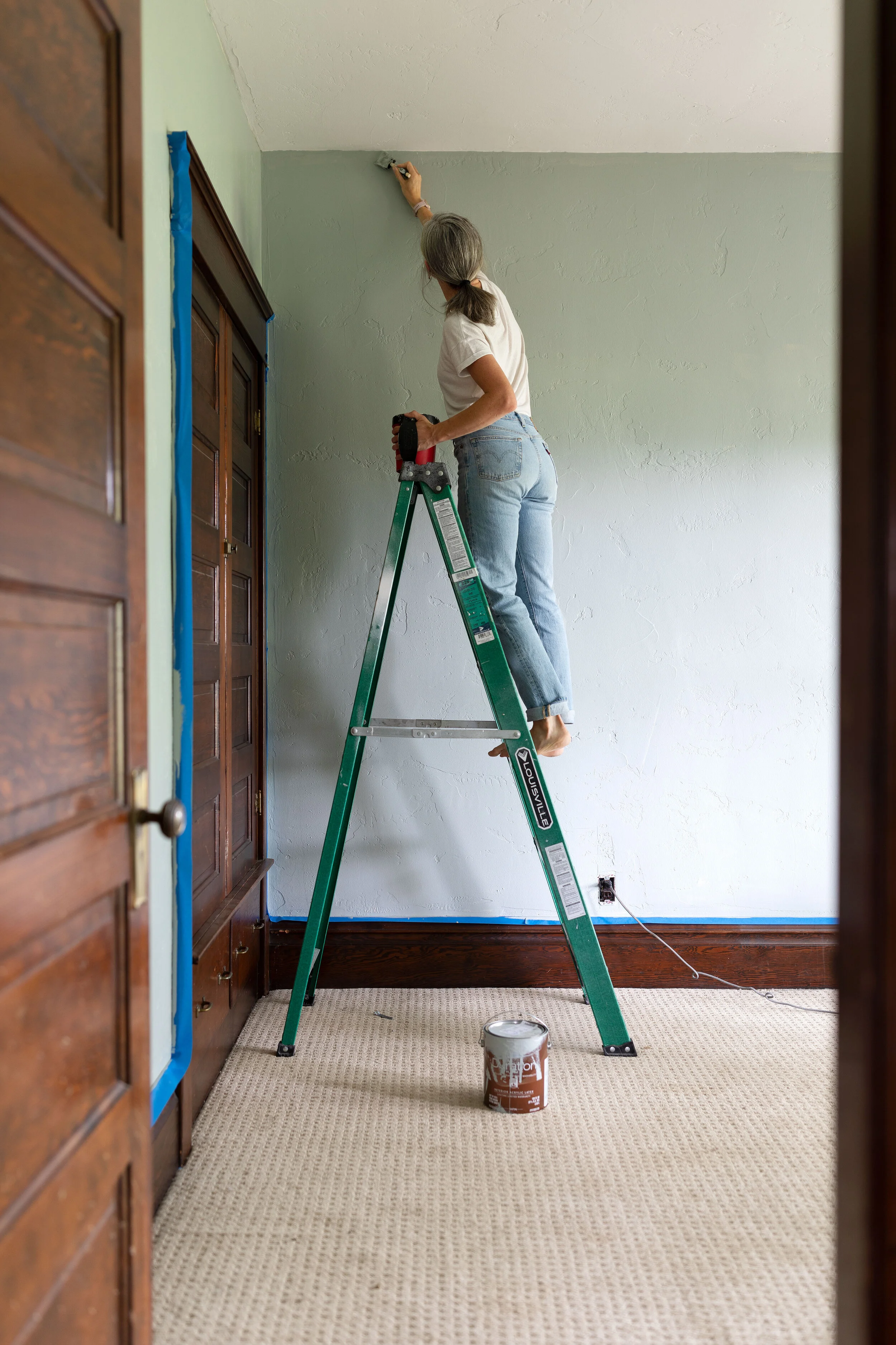
This weekend we painted our guest bedroom! We picked Farrow & Ball Light Blue, which is the prettiest silvery blue color that is cozy and, dare I say, sophisticated. I love it so! Today I wanted to share all the details on this paint project, inspiration for the color, and my favorite tips and tricks for making paint color selection easier (!!!). Let’s get into it…
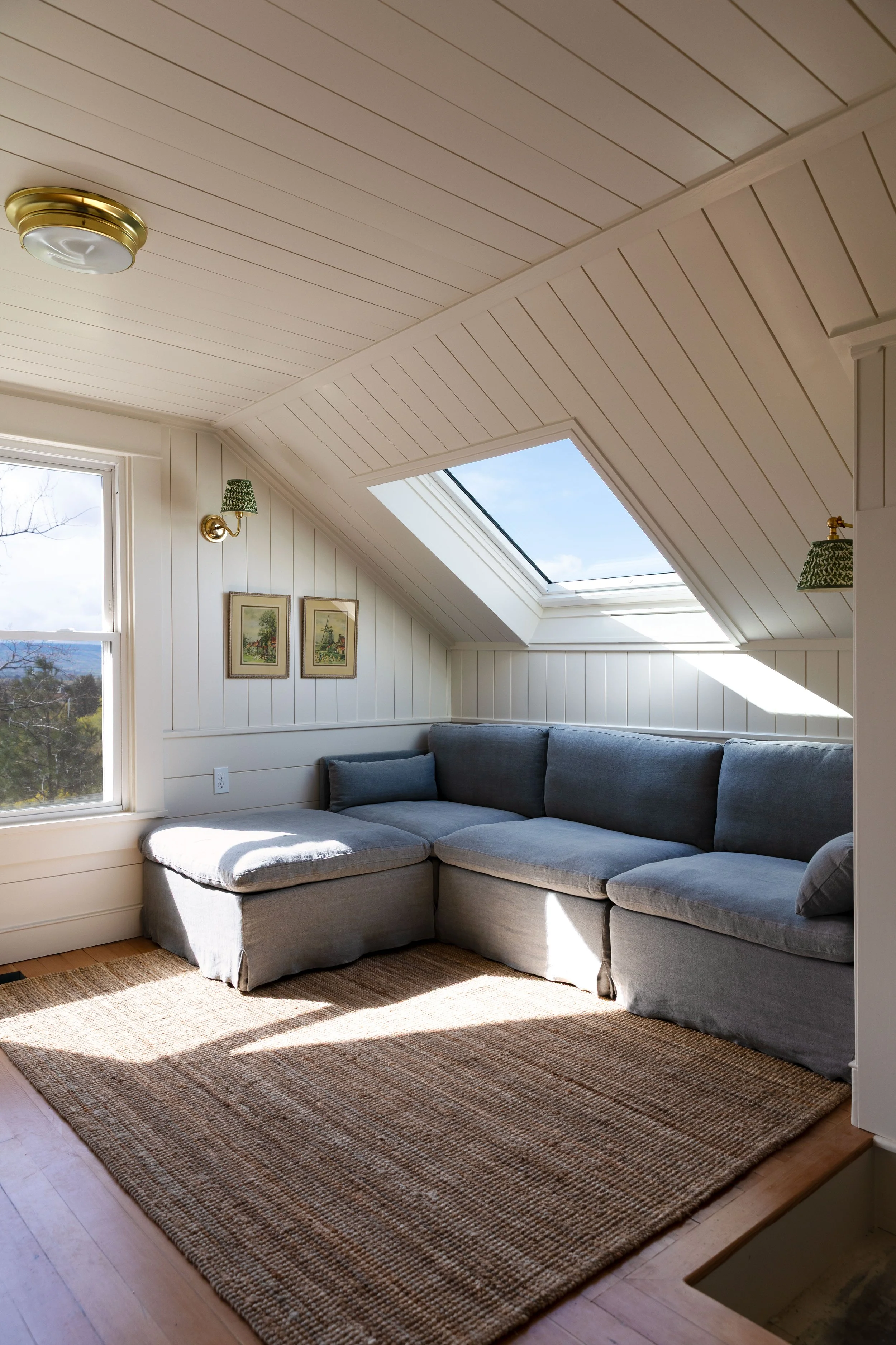
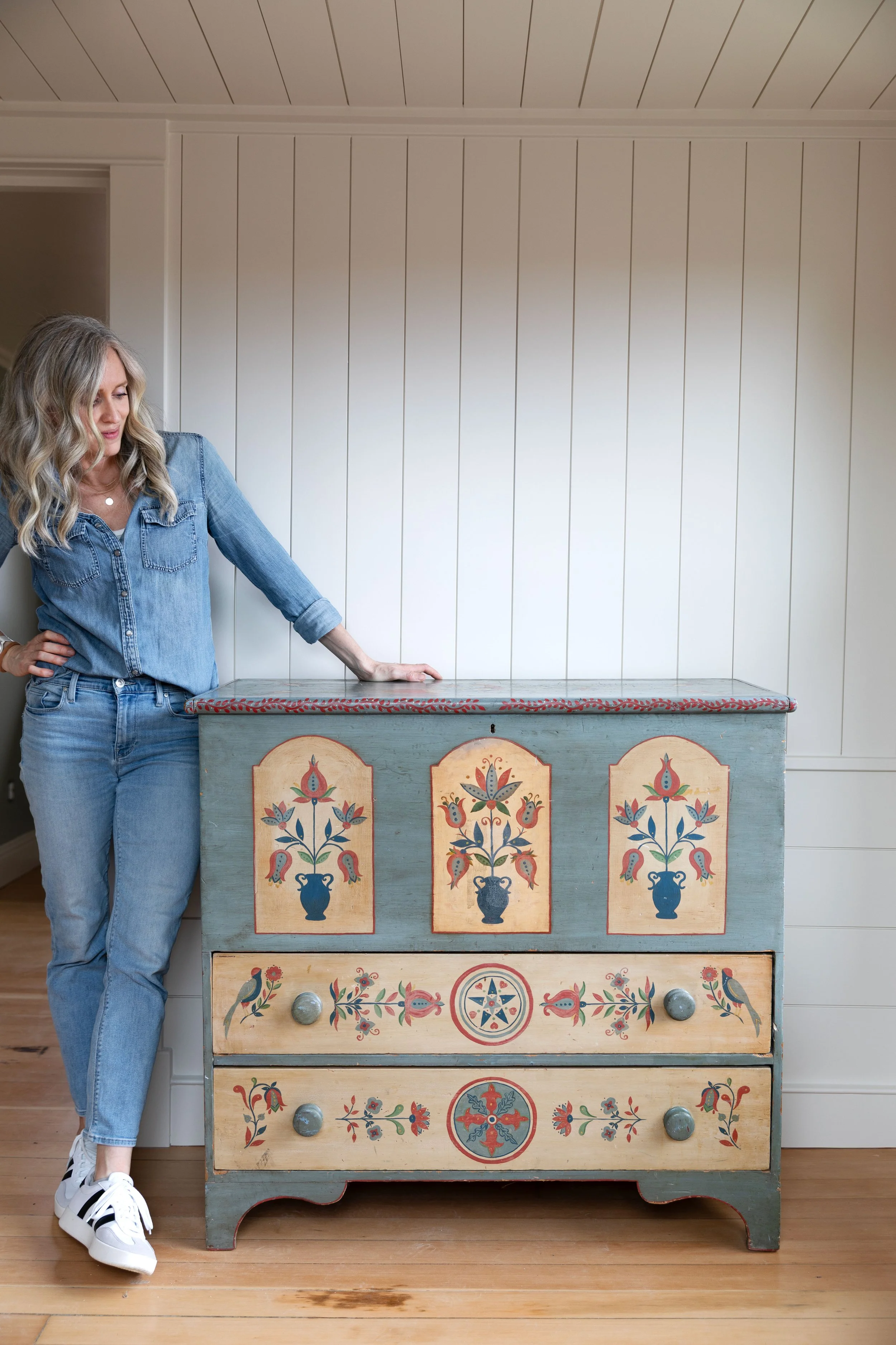
We haven't shared much of this guest bedroom here on the blog. Honestly, it's been at the bottom of our renovation priority list and thus neglected for 5 years. But we're finally working on it! In addition to painting, we'll be pulling up carpets, refinishing the hardwoods (that are surely lurking underneath), adding lighting, and bringing in furniture. It's going to be a fun one!
All About our paint
This room has one of my very favorite colour schemes (blue, white, and wood!). Let's run through the details...
Farrow & Ball Light Blue
There are a lot of great blue paint colours out there, but Farrow & Ball Light Blue, No.22, is one of my favorites. It's the lightest blue Farrow & Ball made in their first collection of colours, so it's been around a long time and it's that perfect midrange between dark navy and nursery blue that feels cozy and versatile. The color becomes more of a silver in interior halls and artificial light, blue in strong natural light, and even a little green at certain time of day. Farrow & Ball calls Light Blue "both peaceful and calming" when paired with a nice white - I love that!
Benjamin Moore Simply White
Benjamin Moore paint is a favorite of our's and we've used Simply White throughout the Farmhouse, including on the ceilings. If we didn't have beautiful unpainted, wood trim, we would have painted the millwork in BM Simply White as well. See note on color matching below, but we highly recommend using Benjamin Moore paint to get a perfect match on Simply White. Sherwin Williams tends to tint this formula with a little too much yellow.
A note on color matching
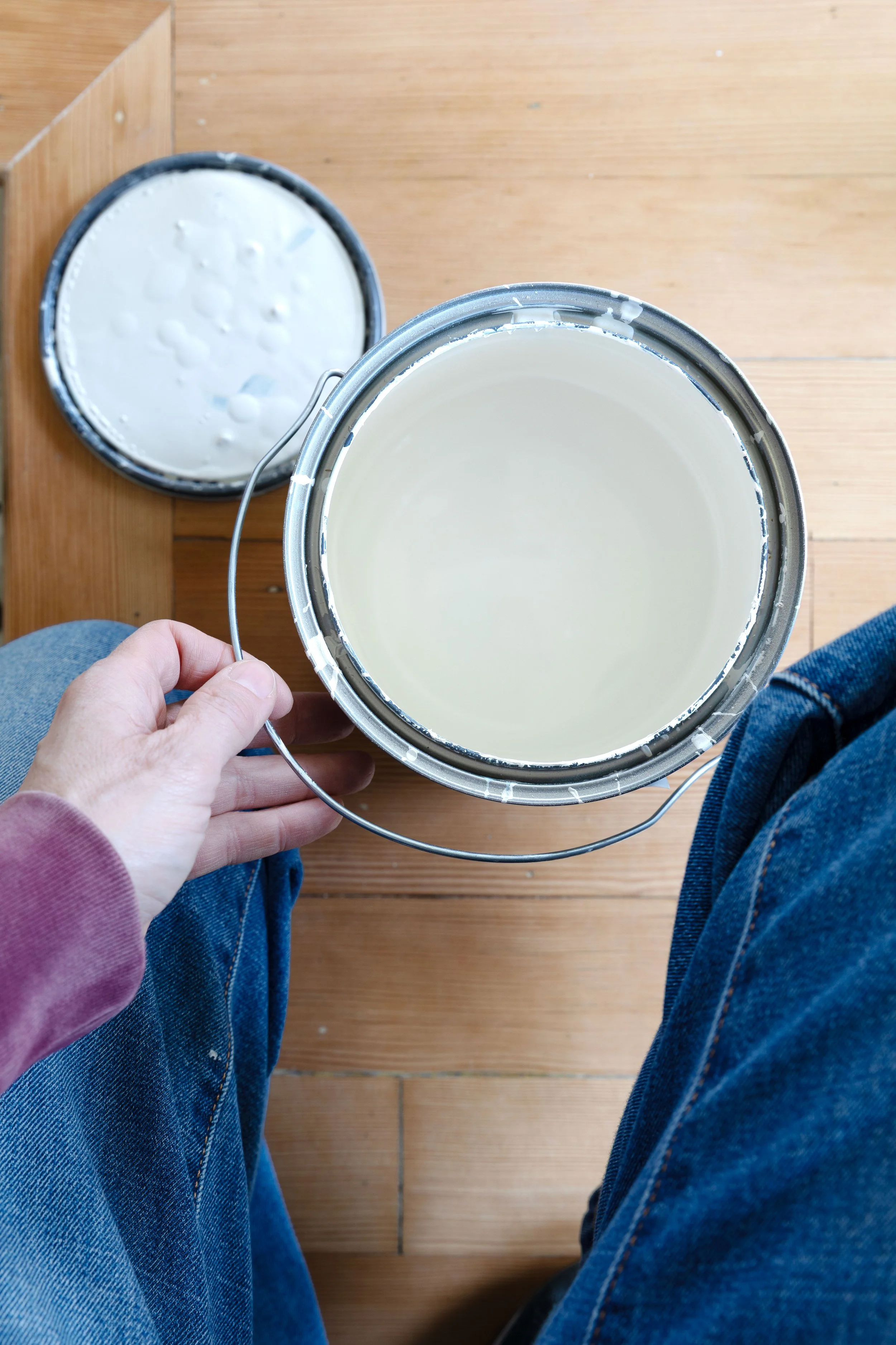
Paint matching is not an exact science. Farrow & Ball handcrafts their paint in Dorset with quality ingredients like minerals, pigments and resin and it's impossible to get the exact same look with a competitor’s paint. That's true with all paint brands. BUT...we've found that matching can get you pretty dang close. For this paint job, we had Sherwin Williams match Light Blue for us (they have the formula in their system) so it's not an exact match, but it's still beautiful. If you want exact matches and don't live close to a Farrow & Ball store, you can order online.

Paint Finishes
You'll want to pick a high-quality primer to start and then a high-quality paint with a long-lasting finish. Our preferred paint finishes are eggshell on the wall, satin on the trim, and matt on the ceiling (we tint basic, inexpensive ceiling paint). We find that in general, low sheen is the best finish for historic houses. And we opt for low voc or low-odour whenever possible.
How to pick a color
If picking paint colors is hard for you, know that you're not alone. A few years ago I would have said that selecting paint colors was not my forte (remember when it took me 4 times to get the Poplar Cottage cabinets right?!). Color felt daunting and frustrating and that’s why you saw so much white in our houses. But of course we’ve remodeled 8 houses over the years and I am a home blogger, so picking colors is something I’ve had to do again and again and I've slowly gotten better at it and compiled a list of go-to colors (like Farrow & ball Hague blue, BM hale navy, F&B Pigeon, and F&B Stiffkey blue). After years of trial and error and repaints, I've finally learned to embrace color. So here's some general advice and my best tips and tricks for anyone else who finds color difficult.
Have a general color in mind
The most successful paint jobs, at least for us, start with me having a color in mind. For this room it was blue. Not a light or dark blue but something mid-tone. I even had inspiration images picked out (we’ll get to that tip in a second) so I really felt confident in my color. Whenever I don’t have a general color in mind, that’s when we have to repaint and repaint…
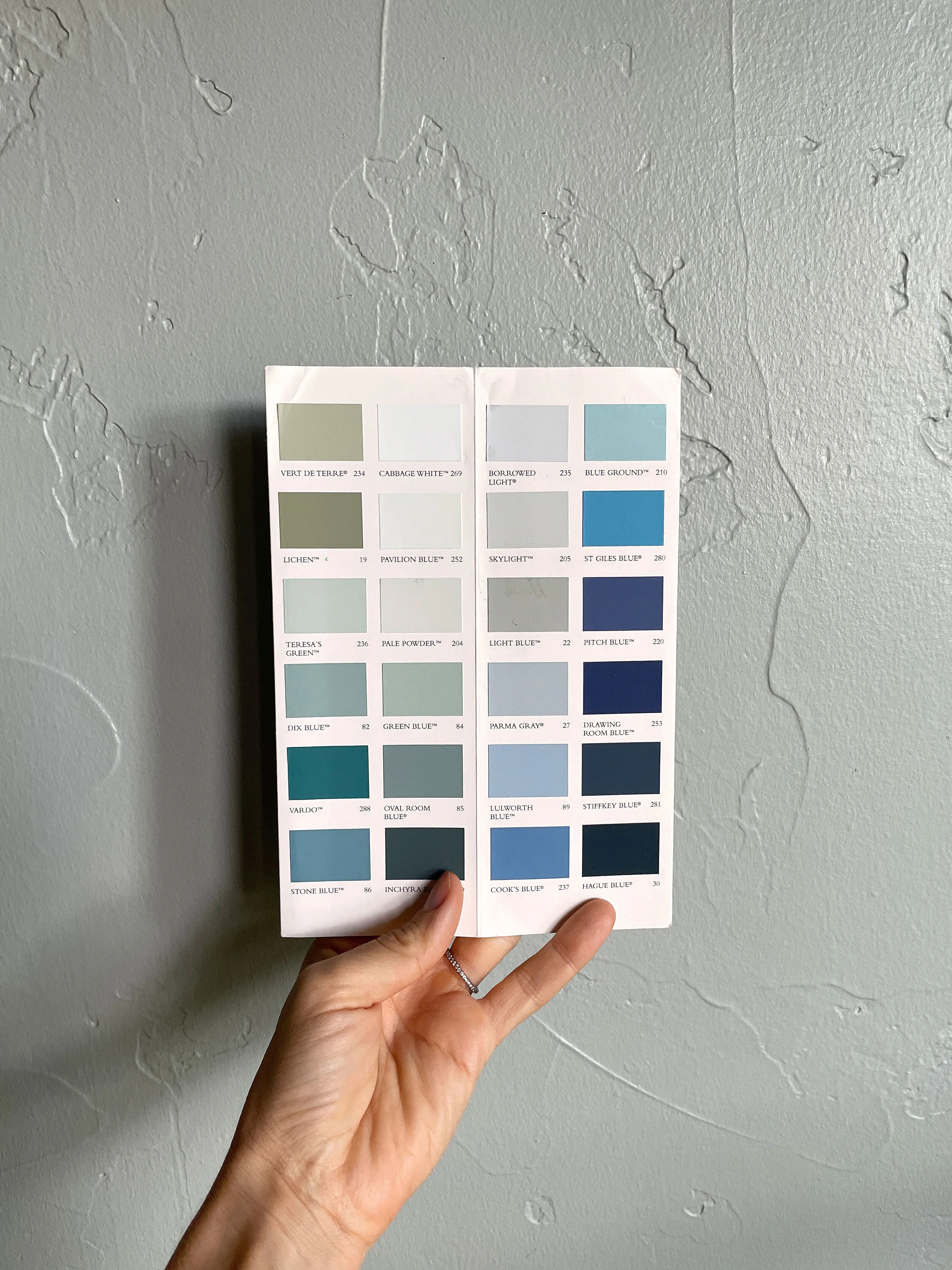
Look at a paint deck/color card
I highly recommend owning a paint deck or two. We have decks from Benjamin Moore, Sherwin Williams, and Farrow & Ball and it means I can look at colors at home in the actual room we’re going to paint before heading to the paint store. I like BM’s paint colors - their historic section is a great spot to start - and Sherwin Williams has some of my go-to colors, but my favorite right now are Farrow & Ball paint colors because their colors are all gorgeous and they have a small selection on their color card. When picking colors is hard for you, limited selection is a good thing! BTW you can get a F&B color card for free from their website here. Sherwin Williams has many of the F&B color formulas on file (and other brands too), so that's where I usually have them matched. But as discussed above, color matches are not exact, but I usually find that they're close enough :)


Save inspiration
Whenever I come across a room I love the color of, I save them to a Pinterest Board called “paint and color”. And if I can dig up the actual paint color of the room, I add it to the description of the Pin (btw I don’t ask designers for colors since that’s something clients pay them for and they understandably don’t want to give sources away for free, but I do scroll through comments or articles to see if they've shared it there). I have a similar saved file on Instagram, too. Taking the time to save color inspiration whenever you find it, means you’ll have that info at the ready when it comes time to select a paint color for your own space.
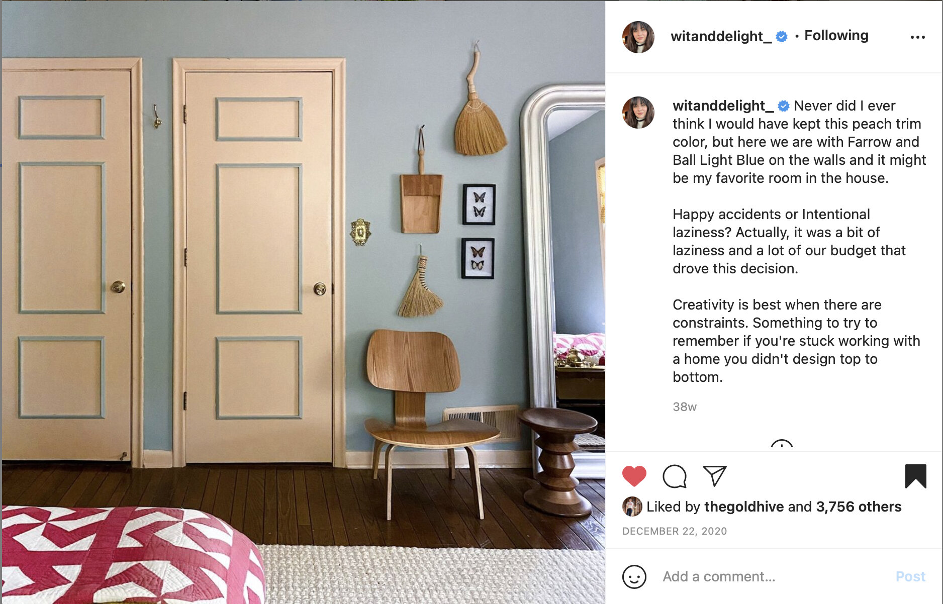
Here are three rooms painted in F&B Light Blue that I had saved on Pinterest (originally found on Instagram) and served as inspiration for our guest bedroom:


Of course just because you like a paint color on someone else’s wall DOES NOT mean it will look good on your wall (and just look how different those three inspiration rooms look)! But inspiration and using a paint deck are good places to start before you get samples.

Get Samples!
My last tip...get samples on your walls! They can be actual paint on the wall or portable paper samples like peel and stick samples (Samplize makes some easy options). Sample is the key word here! It’s absolutely worth the added time and trip to the paint store. Especially when picking colors is not your forte and you’re working from online inspiration and teeny tiny color samples on cards. It will often save you buying a whole extra gallon of paint in the wrong color.
Unfortunately our Sherwin Williams store was out of samples this time (I’ve heard it’s due to a warehouse in Texas freezing last winter) so we had to bite the bullet and go for a whole gallon. It was a gamble that paid off this time, but it doesn’t always. I’ll opt for samples whenever I can!
BTW I’ve heard there’s lots of paint shortages in the US this year, but F&B is located in the UK and apparently does have samples to ship. I’d actually love to use their paint sometime instead of getting it color matched, but I never seem to plan ahead enough to order samples.
I'm really happy with F&B Light Blue! Like so many things in design, I’ve found that the more non-white paint colors I look at, appreciate, and try, the better I've gotten at picking them. Any tips or tricks you use for picking paint colors?