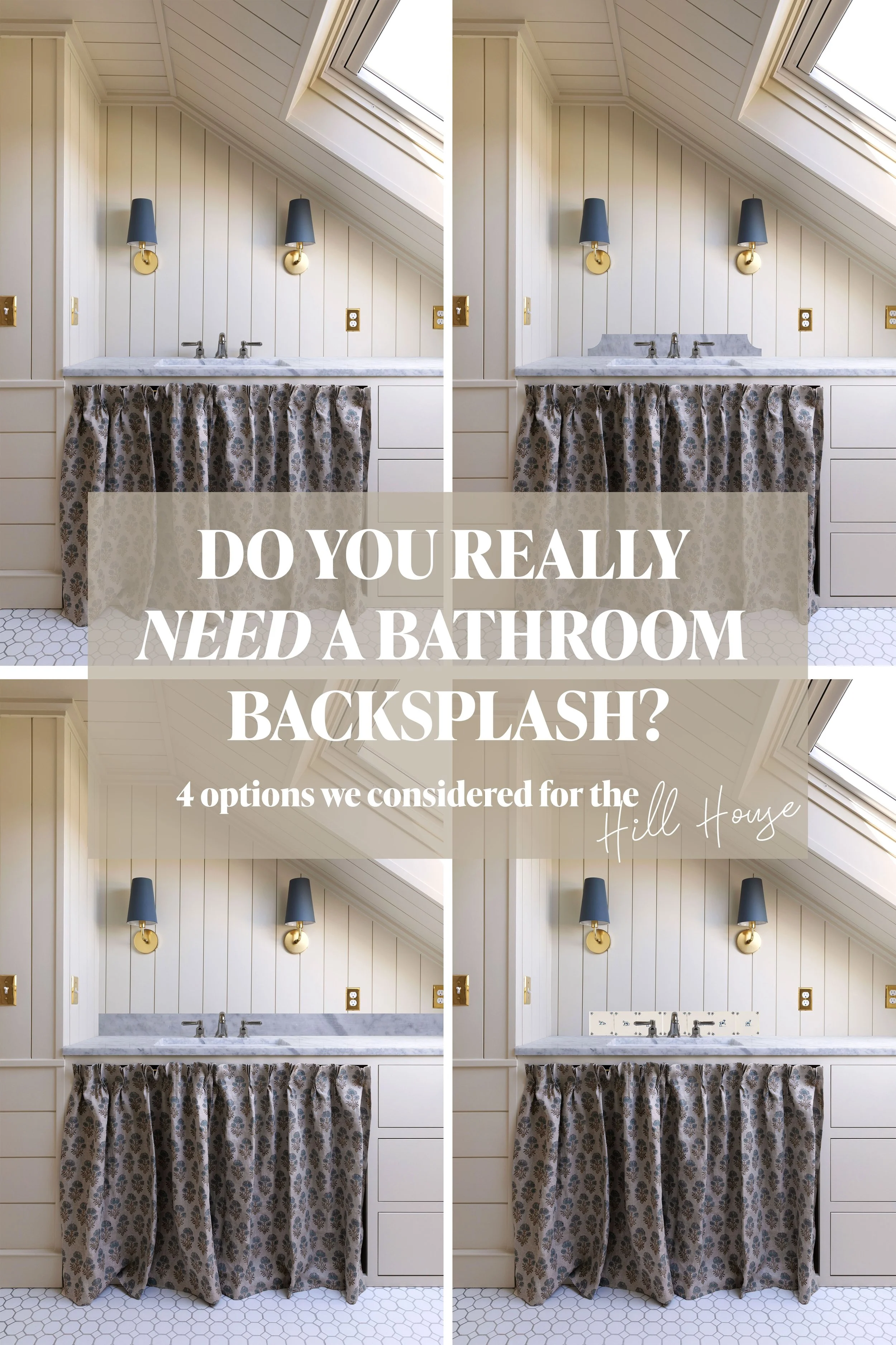
Choosing a Warm Neutral Paint for Upstairs at the Hill House
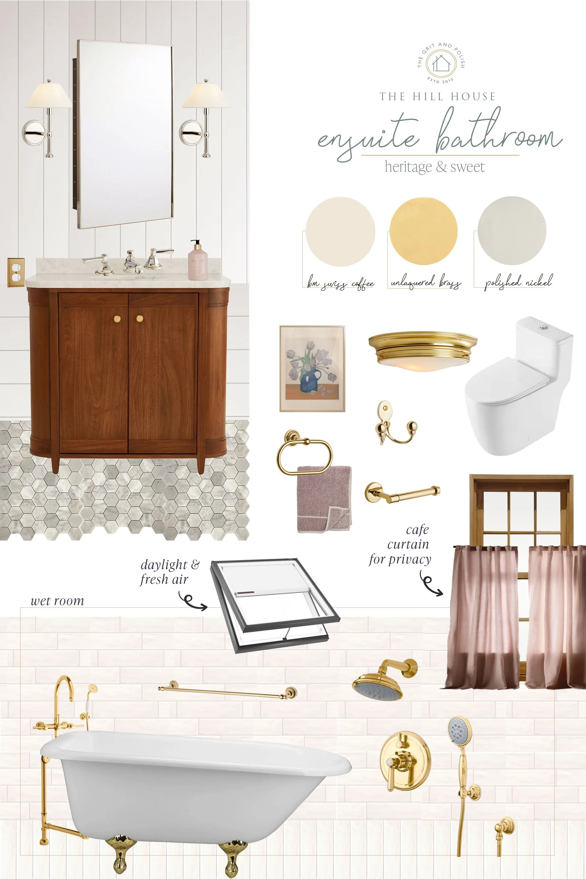
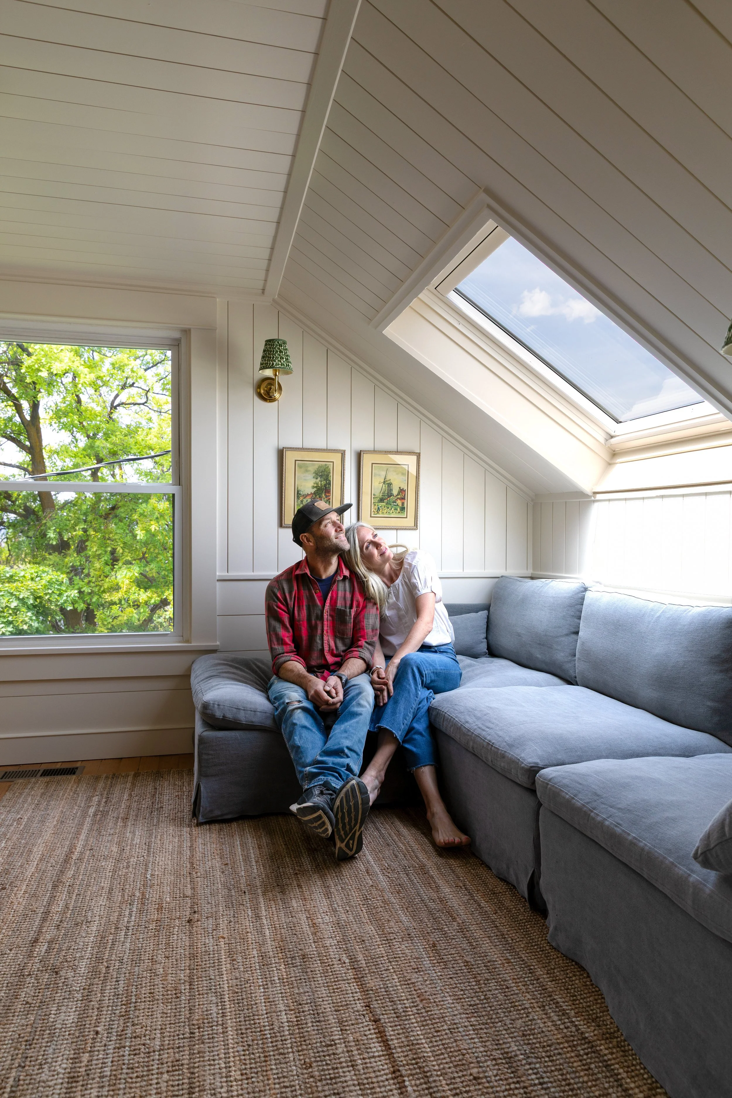
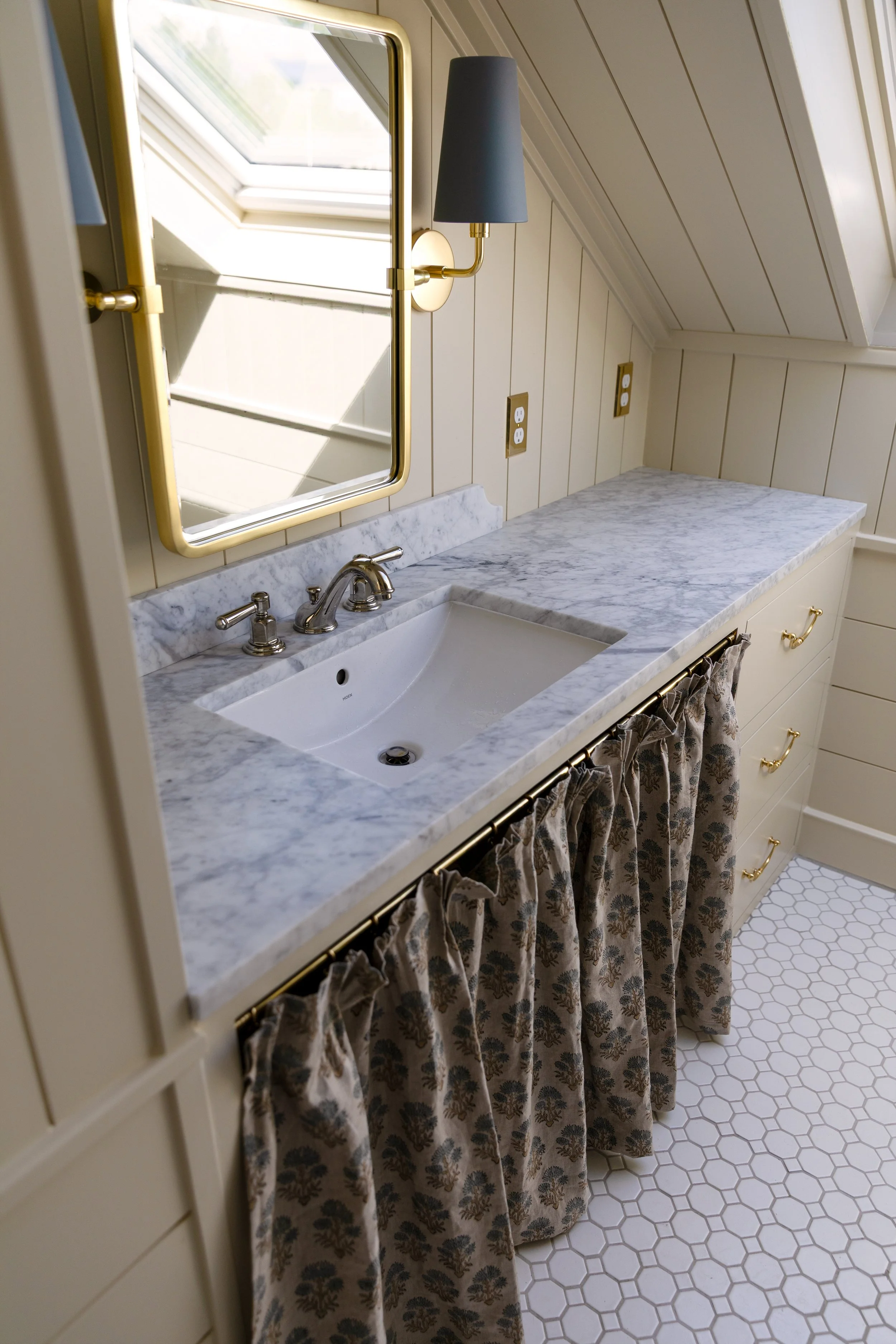
THE HILL HOUSE
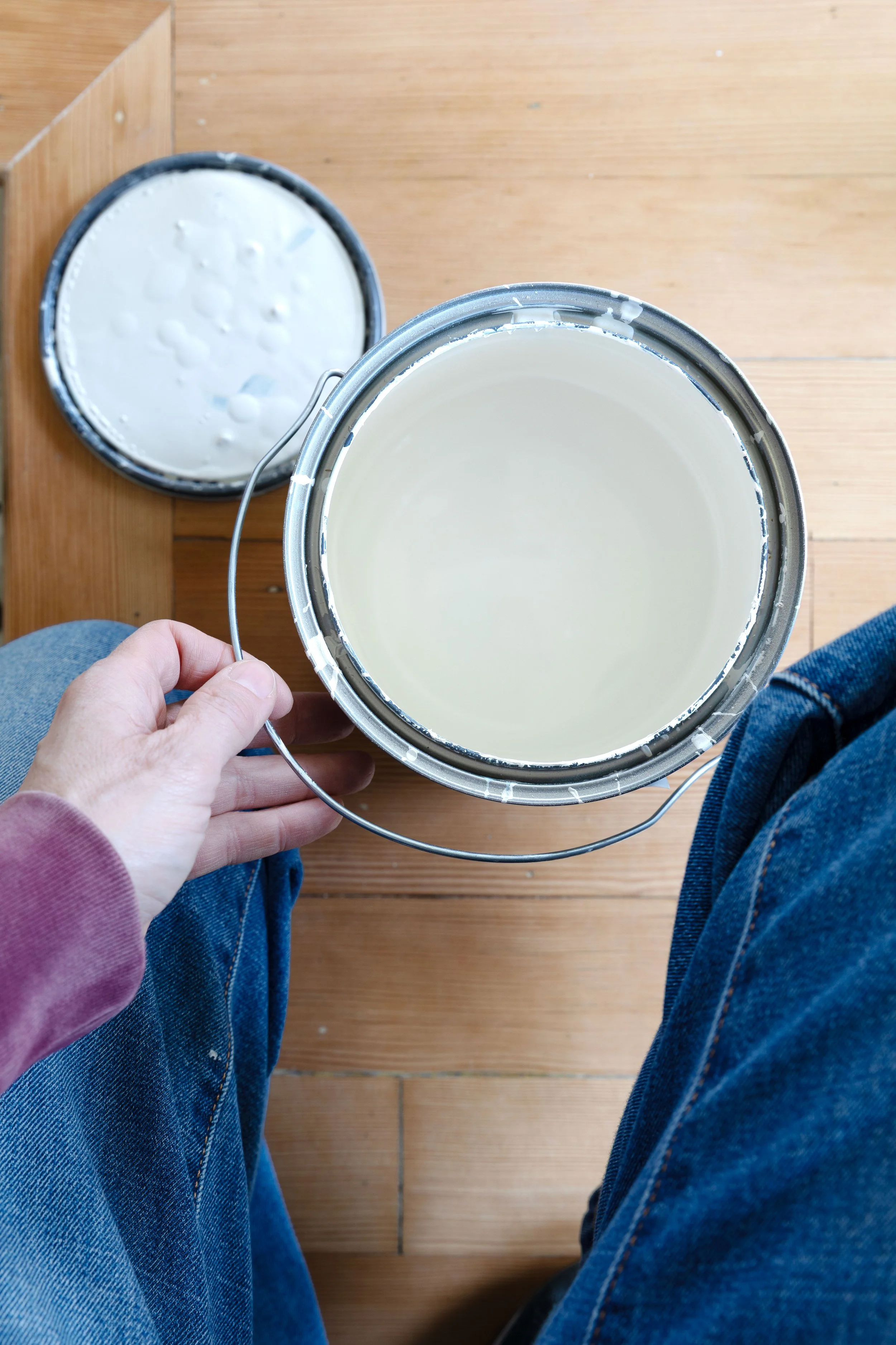
Choosing a neutral paint color sounds simple…until you start testing samples! Last week we picked up sample pots of lots of popular warm neutrals for the upstairs bathroom and landing. We tested them over several days and at multiple times of day and I’m here to tell you that what looks perfectly warm and creamy on a paint chip can quickly turn gray, muddy, or flat on the wall, especially in the gray light of January! Today I wanted to share all of the colors with you, with our thoughts on each and how we whittled it down to our favorites. Let’s get into it…

That was most of the neutrals we picked up ;)
What We Were Looking For in a neutral Paint Color
We wanted a neutral color for the upstairs hall bathroom (and maybe the landing and hallway, too) that felt warm and timeless. Think something you’d see in House and Garden UK. Something softer, warmer, and more enduring than the cool grays of decades past (looking at you Revere Pewter). Something…
Warm but not yellow
Soft but not pink
Neutral without leaning gray
Calm enough to let the finishes shine
Timeless enough to live with for years
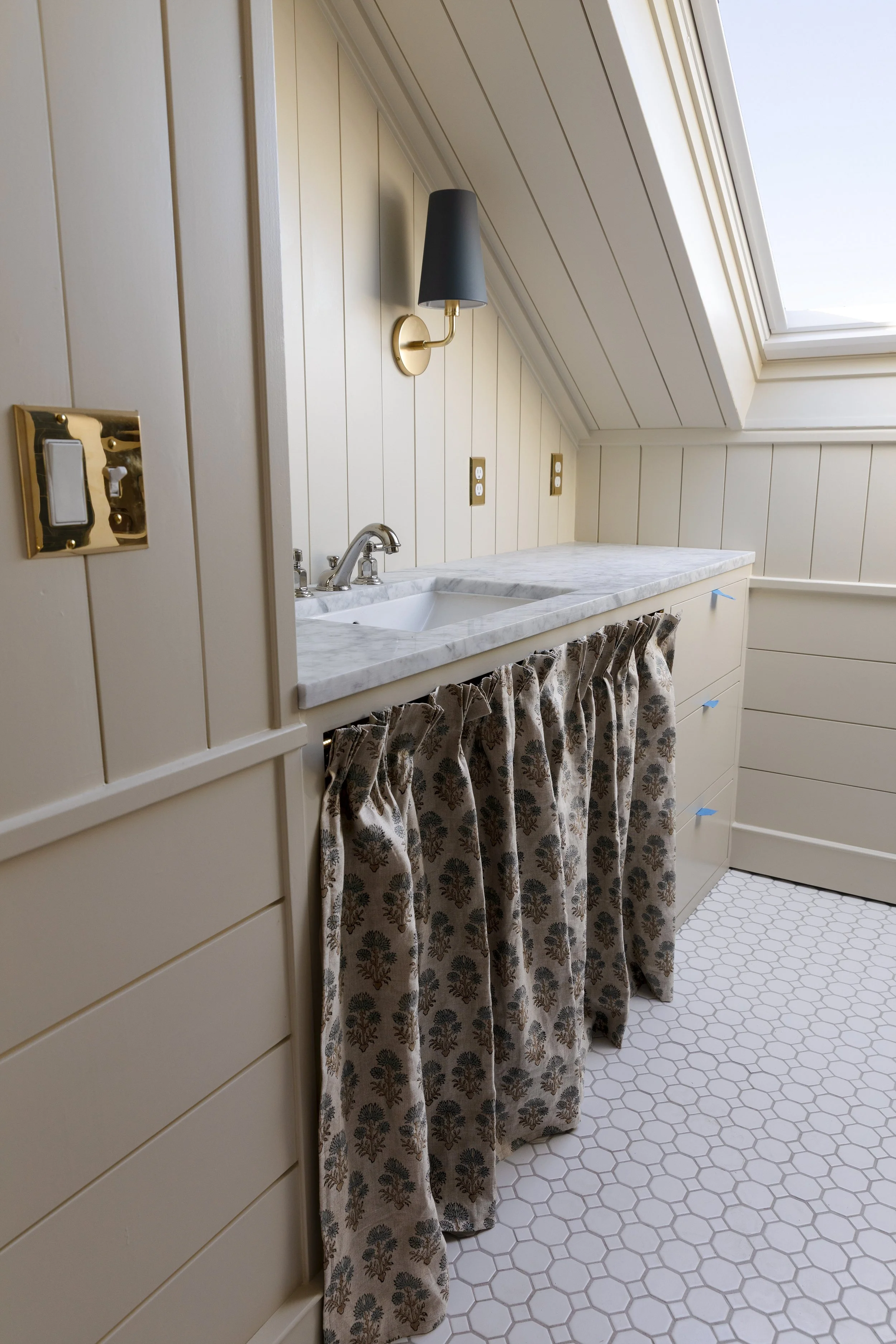
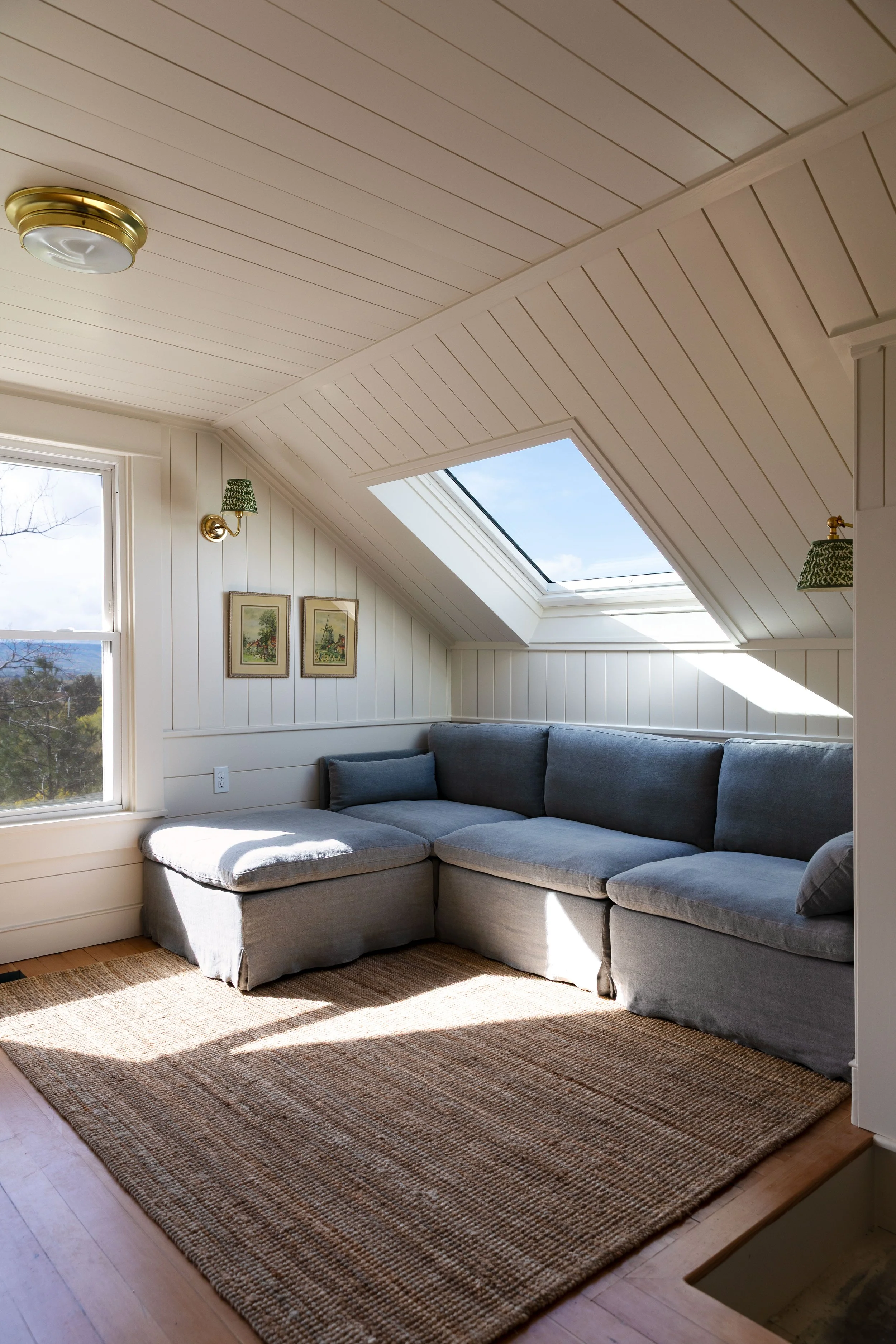
This color had a lot to live up to! Picking a color for a bathroom can be extra tricky because finishes tend to be cooler (tile, metal, hard surfaces) and we really wanted to keep the space feeling more ‘home’ and less ‘laboratory’. And of course, this bathroom connects to the upstairs hallway and landing, and I like the idea of using the same color for both, though I’m not committed to it. SO we’re choosing a color that can live in a lot of different lighting situations.
The Lighting Conditions (Because They Matter!)
These samples were painted on watercolor paper and photographed on a north-facing wall with west and north light coming from nearby windows. It’s January in the PNW so very low winter light. In other words: not forgiving conditions. If a color holds up here, I figure it’s likely to look great the rest of the year. Here are the colors in different lighting…
Note that all the Farrow and Ball colors were matched by Sherwin Williams so are not exact (but close enough for us ;).
The Warm Neutral Paint Colors We Tested
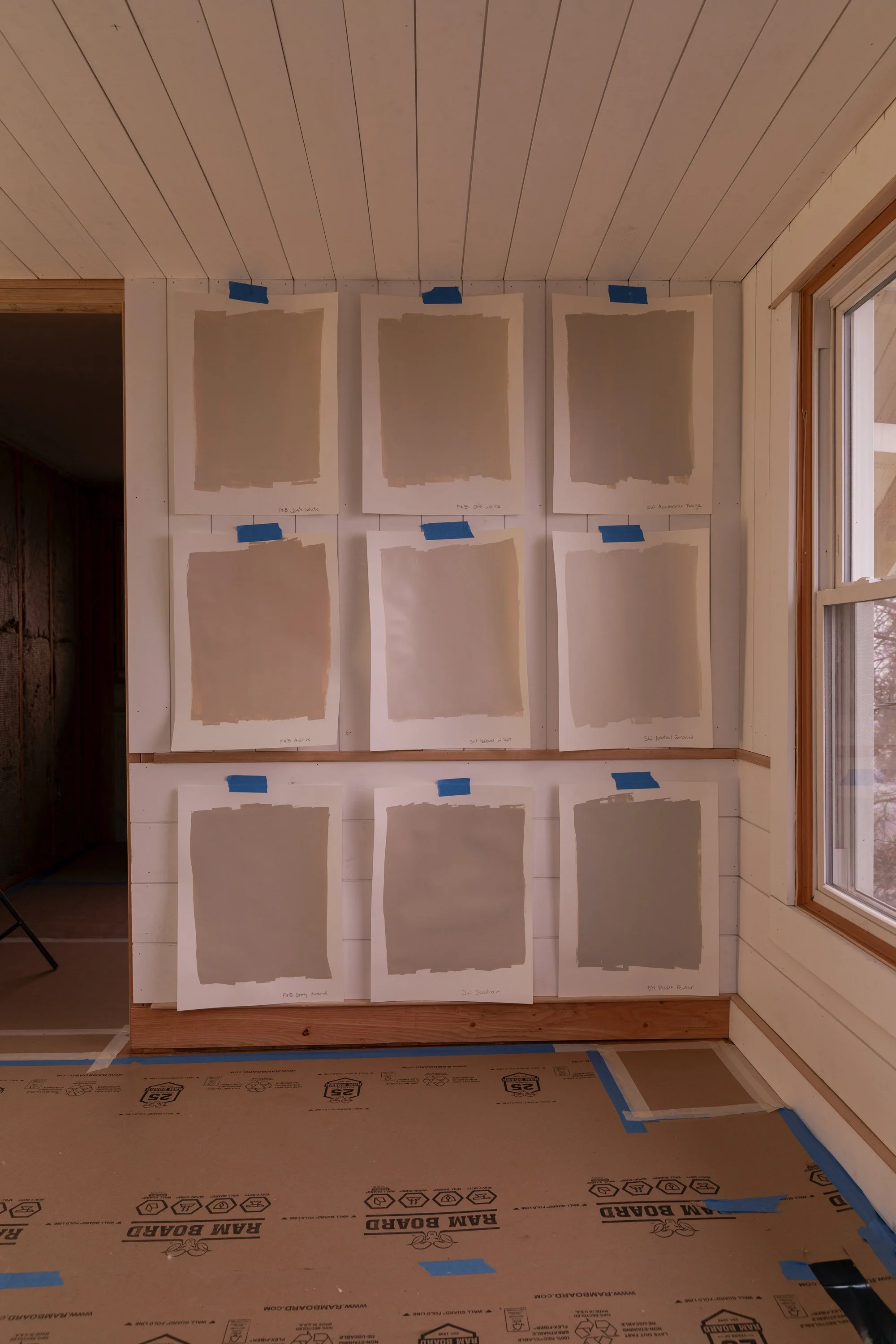
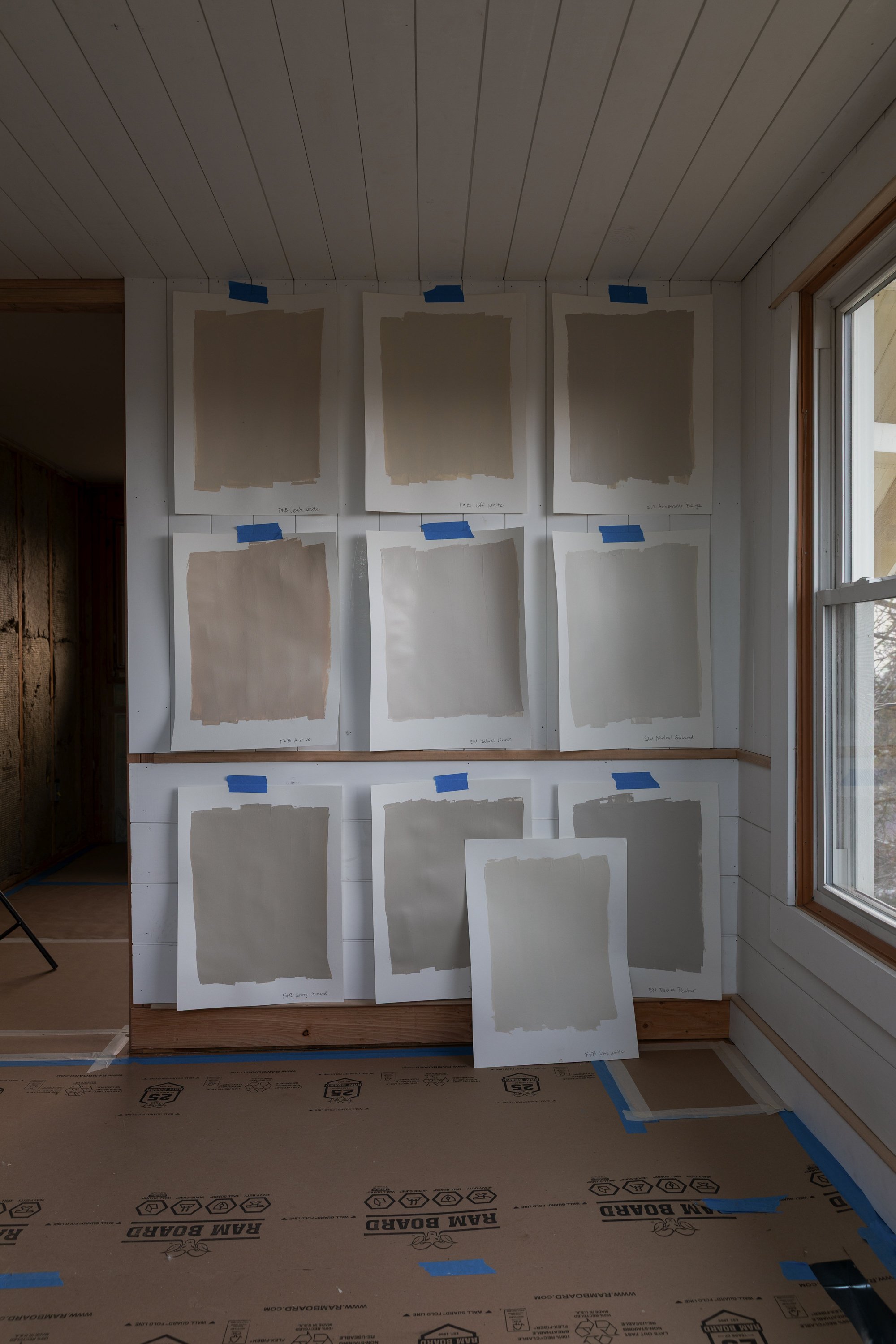
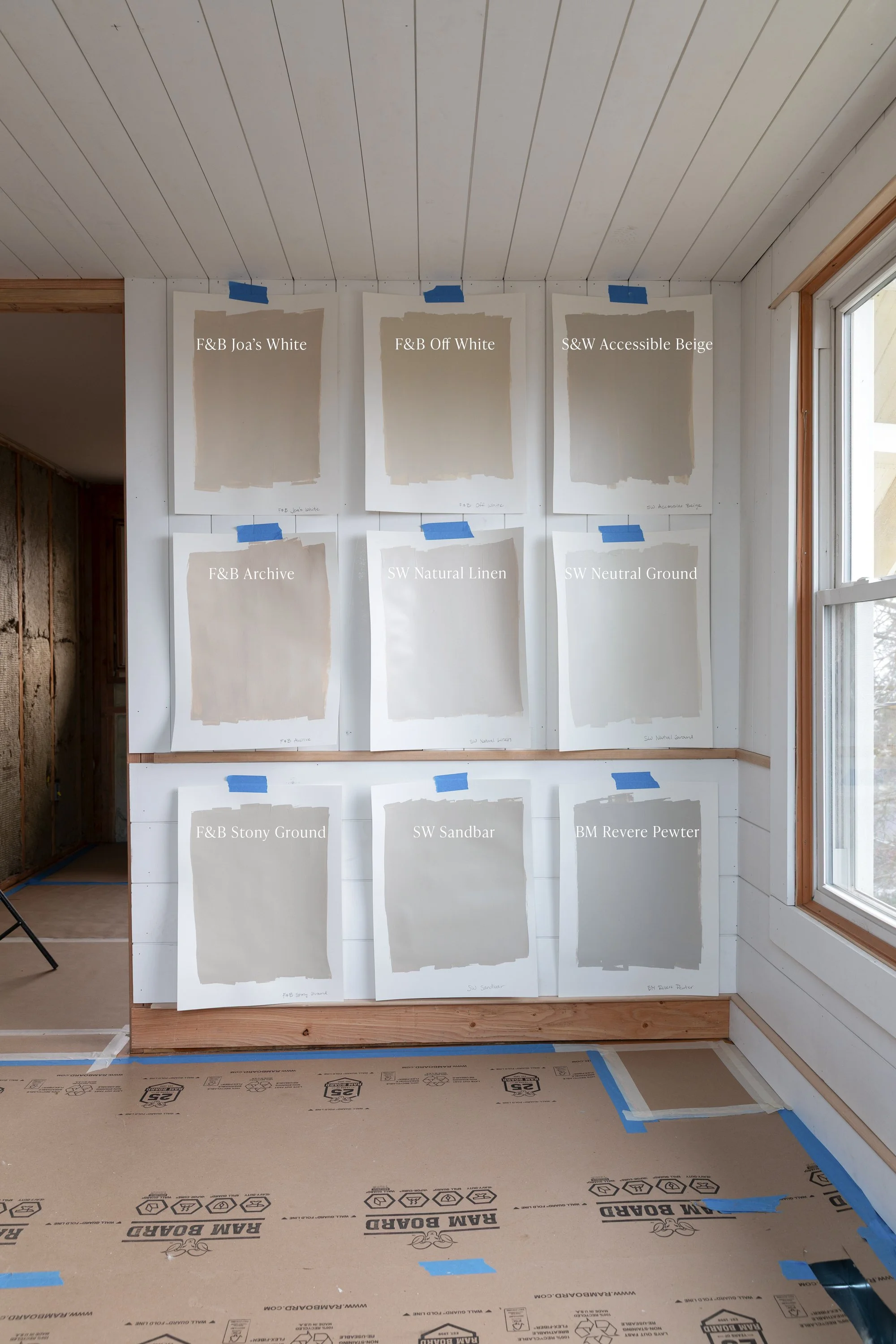
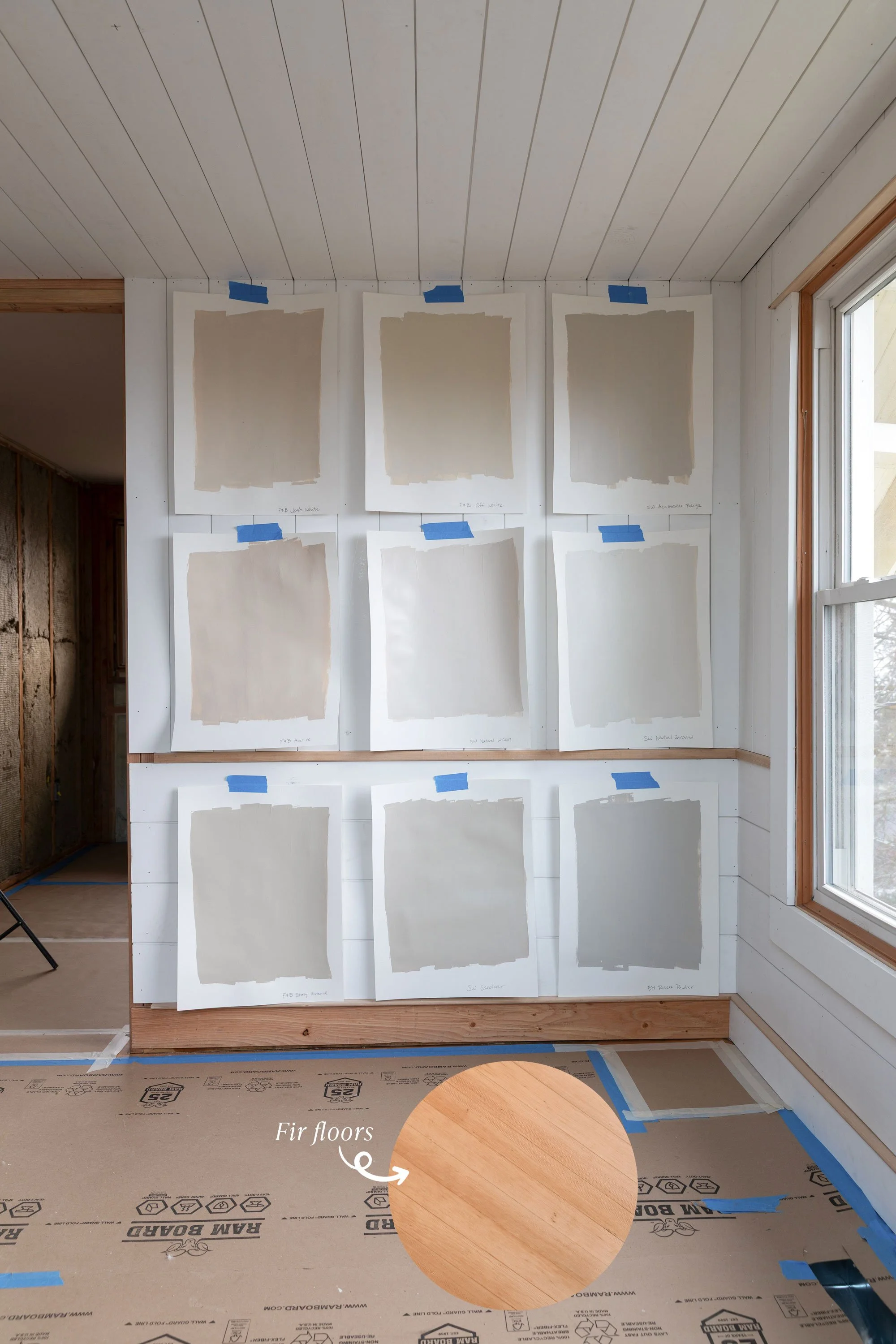
Here’s the full lineup, top to bottom, left to right:
Top Row
Farrow & Ball Joa’s White
Soft and warm, but slightly deeper and pinker than we wanted for this bathroomFarrow & Ball Off-White
Warm, creamy, and incredibly balanced. This was a contender!Sherwin-Williams Accessible Beige
A solid neutral, but read a bit grayer in this light than we wanted
Middle Row
Farrow & Ball Archive
Beautiful warmth, but leaned pink-beige here. Lovely, just not right for this space.Sherwin-Williams Natural Linen
A popular choice, but it was a little flatter and pinker than expectedSherwin-Williams Neutral Ground
Still a favorite neutral overall, but slightly cooler and lighter than what we wanted for this bathroom
Bottom Row
Farrow & Ball Stony Ground
Earthy and complex, I LOVE this color but it’s darker than we wanted for the bathroomSherwin-Williams Sandbar
Warm and approachable, though a bit taupe-leaning in low lightBenjamin Moore Revere Pewter
Once a go-to, now reads unmistakably gray and a little too 2000’s
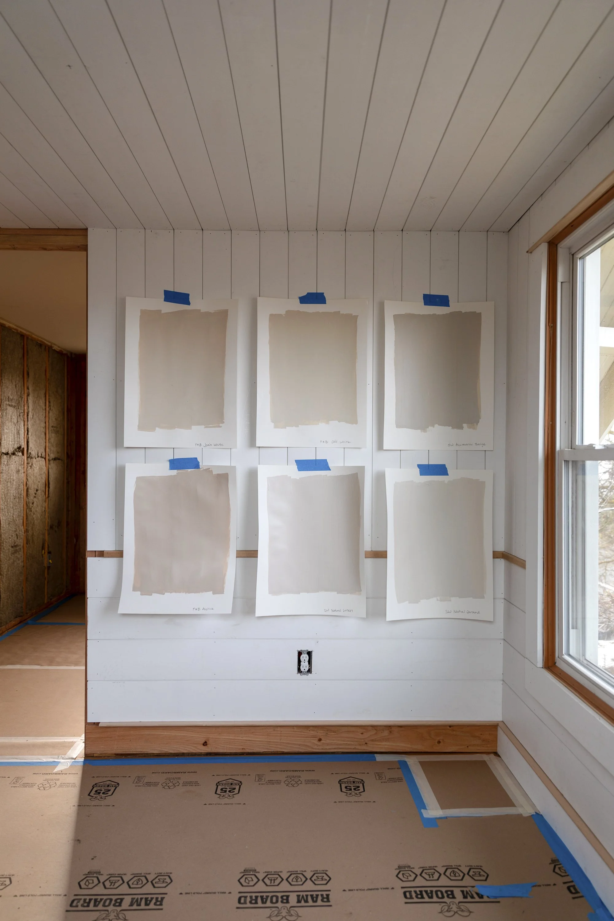
The top two rows were our favorites…
Here’s how we narrowed it down…
How We Narrowed It Down
Once we narrowed our samples down, the real work began. At this stage, it’s less about finding a pretty color and more about figuring out what role we wanted the color to play in the room.
Here’s how I evaluated the finalists…
1. Does it read warm… or just beige-gray?
Some neutrals technically lean warm but still carry a gray cast that feels flat, cold, or early-2000s builder basic once you see it on the wall. This can be pretty but not what we were after.
2. Is it trying to be the star of the room?
The best neutrals act like a soft backdrop, not a feature. If your eye keeps going back to the wall color instead of the tile, fixtures, or brass accents, it’s probably doing too much (in this bathroom at least).
3. Does it feel timeless… or tied to a trend?
This was a big one. Colors like Revere Pewter or cooler greige shades aren’t bad, but they can timestamp a space to a specific era. We wanted something that could have existed 20, 50, 100 years ago and will still feel good 20 years from now.
4. Will it blend quietly - or fight the finishes?
We were looking for a color that would compliment the newly-refinished hardwood floors in the landing and harmonize with the bathroom finishes - blue tile, vanities, brass finishes, plumbing, etc. The wall color needs to work with with these elements, not compete with them. Anything that made the tile look dingy or the fixtures feel cold was out.
5. Does it look good in different lighting, all walls, and all times of day?
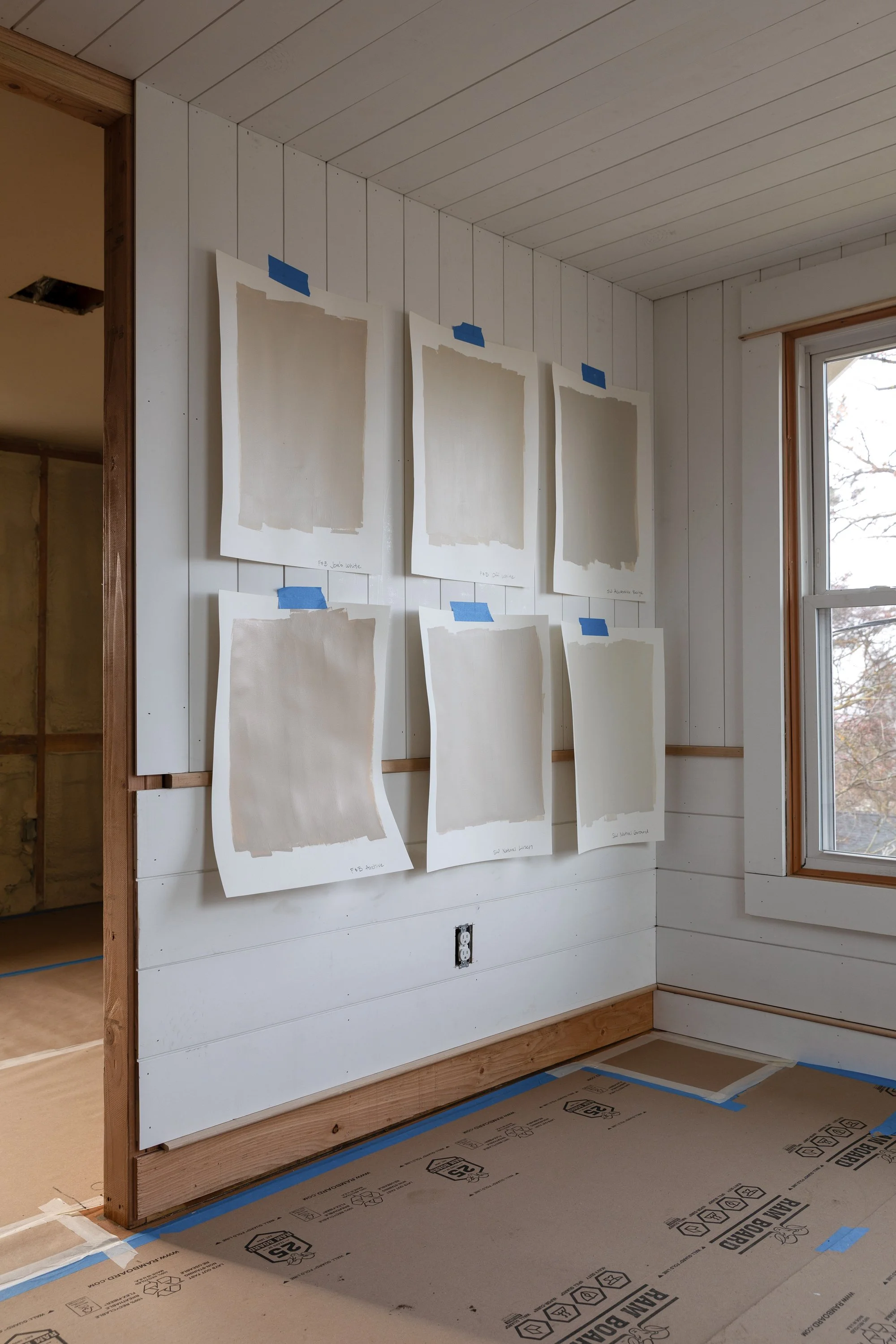
After we had our favorites, we pulled them off the wall and moved them around. We hung the samples below the skylights in the bathroom. On the ceiling in the hallway. On the north, east, south, and west walls of each space we were considering. This is the benefit of painting samples on paper and the longer you take with this stage, the more likely it is that you’ll like the color you pick.
The Big Shift: From “Which Color Do I Like?” to “Which Color Supports the Room?”
Instead of asking Which one do I like best on its own? I asked: which color disappears in the best way?
Which one makes everything else feel better, warmer, and more intentional?
That’s when Farrow & Ball Off-White pulled ahead. It didn’t feel gray. It didn’t feel trendy. It didn’t feel like a “statement neutral.” It just quietly worked - in low light filtered through fog, in evening sun, and alongside the bathroom tile. It lets the finishes do the talking - exactly what we want in a color!
The Final Decision
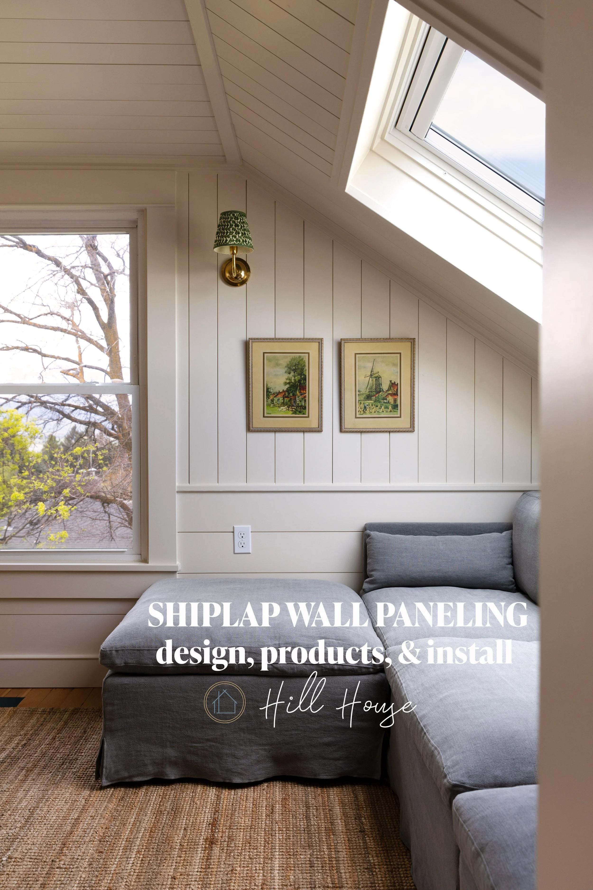
For the Hill House hall bathroom, we chose Farrow & Ball Off-White.
It feels timeless, comforting, and warm - the kind of neutral that makes a space feel finished without trying too hard. It also plays beautifully with classic tile, brass fixtures, and layered textures, which is exactly the direction this house is headed.
And if we hate it, then we can always repaint ;)
Next up: paint on the walls!, fixtures, countertops, and all the layered details that bring this upstairs to life.
More on the Hill House upstairs:
How We Added a Second Bathroom Upstairs (a clever layout trick!)
A hard lesson on epoxy grout color variation (plus a reno update!)
What do you think about our color choice? Would you pick something else?