All the Paint Colors We Used Upstairs at the Hill House
HILL HOUSE
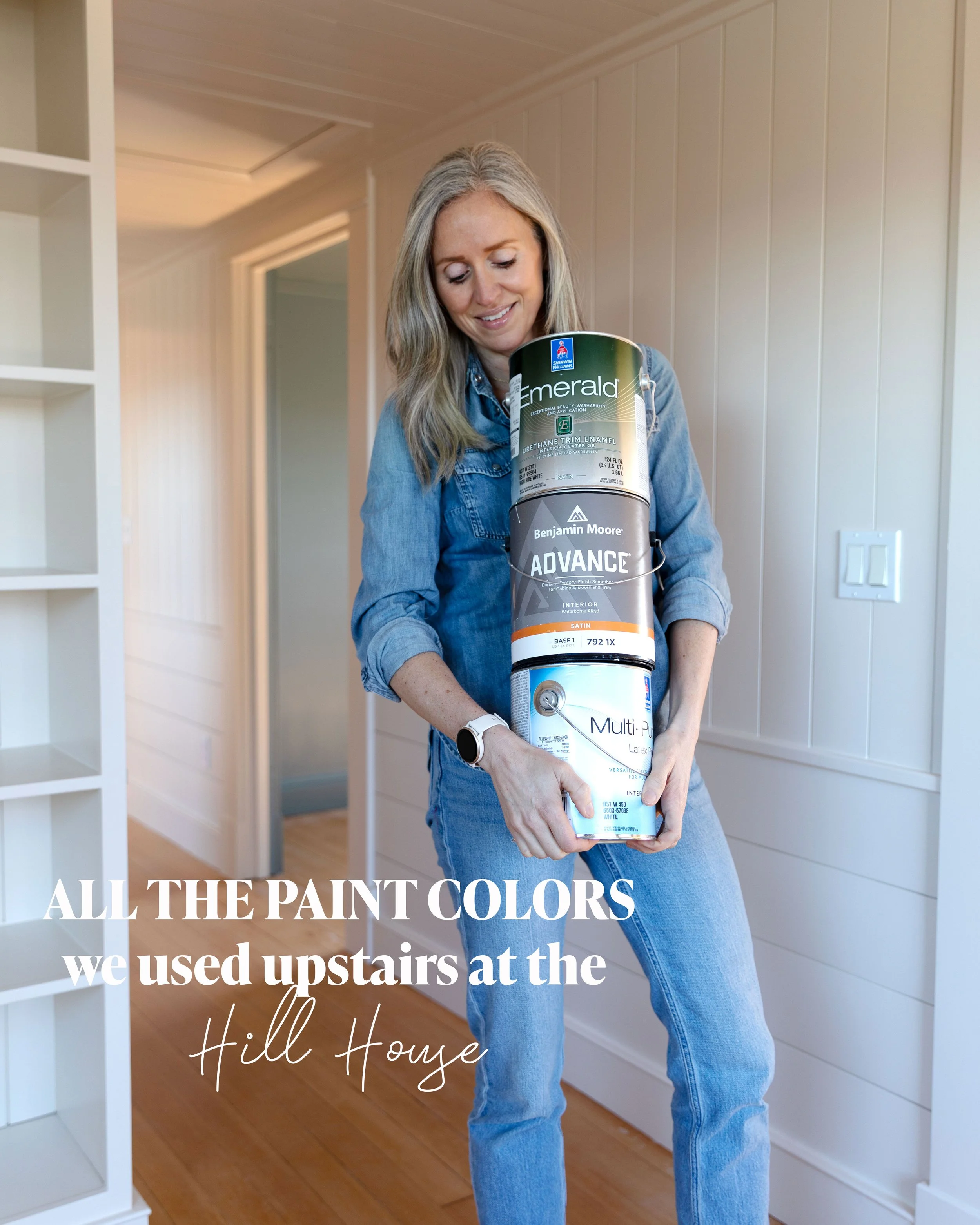
While I was in Charleston last week, Garrett was hard at work on the Hill House, painting the upstairs. Hooray! You might remember the excessive number of neutrals we sampled for the bathroom, but we also picked out a green for Brooks’ room, a blue to color drench Wilder’s bedroom, a white for Daphne’s trim, and a lighter-neutral/warm-white for the snug and hallway. Yes, I spent a small fortune on tiny pots of paint ;) Today I’m sharing all the colors we chose, the paint products and sheens we like best, and a bit about how we landed on them. Let’s get into it…

psst: get caught on up on all Hill House posts here.
The upstairs of the Hill House includes the hall bathroom, landing (aka the snug), hallway, the three kids’ bedrooms, and the ensuite bathroom (which is lagging behind the rest of the renovation and not ready for paint). A couple details to note…
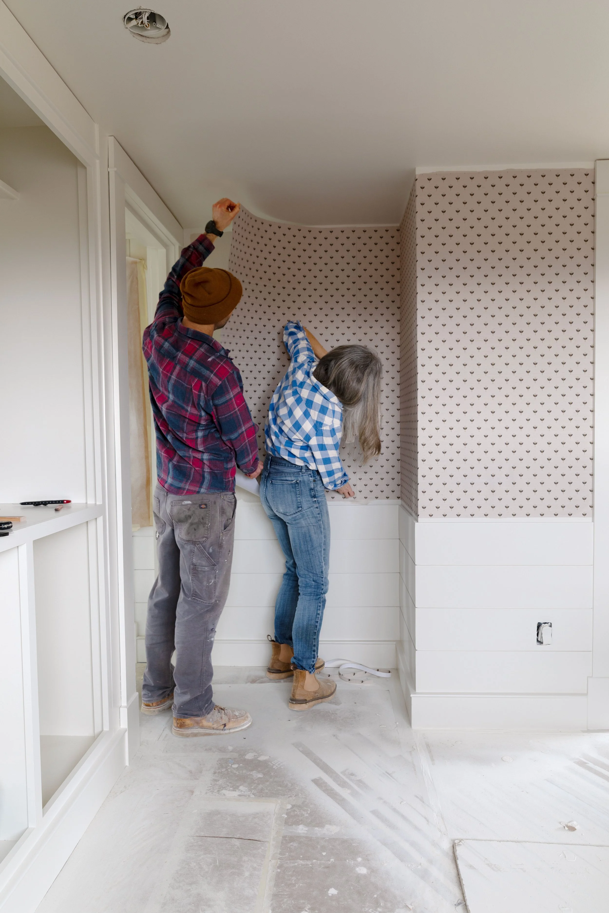
Garrett sprayed all the walls (panelling and drywall), ceilings, and trim for a really beautiful, smooth finish.
All of the Farrow & Ball colors in this house were color-matched by Sherwin-Williams at our local paint shop (find out how to color match here). Lee helped me pick out the best SW product for our application, and gosh good paint really makes a difference!
Eeek! Isn’t it looking good?! Of course we still have touch up to do and don’t you just want to mop our beautiful fir floors?! But I just couldn’t wait another minute to take photos after removing all the masking :)
Let me walk you through each color upstairs, starting with the hallway and snug…
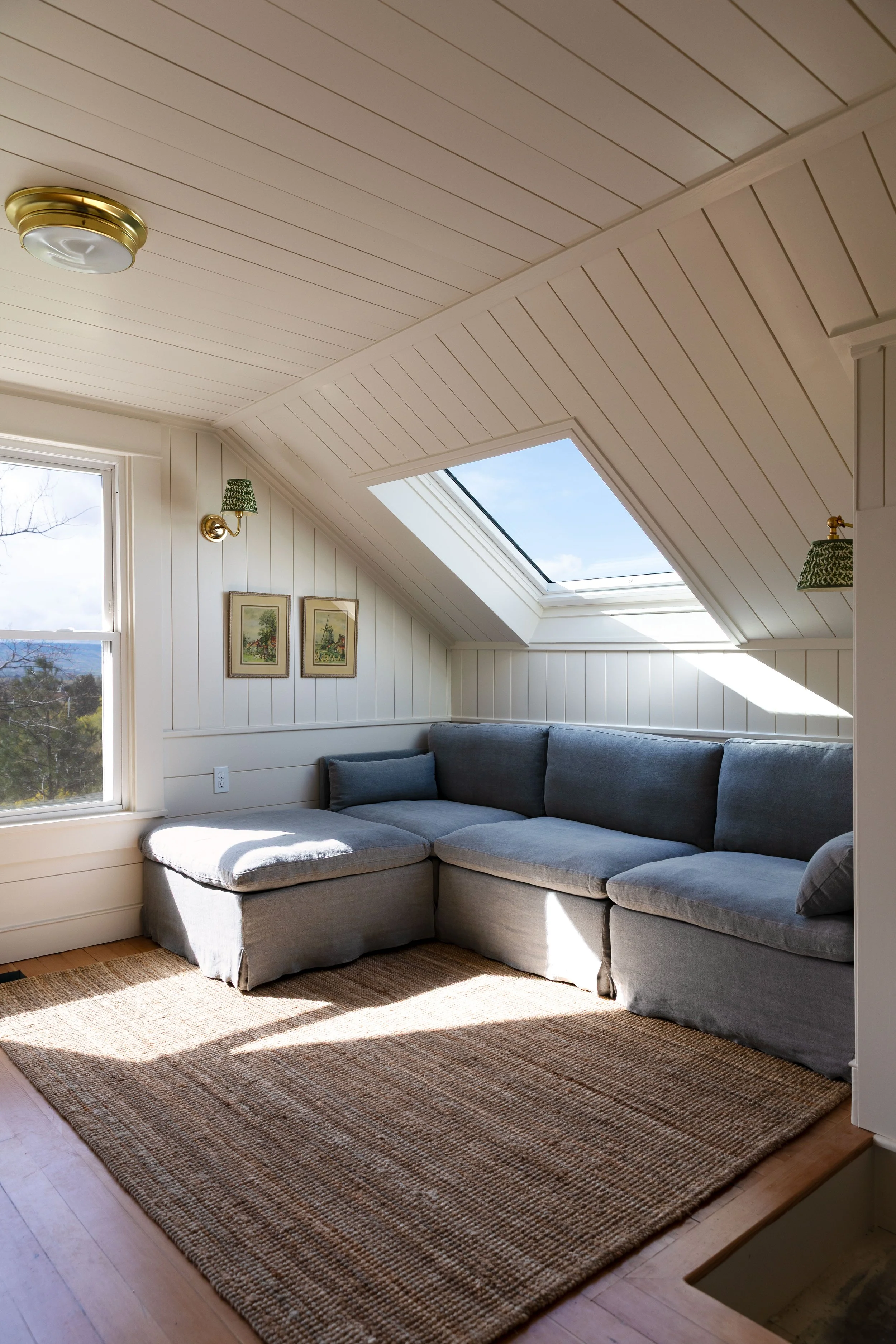
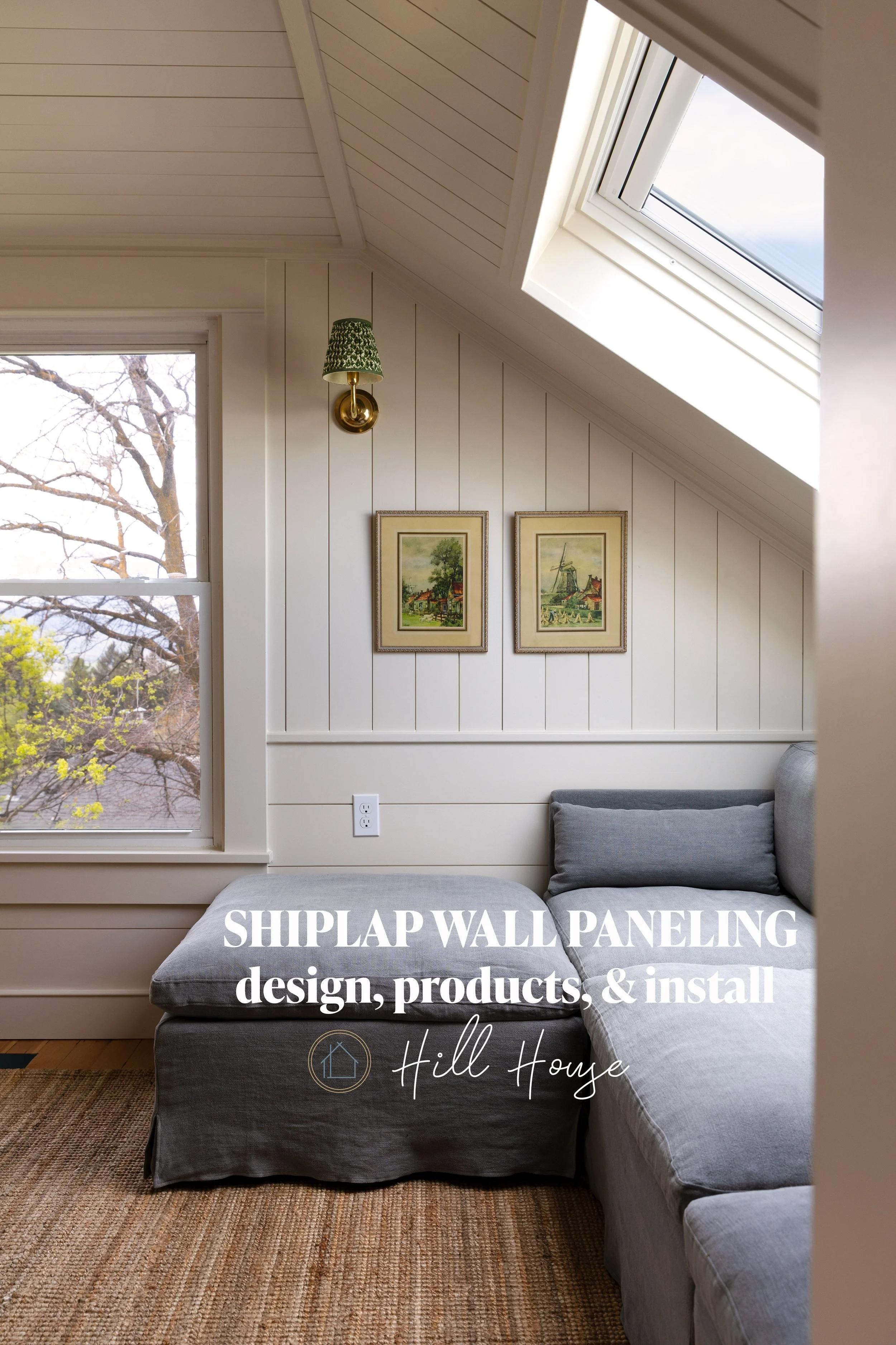
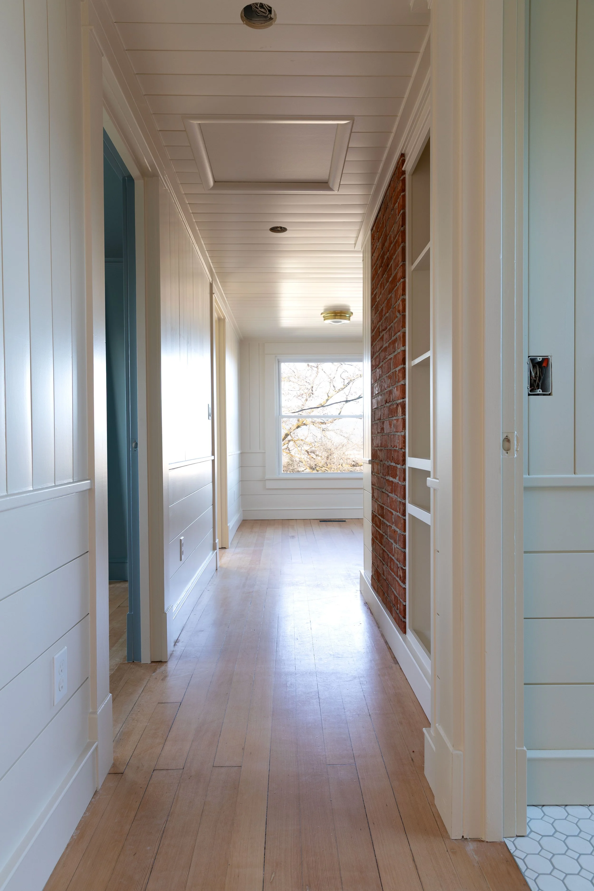
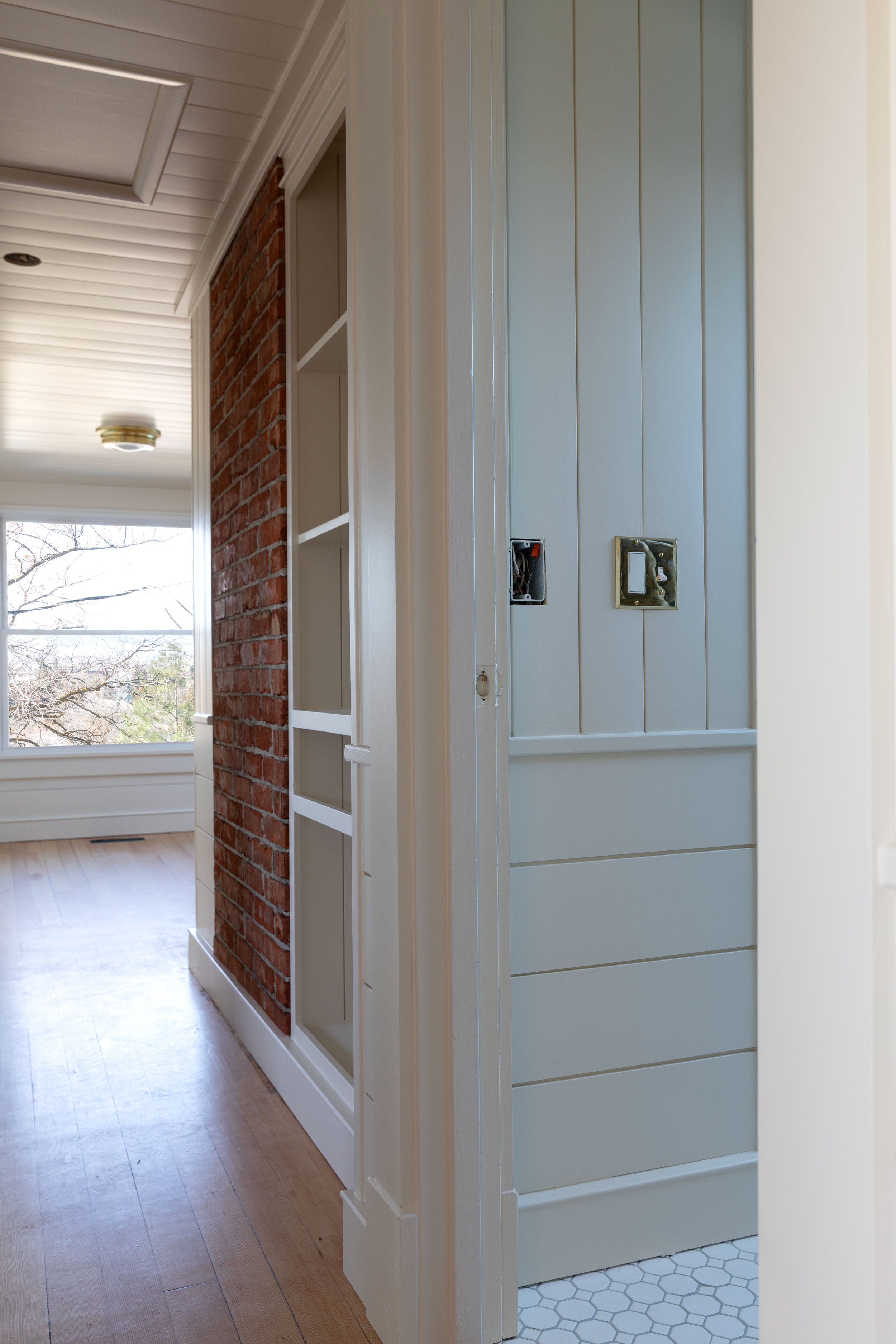
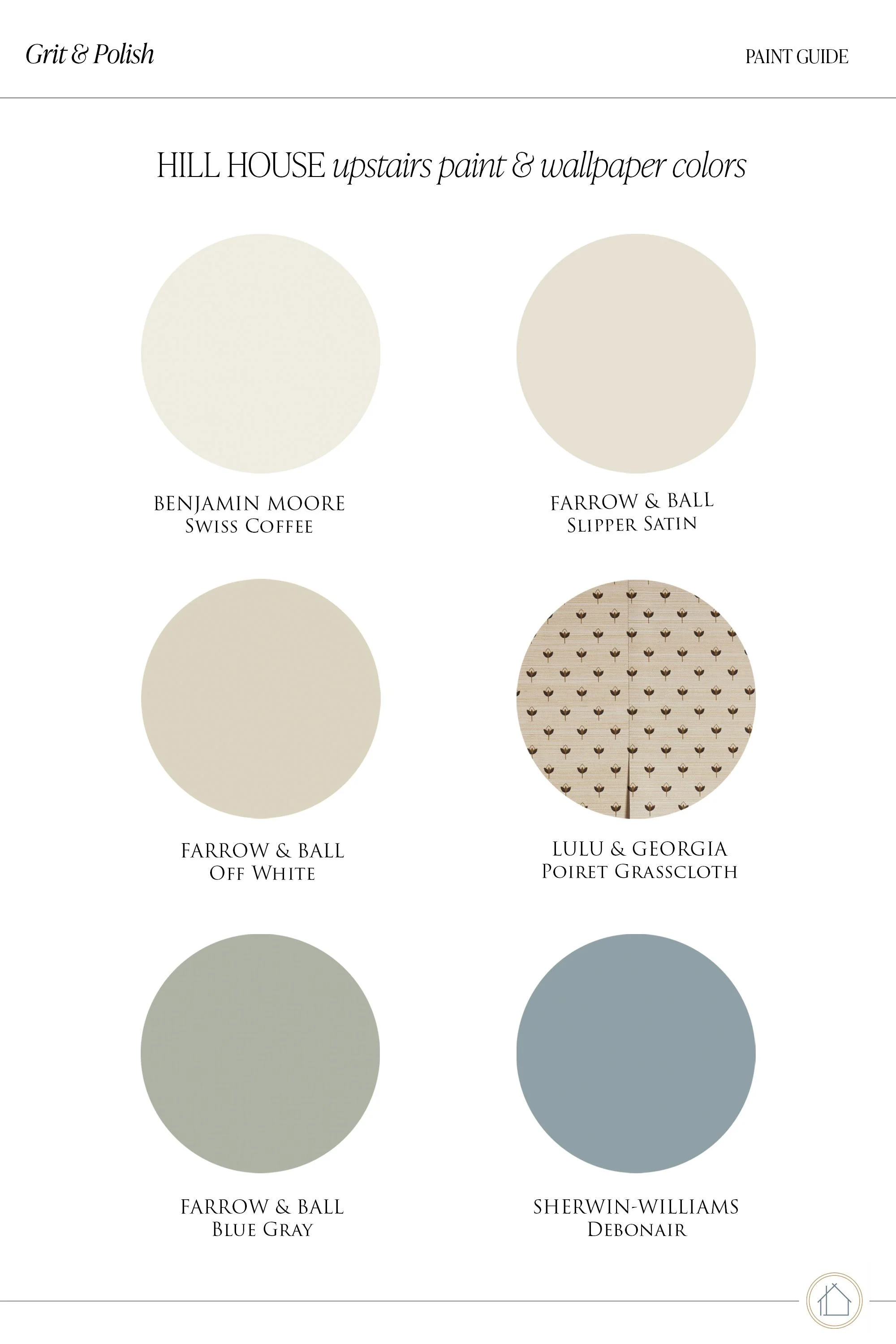
Farrow & Ball Slipper Satin
Space: Landing/Snug + Hallway
This might just be the perfect off-white/light neutral! It’s Farrow & Ball Slipper Satin (color matched by SW) and I’m a little embarrassed how long it took me to land on this color. But now that it’s here, I think it’s perfect. Farrow & Ball calls this a chalky off-white with no blue tones, but however you describe it, it just feels good.
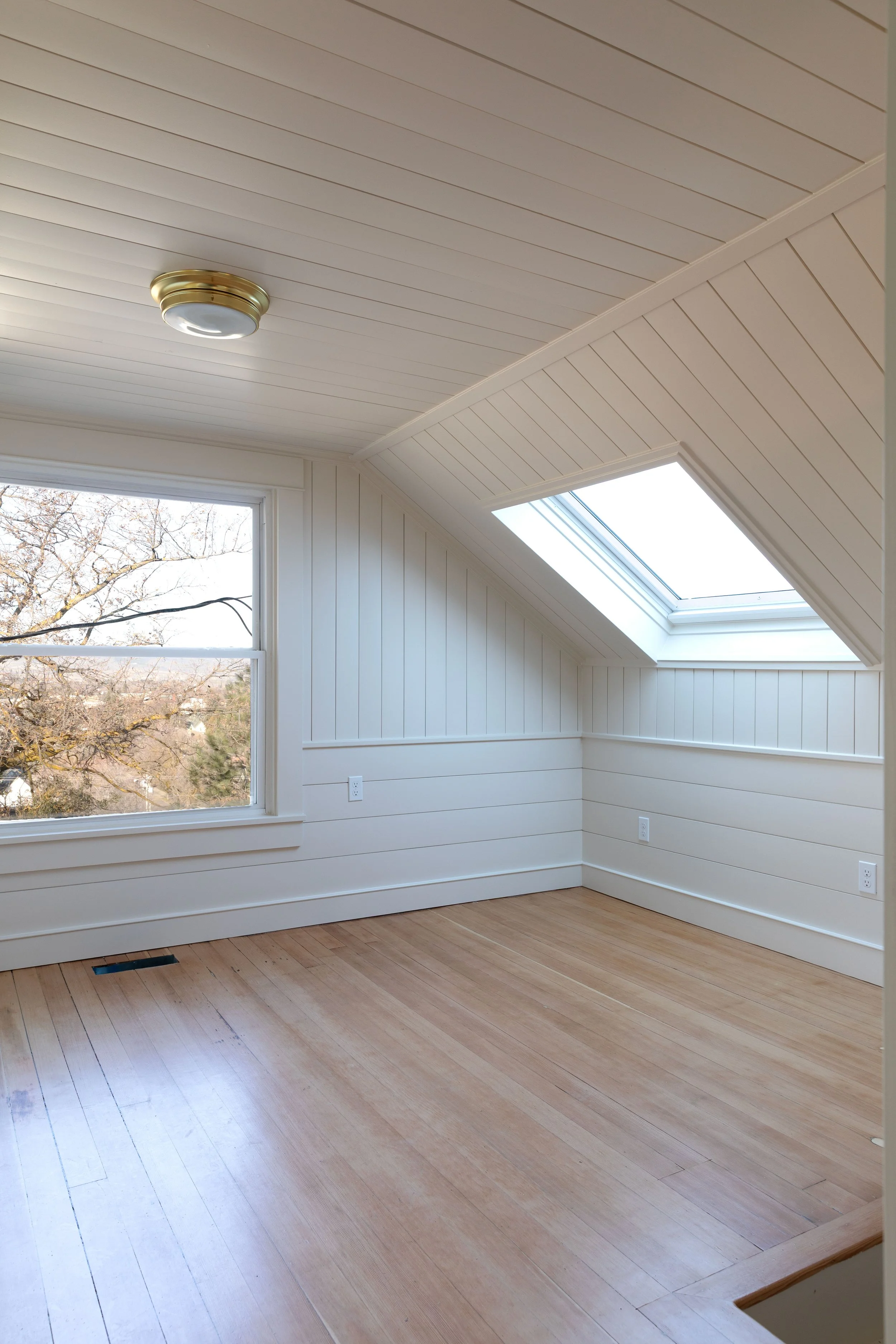
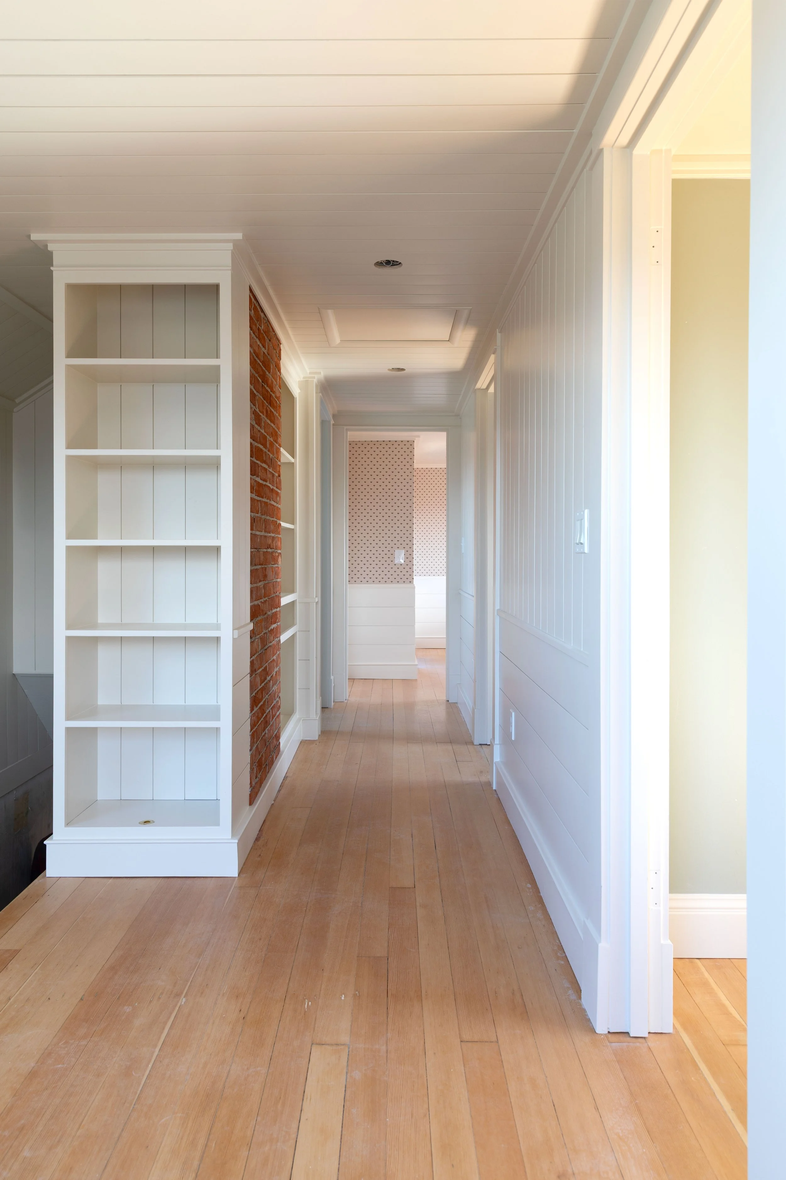

I especially love this color on the paneling and against the brick. I think it lends a historic feel to everything, despite the walls being brand new.
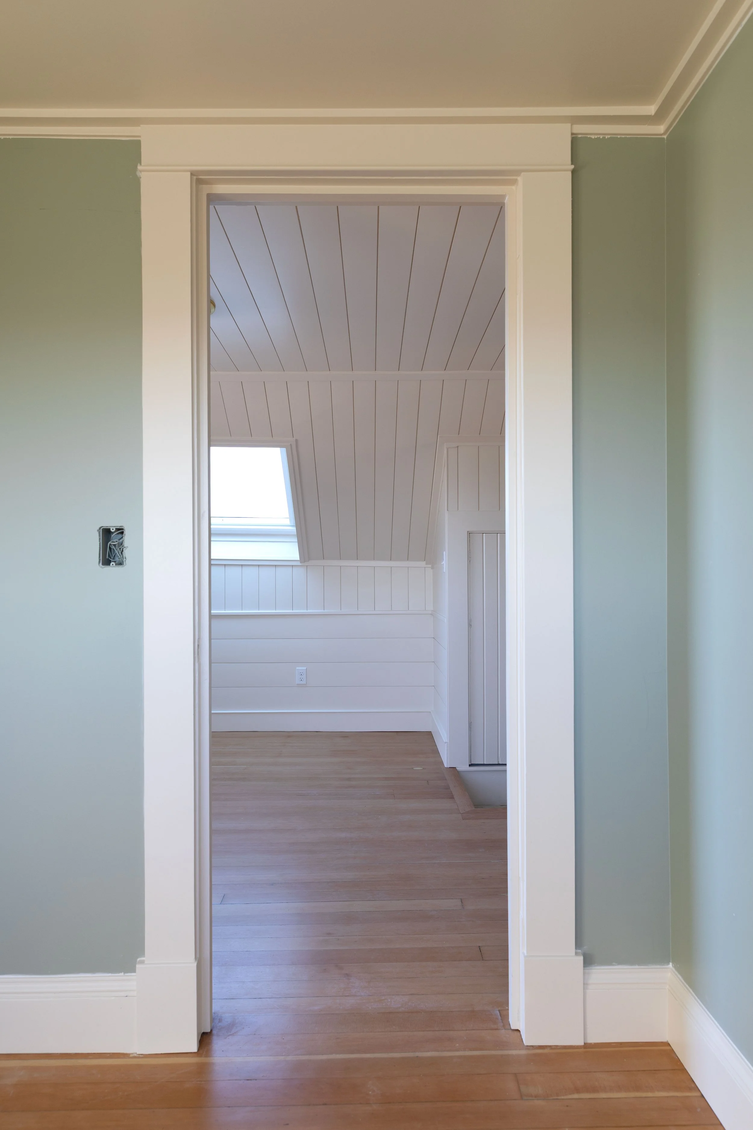
The ceilings upstairs are just 7’ so picking a light color that could go on both the walls and ceilings helped the space feel a bit more spacious. Hallways tend to carry a lot of visual weight since they connect multiple spaces, so keeping a calm and neutral color out here, let the bedrooms take on more personality. You’ll see Slipper Satin pop up again in Brooks’ room trim, which helps visually connect the spaces.
Paint products used
Primer: SW Multi-Purpose Latex Primer
Panneling: SW Emerald Urethane Trim Enamel in Satin
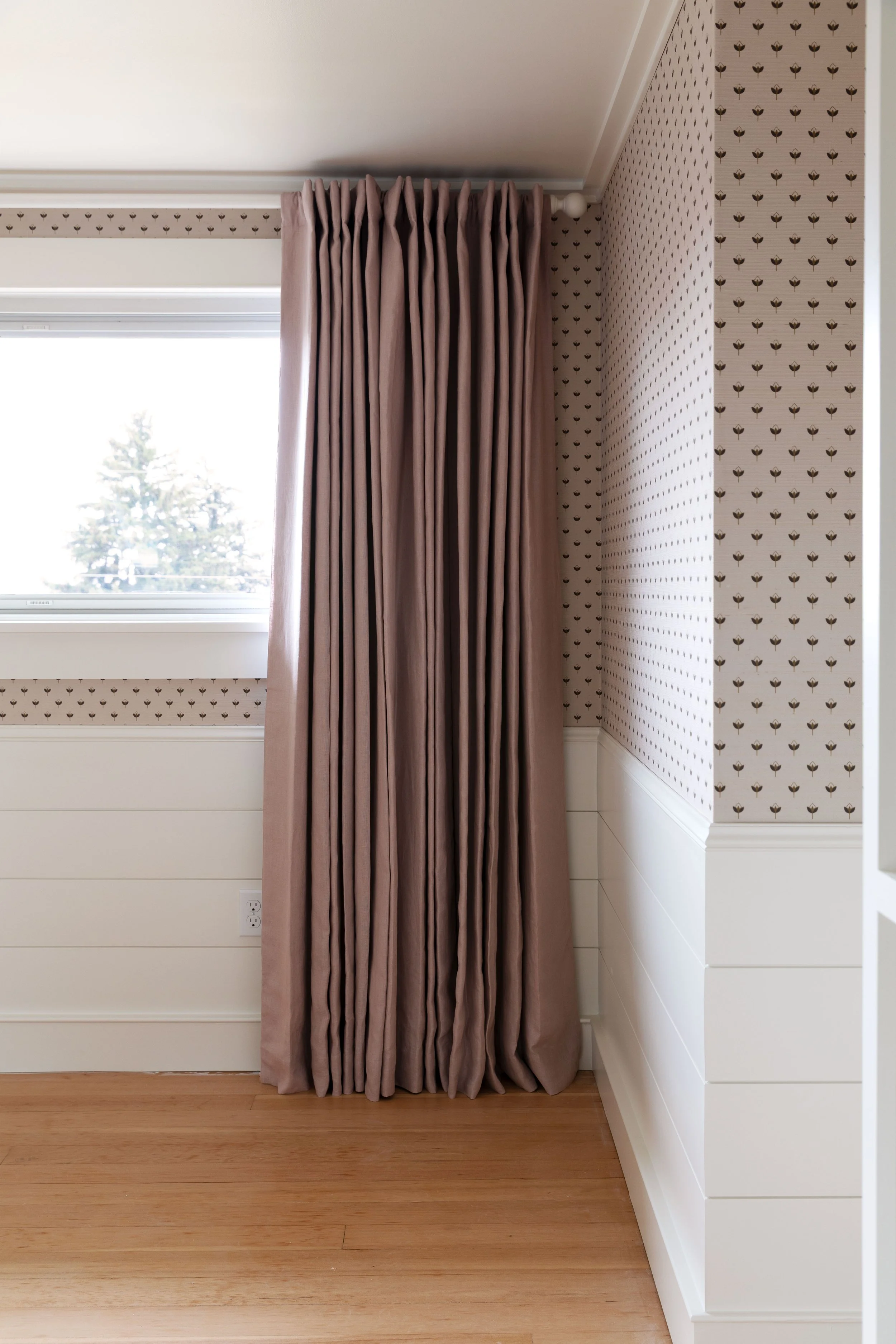
Farrow & Ball Off-White
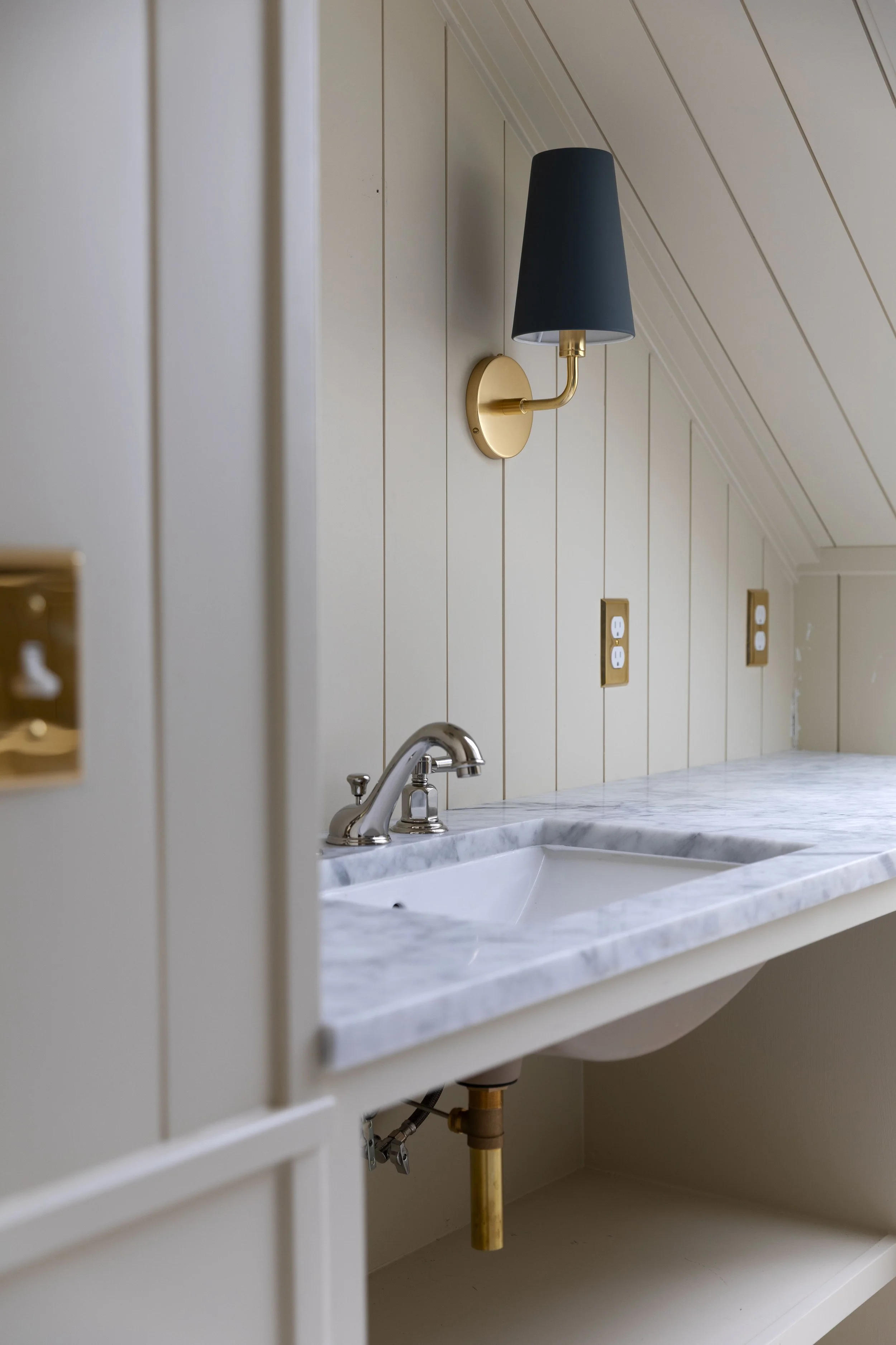
Space: hall bathroom
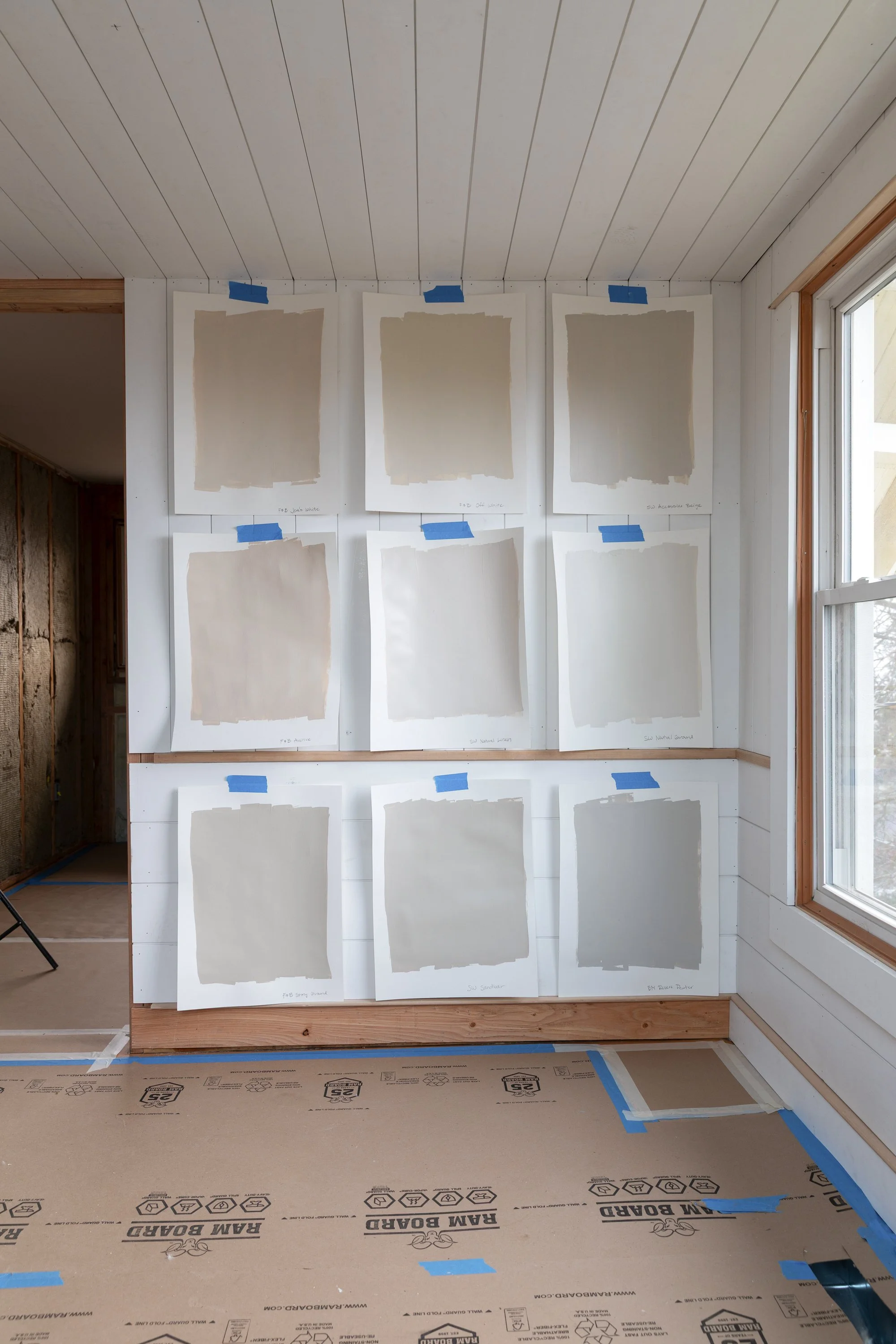
This color came out of a pretty extensive neutral paint test where we sampled more than nine warm neutral paints to find the right tone for the space. Off-White ended up being the winner because it reads soft, warm, and slightly earthy without leaning gray, which was important to me.
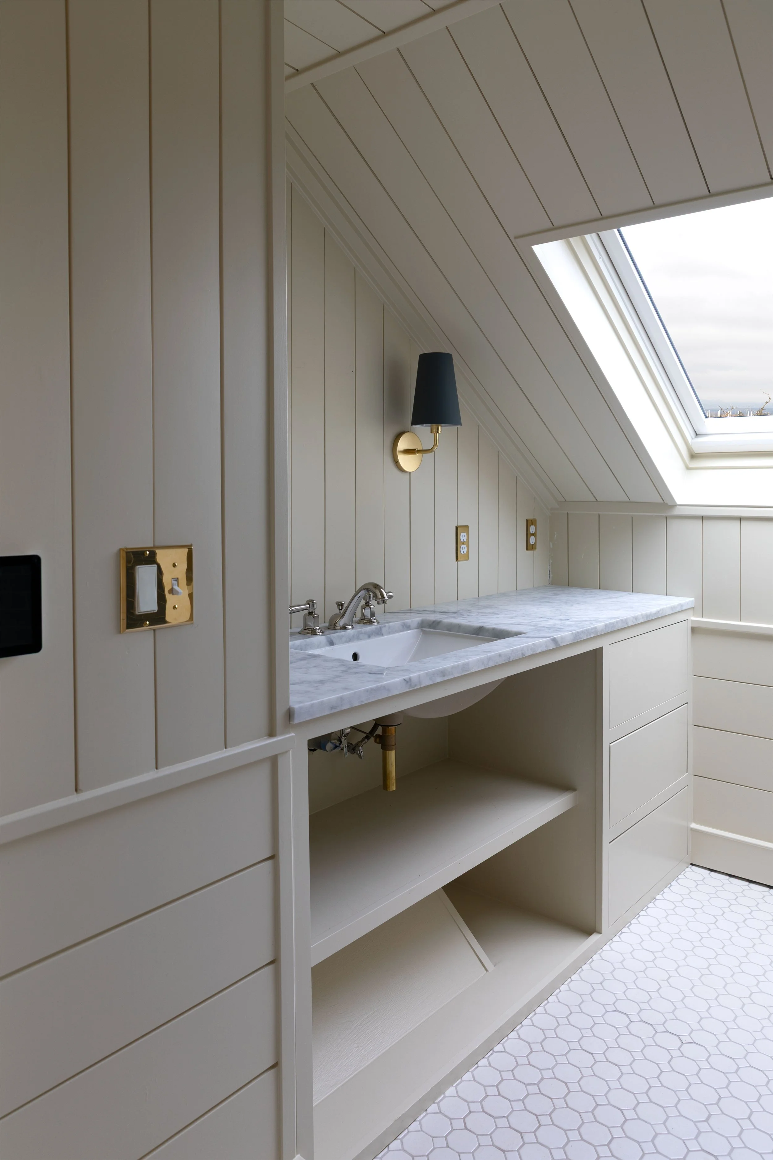
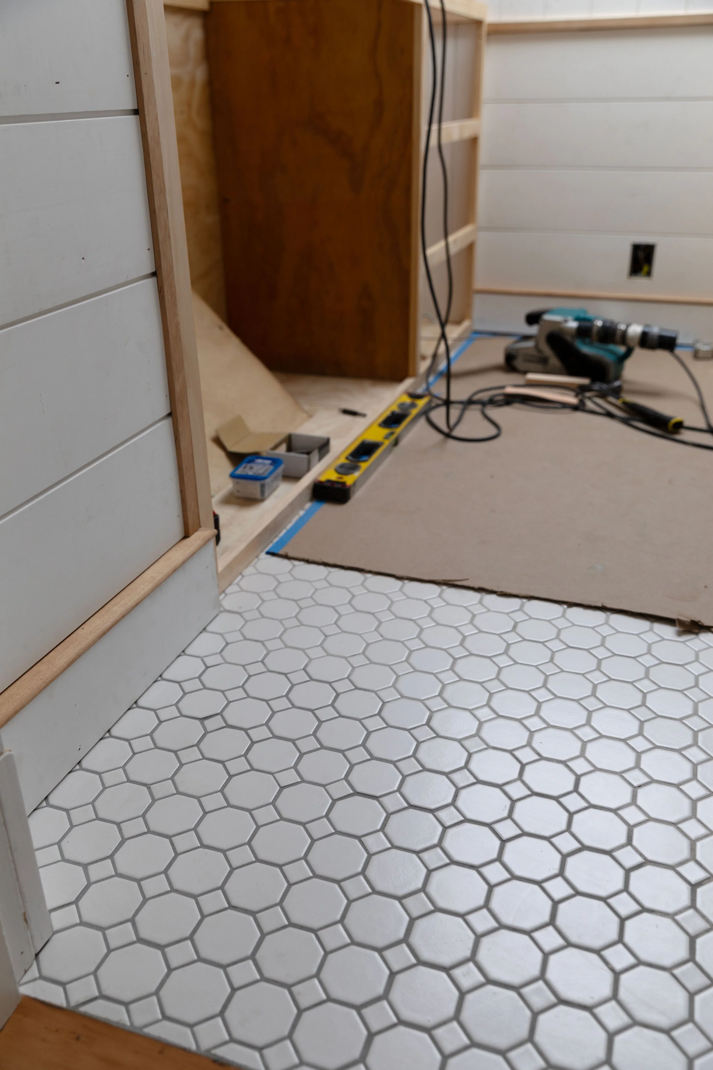
Floor tile, sconce (aged brass, Matte Dark Slate shade), faucet (polished nickel), sink, outlet cover (unlaquered brass), color: F&B Off While
In this bathroom it pairs beautifully with:
• salvaged marble countertops
• classic white octagon-and-dot floor tile
• blue sconce and wall tile
• unlacquered brass hardware
Depending on the light, Off-White can read a little green or a little creamy, which gives the room depth without feeling heavy. And it looks great next to the hallway’s slipper satin.
Paint products used
Primer: SW Multi-Purpose Latex Primer
Panneling: SW Emerald Urethane Trim Enamel in Satin
Farrow & Ball Blue Gray
Space: Brooks’ bedroom
Brooks chose the color for his bedroom. After he gave me a general direction (green), I pulled together a shortlist of colors I thought could work in the space, making sure I liked them too. We sampled them and he picked Farrow & Ball Blue Gray.
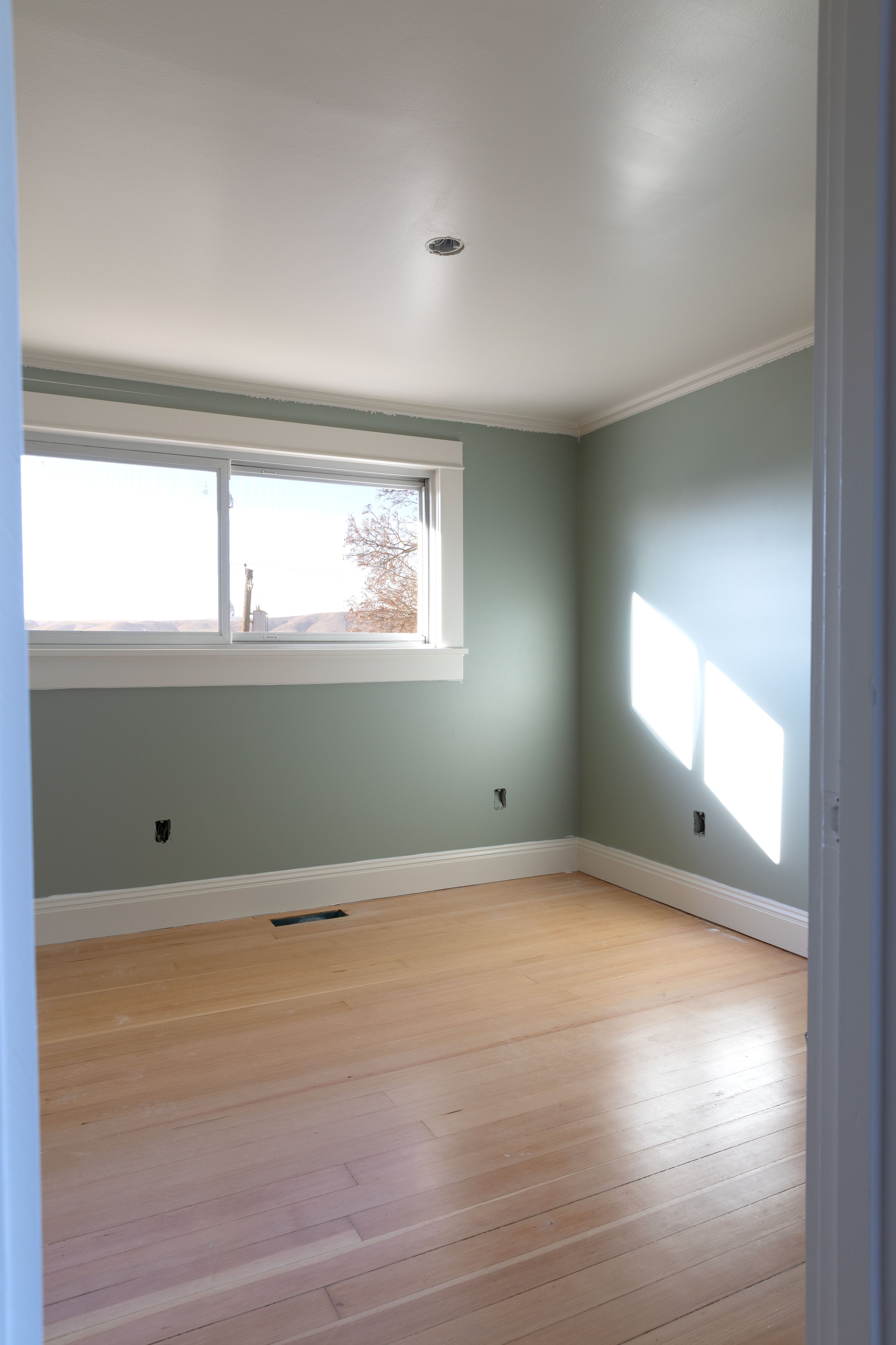
Blue Gray is supposedly a soft muted blue but definitely looks green in this house. It feels calm and classic, a perfect resting space for a boy with a busy mind.
In Brooks’ room we paired it with Slipper Satin trim (to tie the room back to the hallway) and warm fir floors. The result feels relaxed and timeless.
Paint products used
Primer: SW Multi-Purpose Latex Primer
Trim + Ceiling: SW Emerald Urethane Trim Enamel in Satin
Walls: SW Emerald Urethane Trim Enamel in Satin
Sherwin-Williams Debonair
Space: Wilder’s Bedoom
Wilder chose Sherwin-Williams Debonair from a short-list of pretty blues for his room, and we went all in by color drenching the space. Debonair is a rich blue with depth, but it’s still really livable and soft. When I compared all the blues to the bathroom tiles and sconces, this was closest - and I love a repeating color!
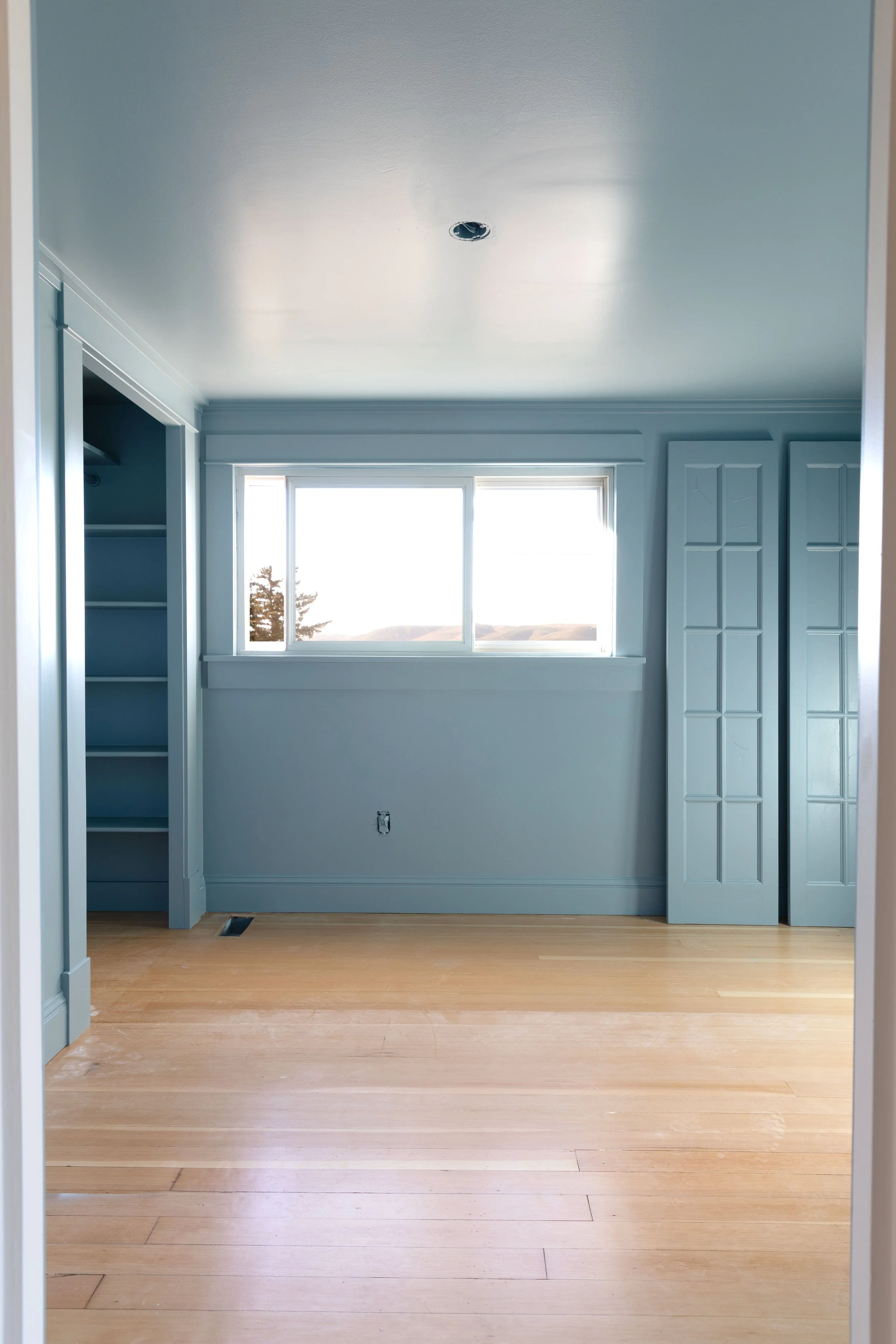
Wilder had asked for a cozy, ‘cave-like’ feel and painting the ceilings in the same rich blue as the walls is an easy way to achieve that (dark ceilings definitely make them feel shorter). And the closet doors also got a coat of blue. Bedrooms are a great place to experiment with color since they’re contained spaces that close with a door.
Paint products used
Primer: SW Multi-Purpose Latex Primer
Trim + Walls + Ceiling: SW Emerald Urethane Trim Enamel in Satin
Benjamin Moore Swiss Coffee
Space: Daphne’s bedroom
Daphne’s room is mostly defined by her grasscloth wallpaper, but the trim and ceiling are painted Benjamin Moore Swiss Coffee. Swiss Coffee has become one of our favorite whites after using it at the Poplar Cottage. It’s warm, soft, and very forgiving in different lighting conditions.
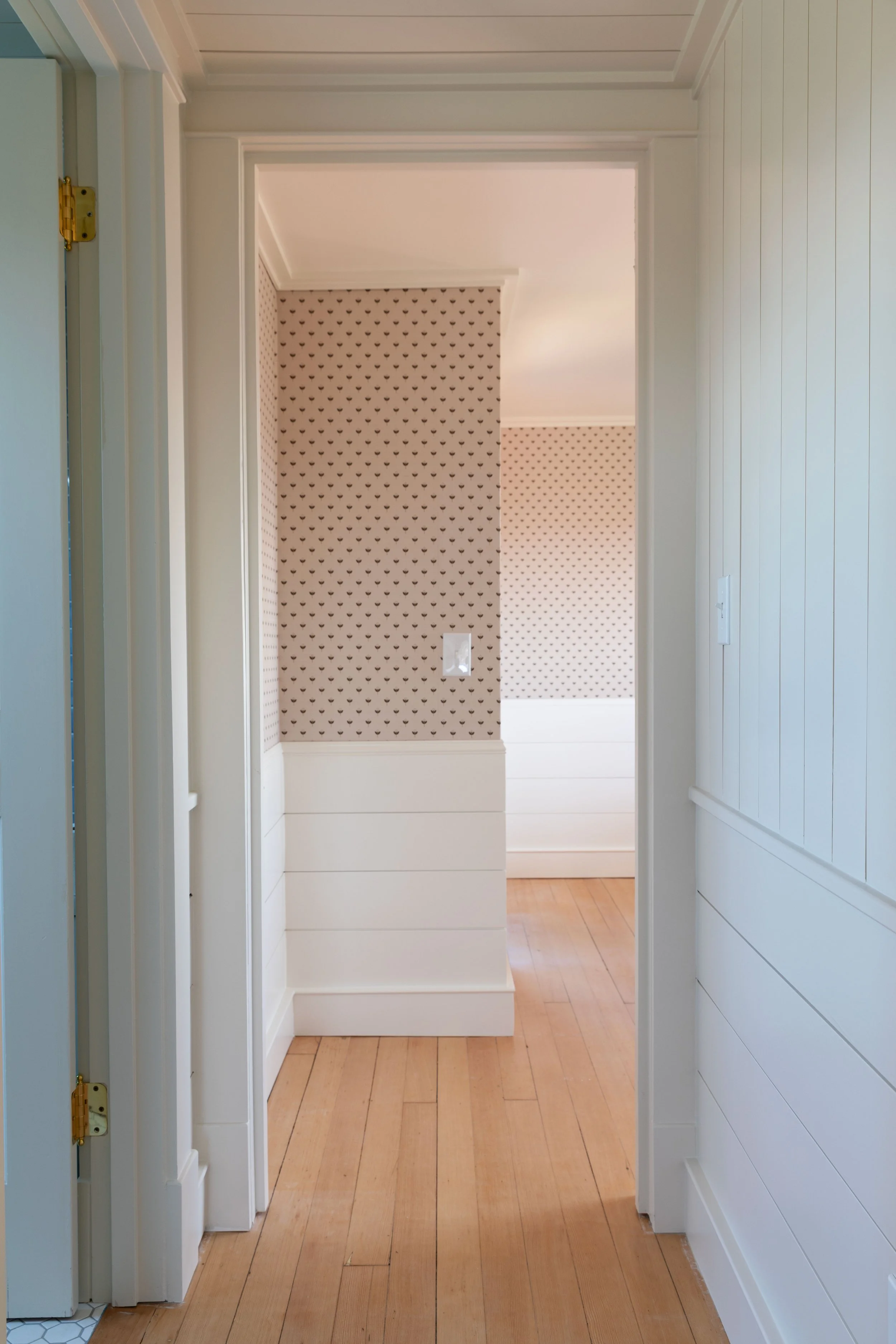
wallpaper, nickel-gap paneling, paint: BM Swiss Coffee
It pairs especially well with natural textures like wallpaper, wood floors, and woven materials - which makes it a great backdrop for Daphne’s room. Swiss Coffee looks great with the Slipper Satin in the hallway, too.
Paint products used
Primer: SW Multi-Purpose Latex Primer
Trim: BM Advance in Satin
Ceiling: BM Regal Select in Eggshell
Our Upstairs Paint Palette
Even though each room has its own personality, the colors upstairs work together as a palette:
• F&B Slipper Satin – hallway and landing
• F&B Off-White – hall bathroom
• F&B Blue Gray – Brooks’ room
• SW Debonair – Wilder’s room
• BM Swiss Coffee – Daphne’s trim with wallpaper
I tend to like colors on the lighter end overall, but bedrooms are a great place to bring in color and personality and give kids a say in their space!
We also like repeating colors throughout a house where possible. You’ll see Slipper Satin in the landing and in Brooks’ trim. Wilder’s blue walls are repeated in the bathroom tile and sconces. That subtle repetition helps spaces feel connected instead of completely separate.
More soon as we keep working our way through the bedrooms and finishing details!