My New Favorite White Paint Color: Farrow & Ball Slipper Satin
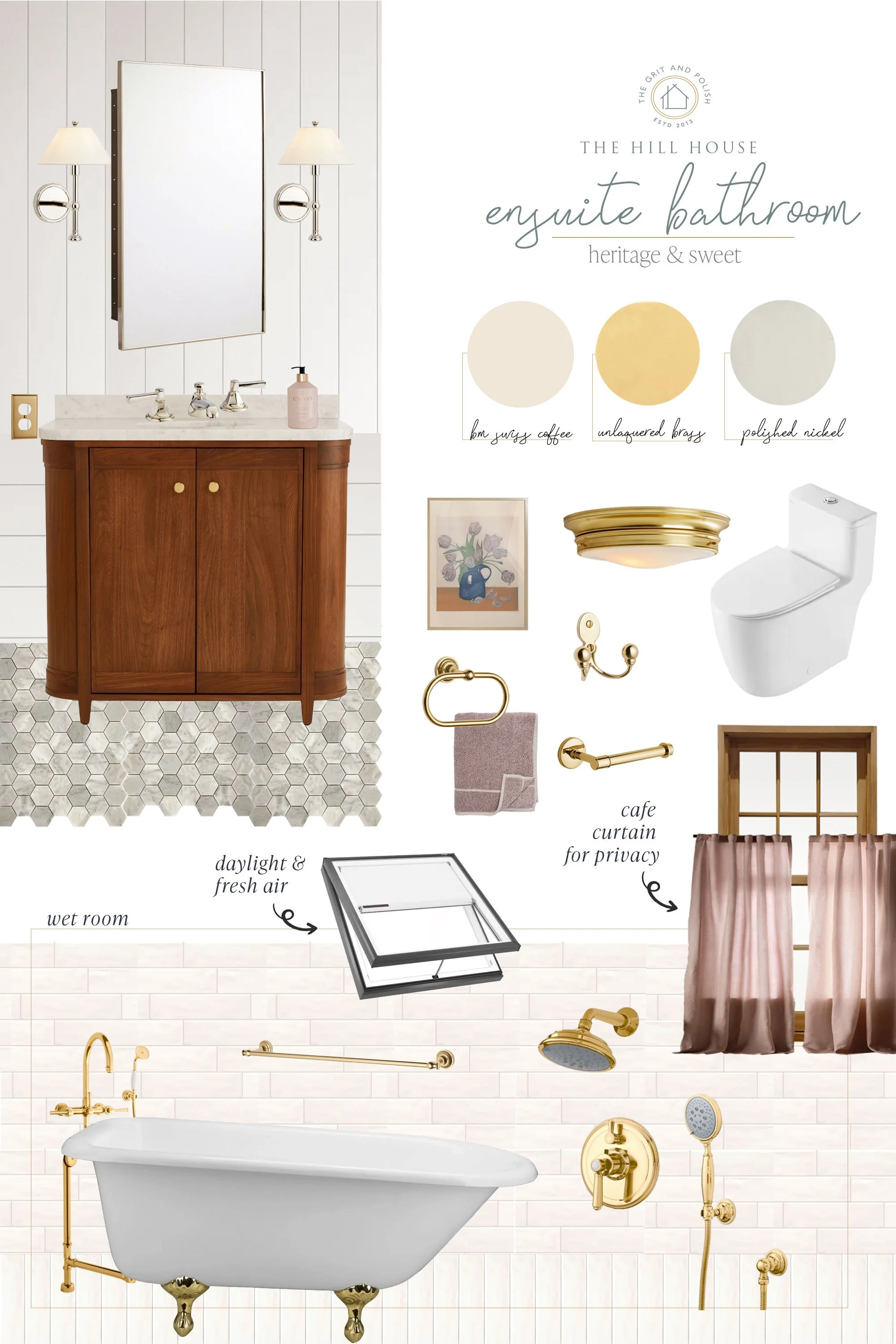
THE HILL HOUSE
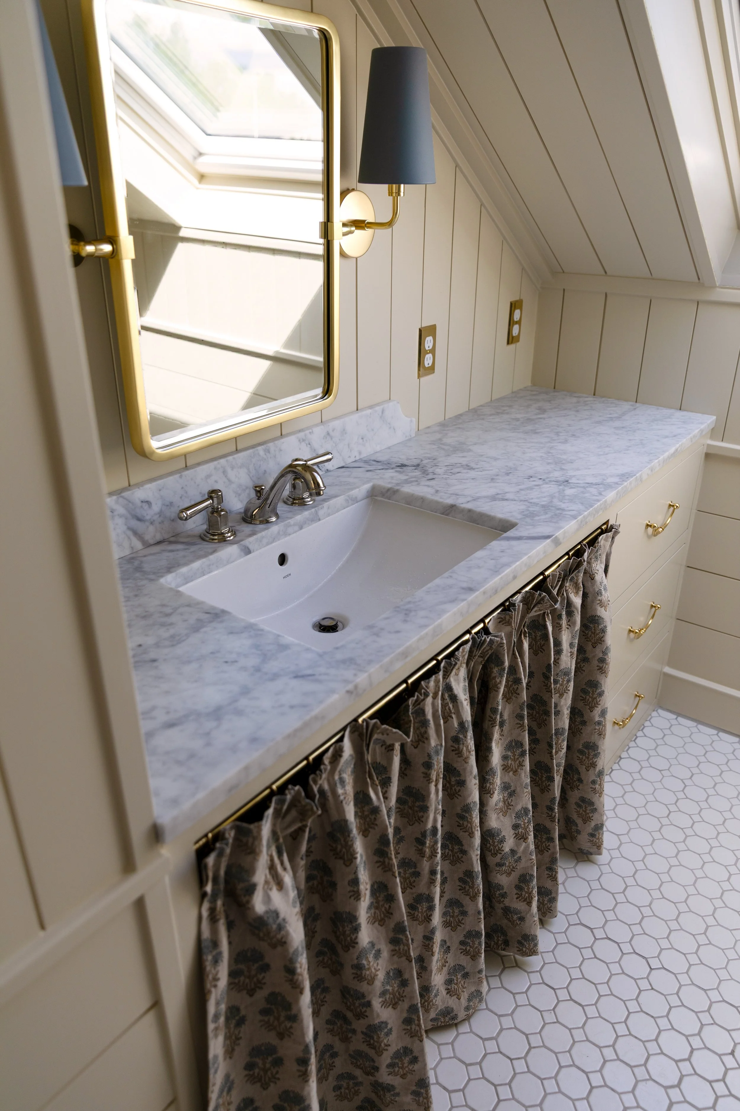
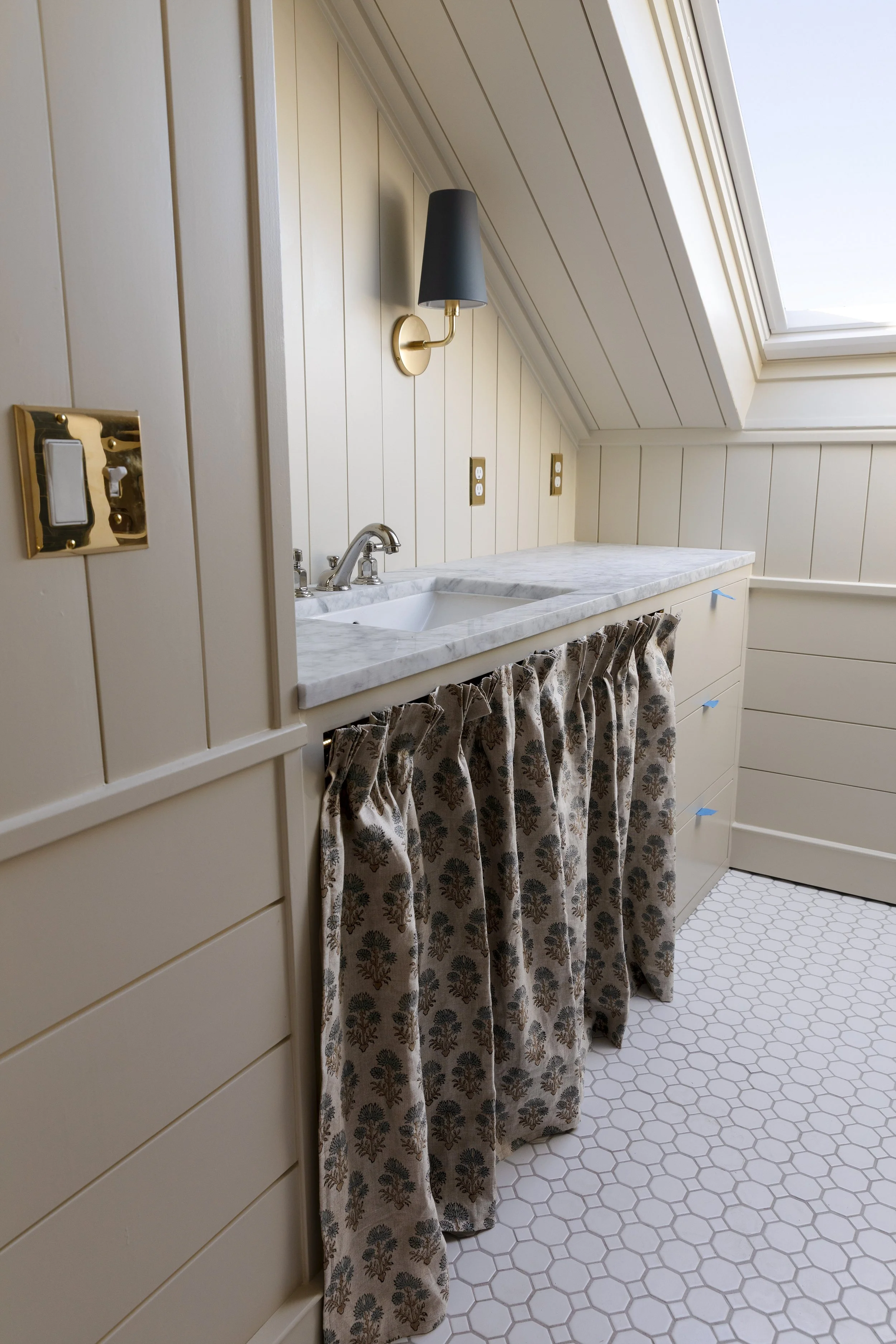
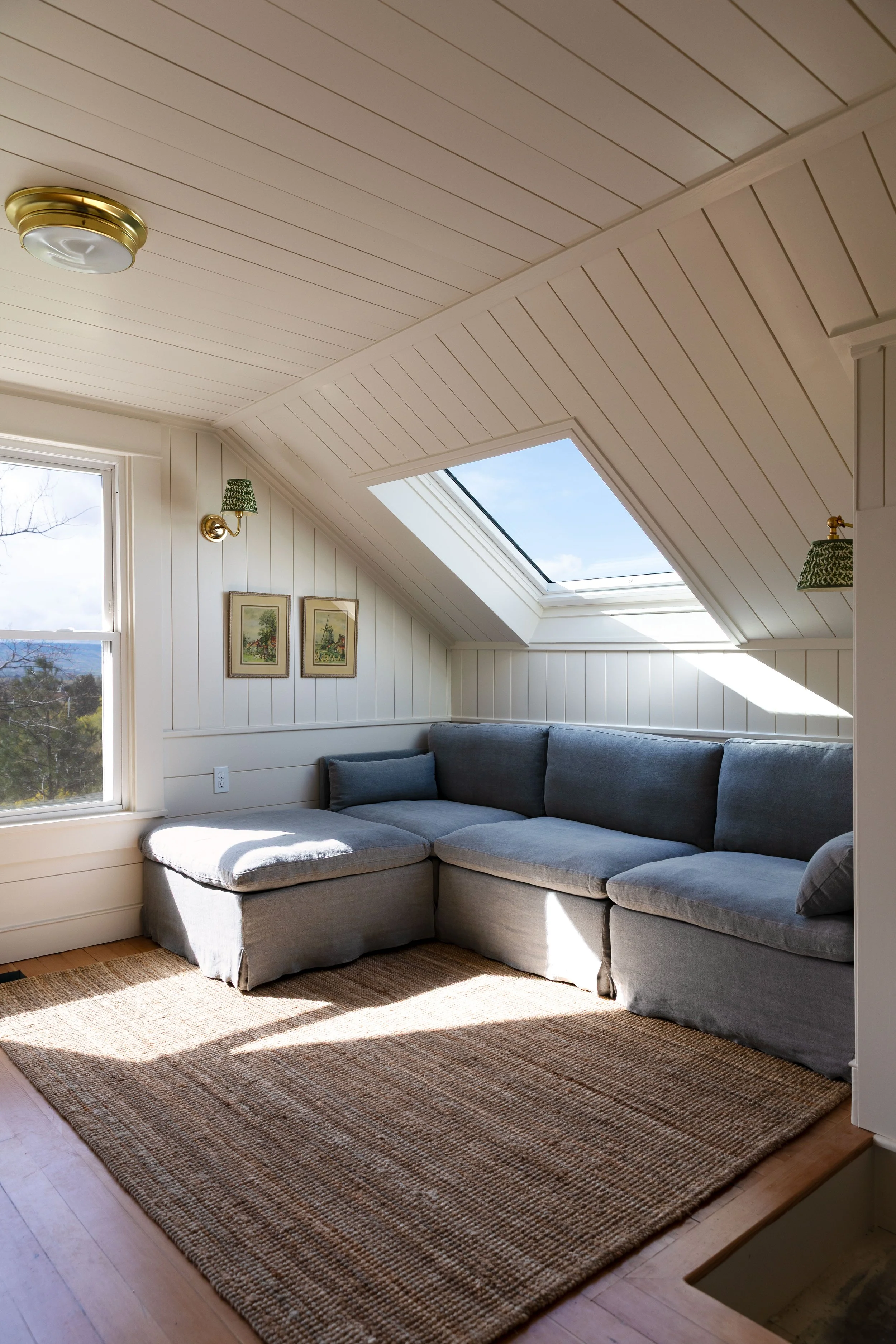
Every one of our renovations has come with a search for the white paint color. At the Farmhouse, it was Benjamin Moore Simply White. At the Poplar Cottage, BM Swiss Coffee. But at the Hill House, I wanted something a little different - something warmer, cozier, and just a touch off-white. So we sampled a fresh batch of whites, and after a lot of hemming and hawing, I finally landed on one. I wish I could say it was love at first sight, but honestly, I wasn’t sure until we had two coats on the wall. And then I fell hard! The color? Farrow & Ball Slipper Satin (color matched at Sherwin-Williams). Sharing all the details, including the formula, below.
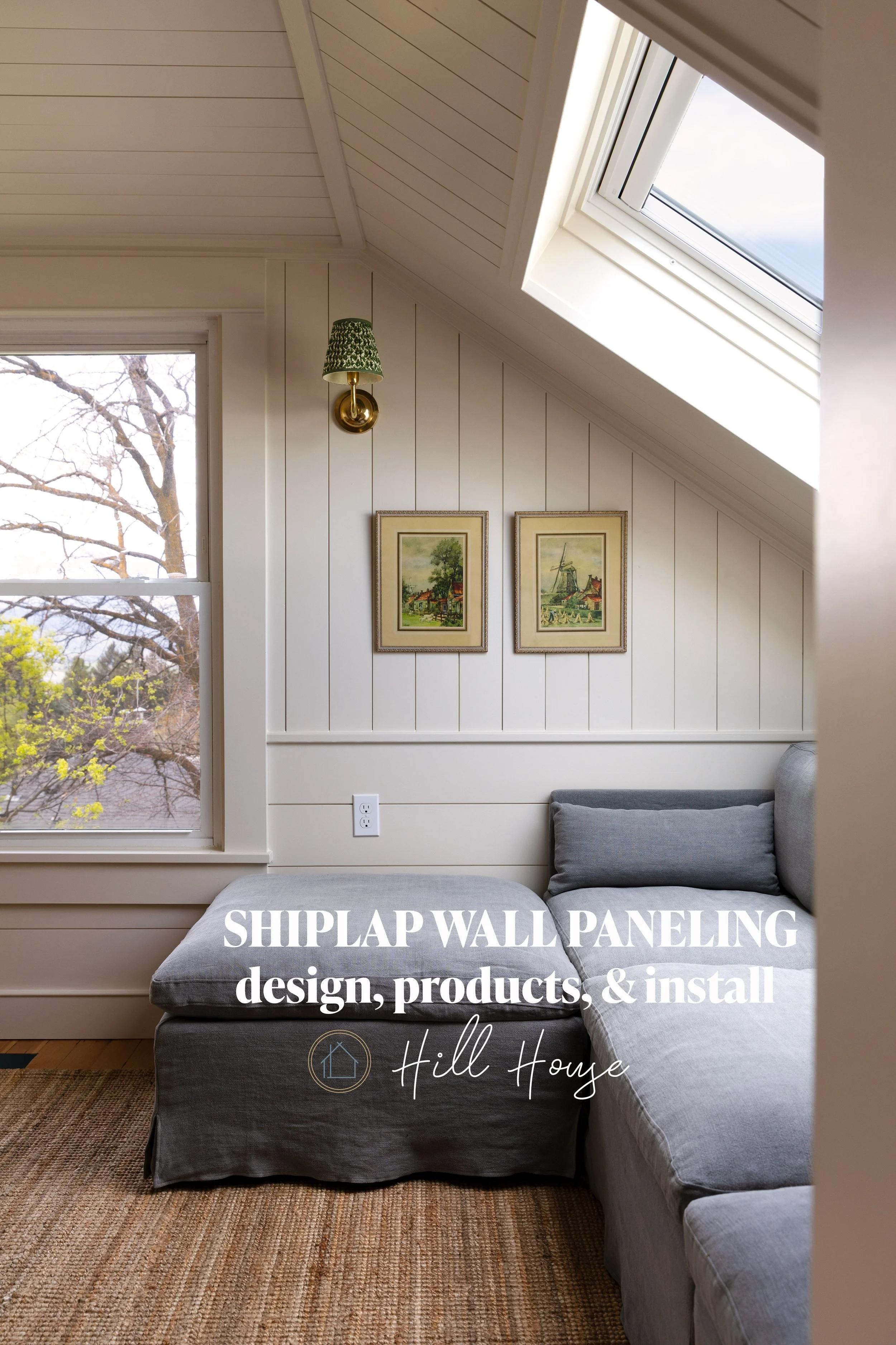
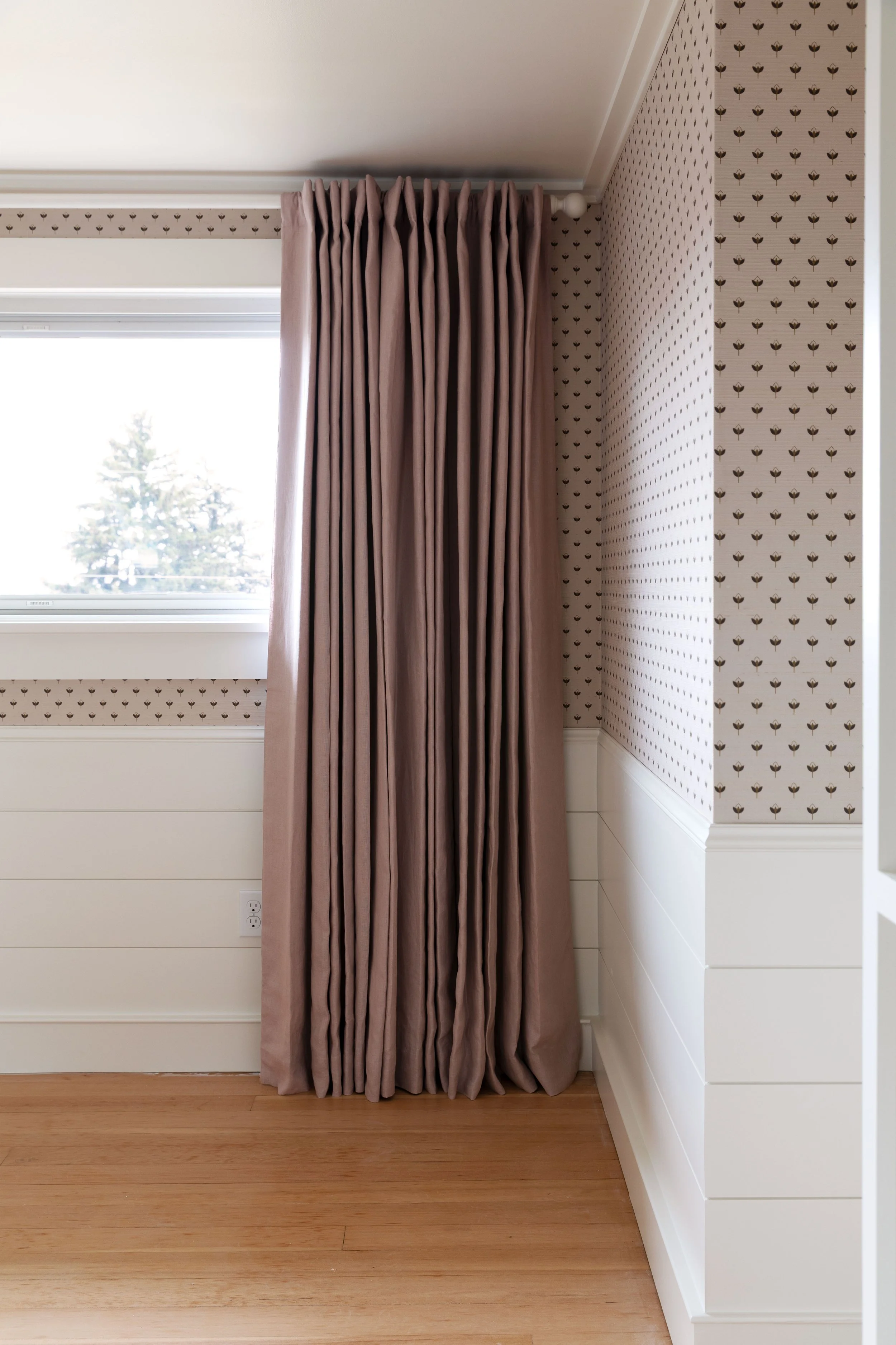
skylight, paneling, light, paint color, floor finish
psst: how to color match between paint brands.
Why We Love It
If you’ve ever stood in front of a wall of white paint samples, you know how quickly it can spiral. This one feels too gray and cold (and maybe a little sad). That one is too yellow. And is that one too stark to actually live with? The more you stare, the more they all blur together… and suddenly you’re not even sure what your name is, let alone what color to choose for the next few years ;)
Slipper Satin was no different. I questioned it - too much pink? too soft? - right up until we committed. But the moment I saw it on the wall, I gasped. It was perfect!
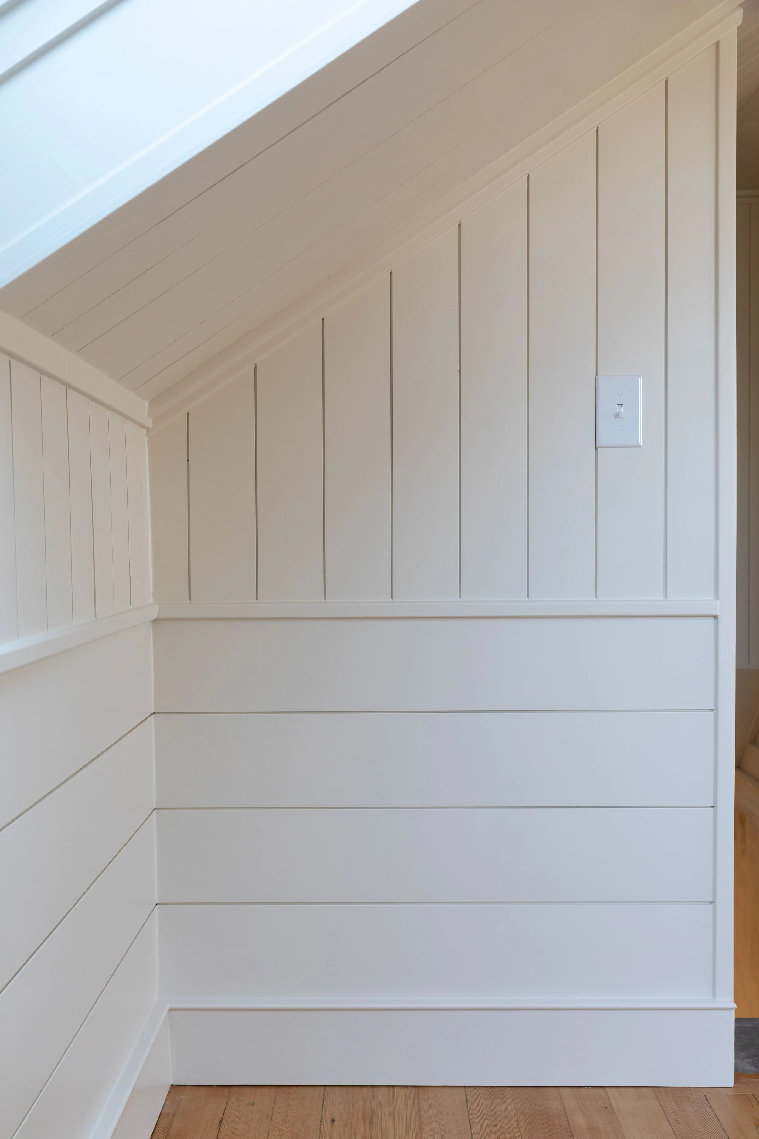
Slipper Satin is that warm off-white that makes a space feel soft and comfortable the second you walk in. It just feels good. There’s enough depth to read as a color, but it’s neutral enough to work everywhere - from our windowless hallway to the bright snug.
If I had to pick one white to use throughout the Hill House, this would be it. Honestly, if I had to pick just one color for the entire house… this might be it.
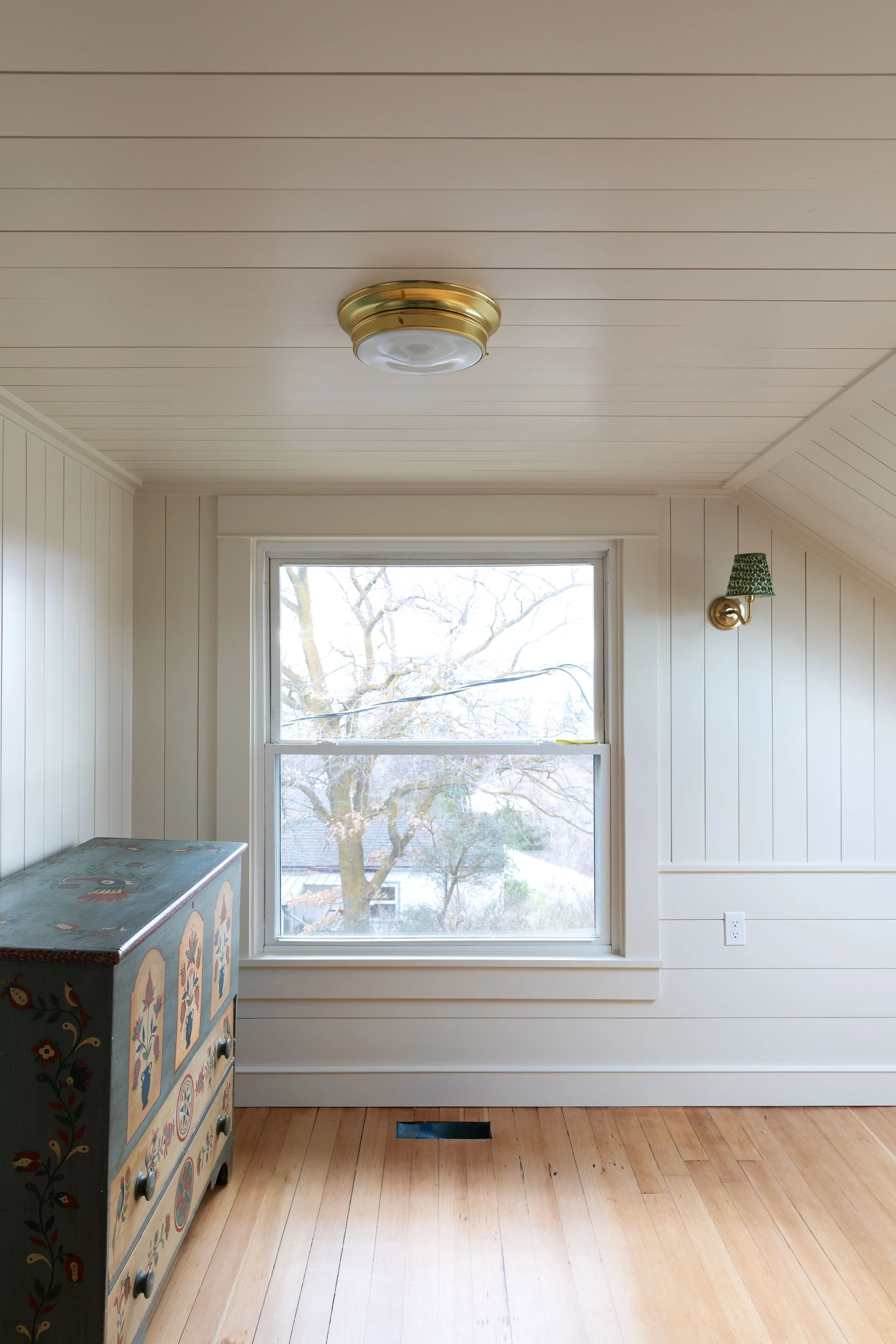
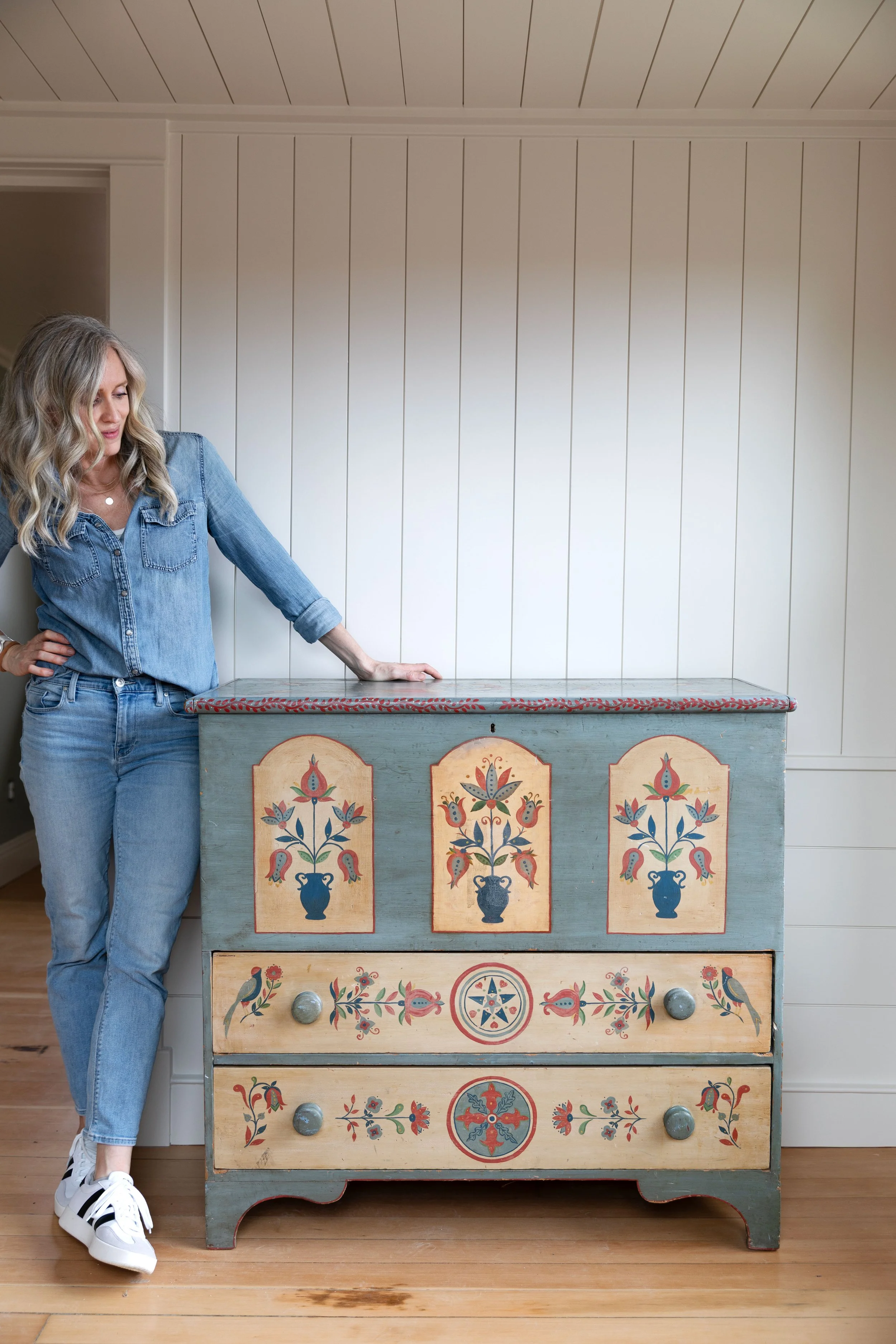
flush mount light, sconce (6” temple green shade), dresser
Farrow & Ball says Slipper Satin inspired by the color of a ballet slipper, which I love, even if it’s not quite the shade of my daughter’s slippers ;)
Where We Used It
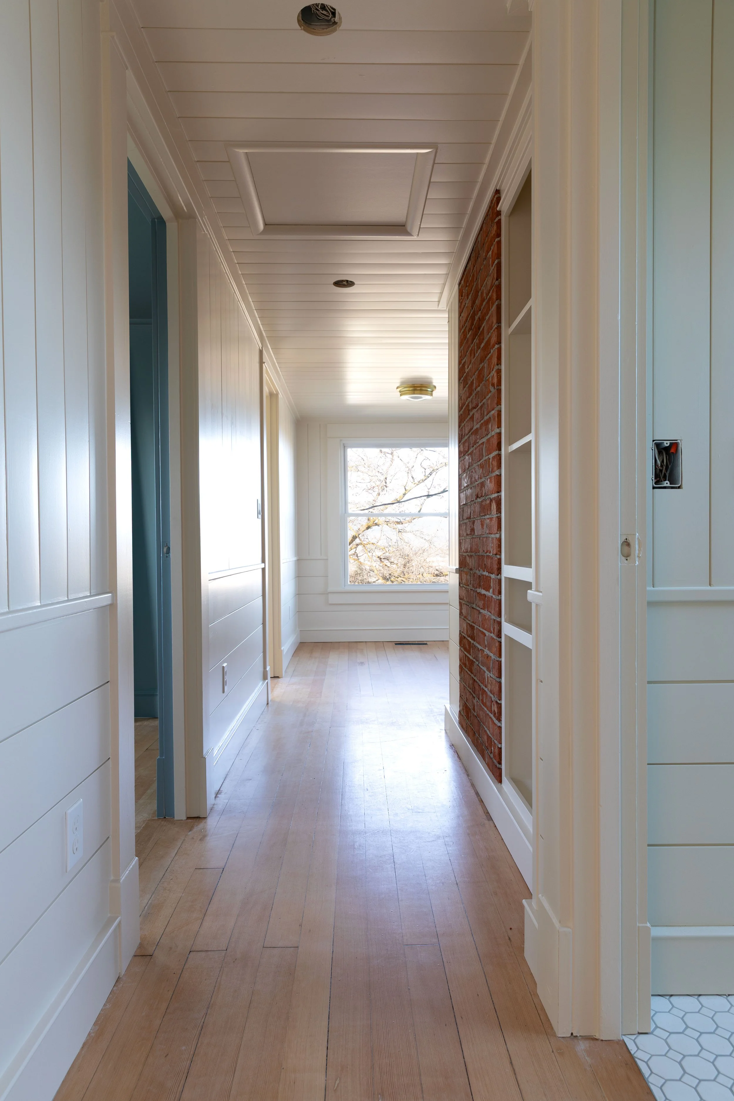
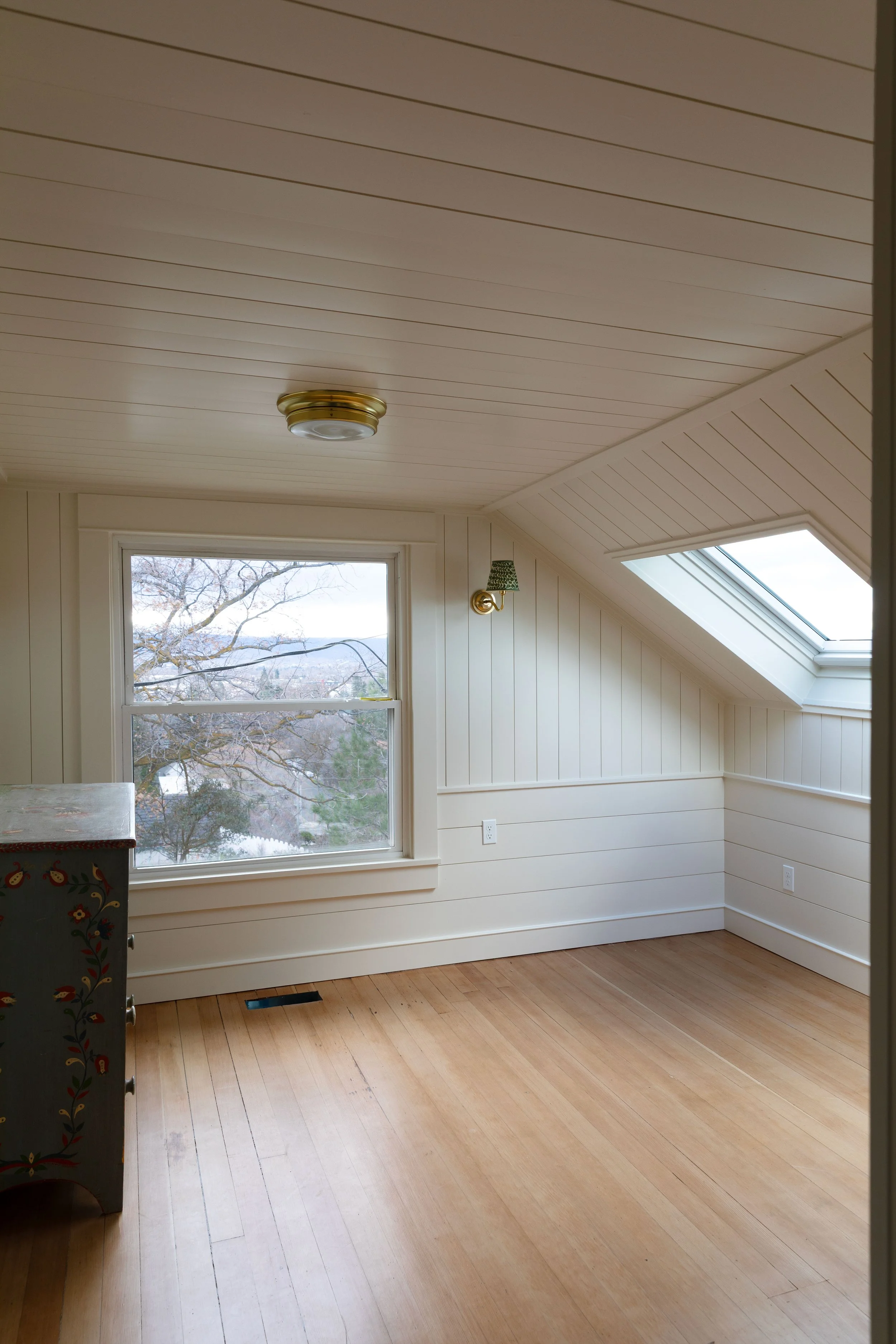
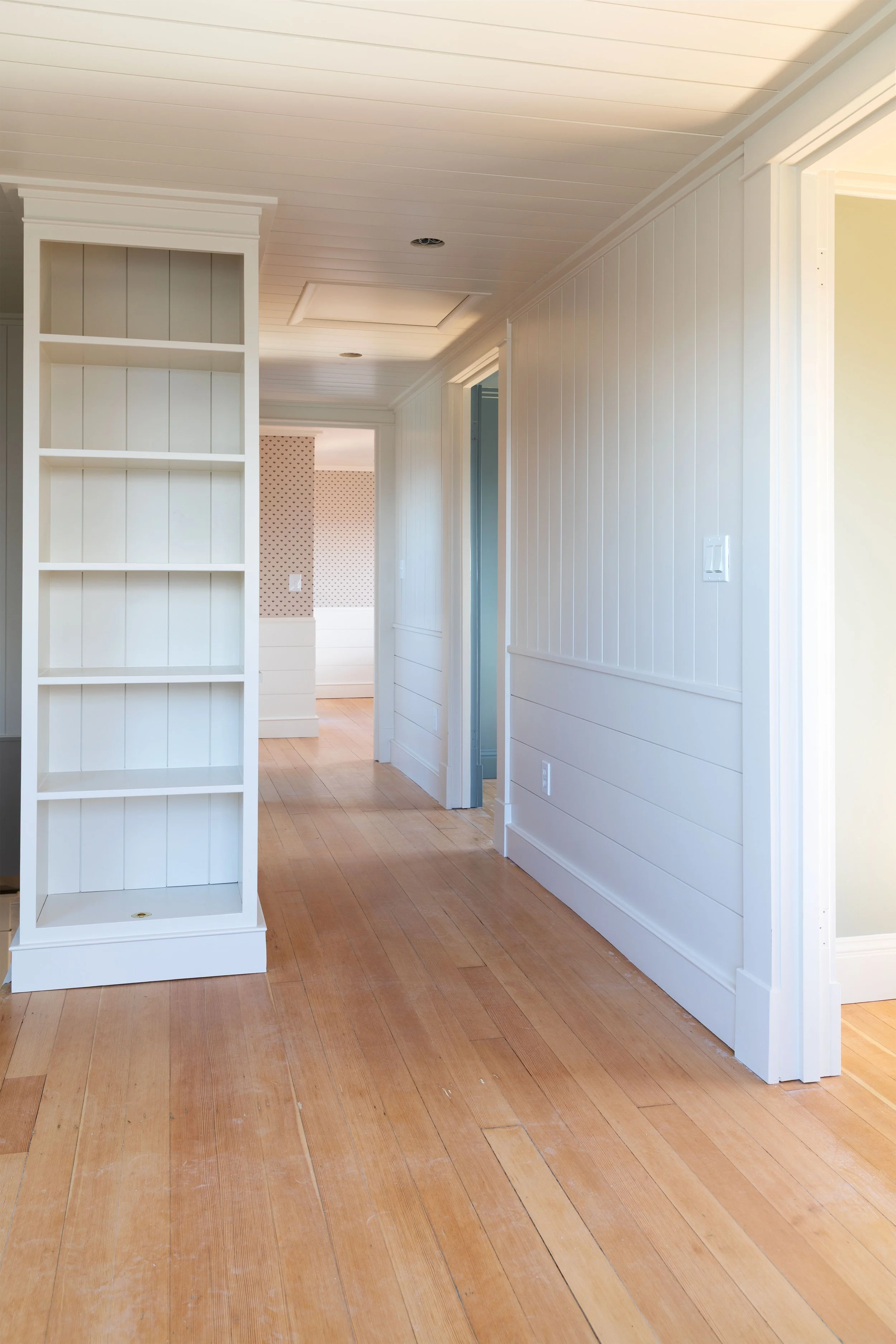
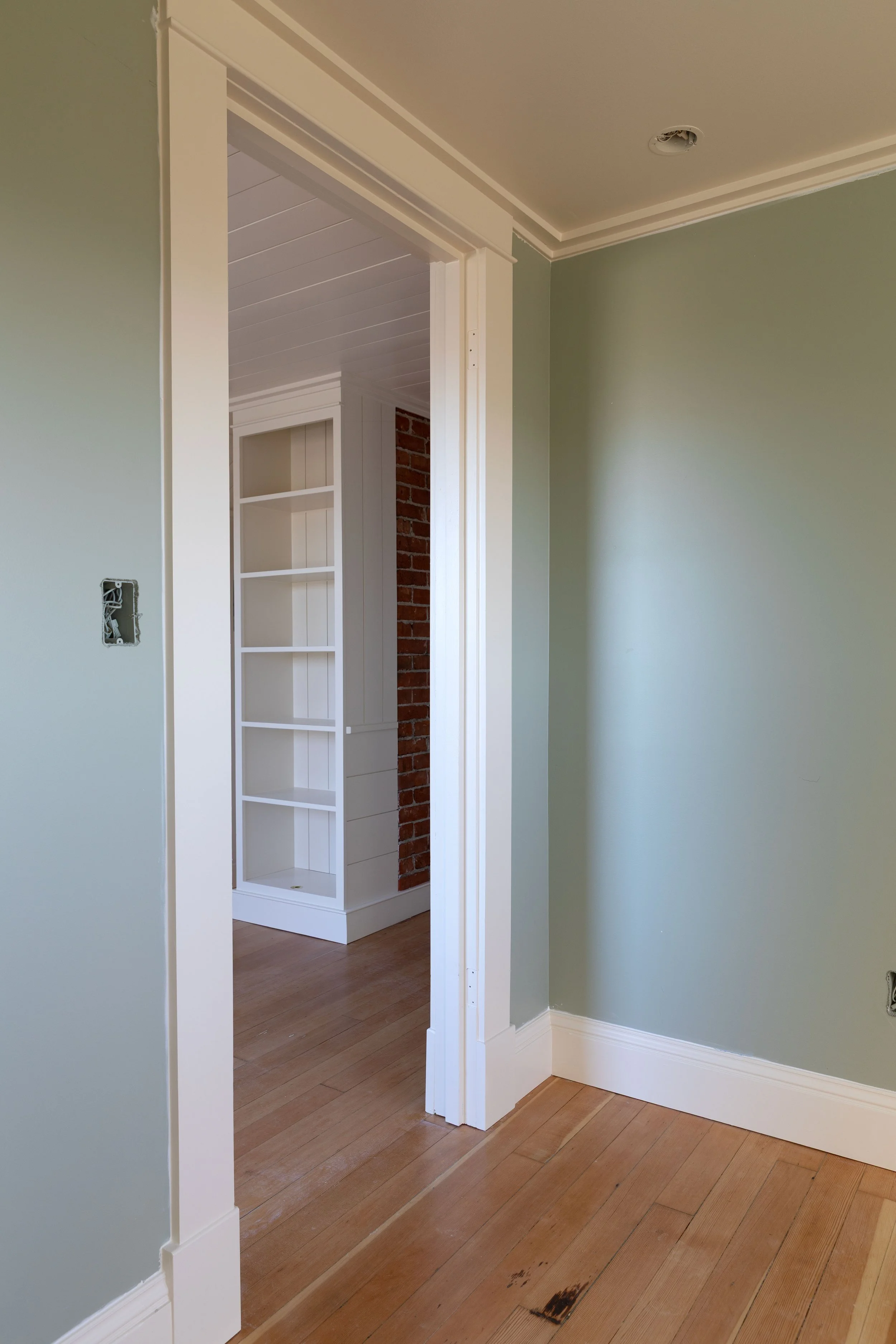
We used Slipper Satin upstairs at the Hill House in:
the hallway
the snug (our little landing space)
and the trim in Brooks’ room
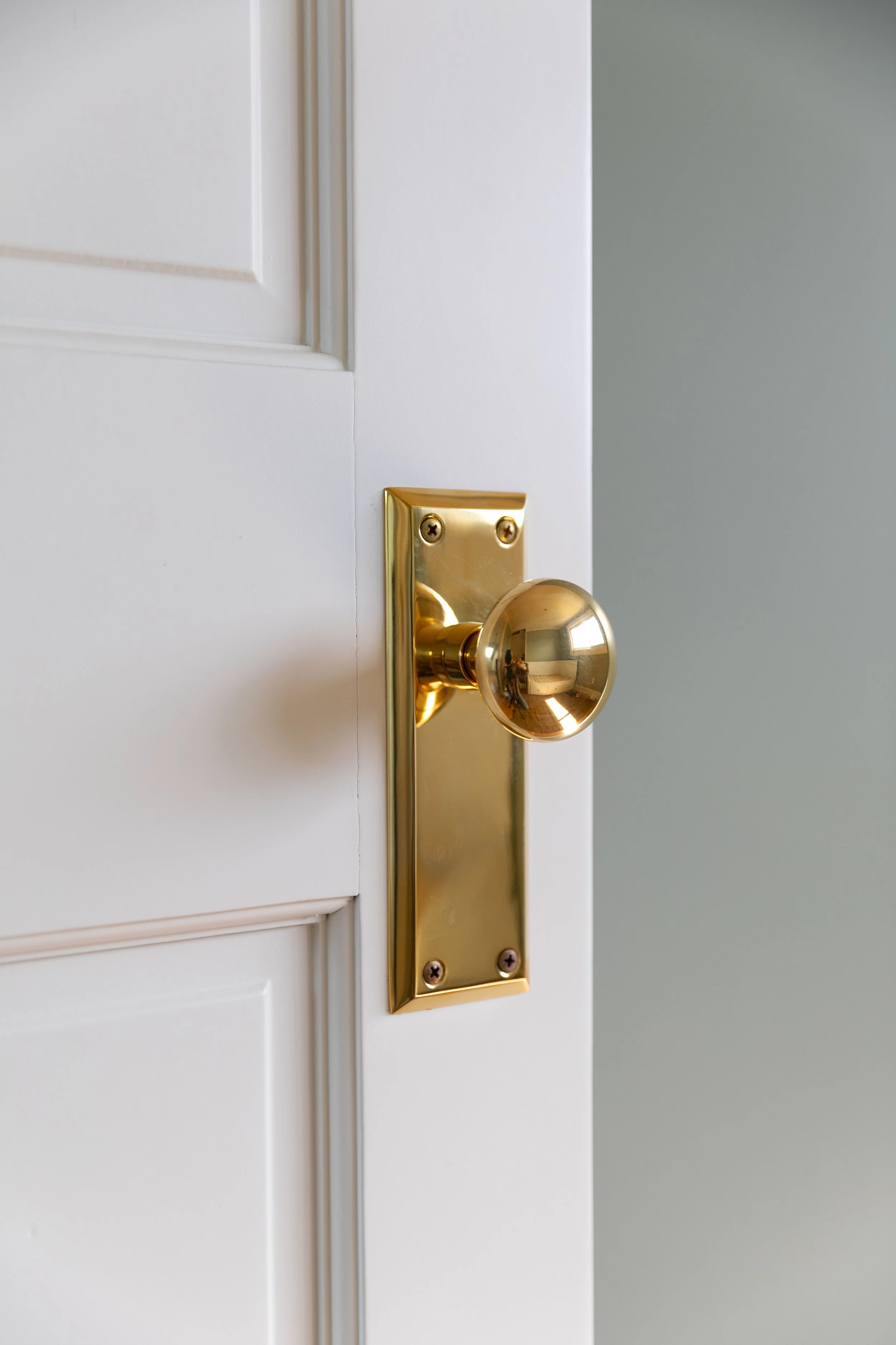
and the doors
It’s one of those colors that makes everything around it look better. It lets the paneling and finishes be the star in the snug, plays really nicely with our original fir floors, and softens (and supports) the FB Blue Gray in Brooks’ room. (It also sits beautifully next to the Off-White we used in the bathroom if you saw that post.)
About Color Matching
We had this Farrow & Ball color matched at our local Sherwin-Williams store. They have the formula on file, just ask at the counter (our manager said it should be available at all stores). We’ve done this with a number of Farrow & Ball colors since we don’t have ready access to their paints and have been really happy with how they turn out.
With color matching you can go about it two ways:
ask your local paint store if they have the competitor’s color formula on file (just ask “I’d like Farrow and Ball Slipper Satin” and they’ll look it up)
bring in the color card to your local paint store and have them use their magical machine to color match the competitor’s color
you can then ask for a similar color from their stock
or have them mix up the custom formula for you
But here’s the truth, color matching is not an exact science. Each brand of paint has their own colors, which they’ve designed to look how they look in that company’s unique paint products. Farrow & Ball, for instance, handcrafts their paint in Dorset with ingredients like minerals, pigments and resin so it's impossible to get the exact same look with paint made of different ingredients in the USA. BUT…we've found that color matching can usually get you pretty close. You can see how close SW got to FB Light Blue in our Poplar Cottage bedroom here.
This also means that no two paint companies will match a competitor’s color in the exact same way. We painted the kitchen cabinets at Poplar in FB Old White, matched by SW, and Kismet House painted their cabinets in the same color but matched by BM and they look quite different. So I had to do an experiment to see how close everyone matched Old White (you can see that here). Of course other things like lighting and products/sheens affect the end result, but it’s just something to keep in mind.
If you really want an exact color, make sure to plan ahead and buy from the original creator of the color either in person or online.
I always get some pushback when I talk about color matching F&B colors, but personally I think that if you like the matched color, then who cares if it’s exact? It’s still a great color :)
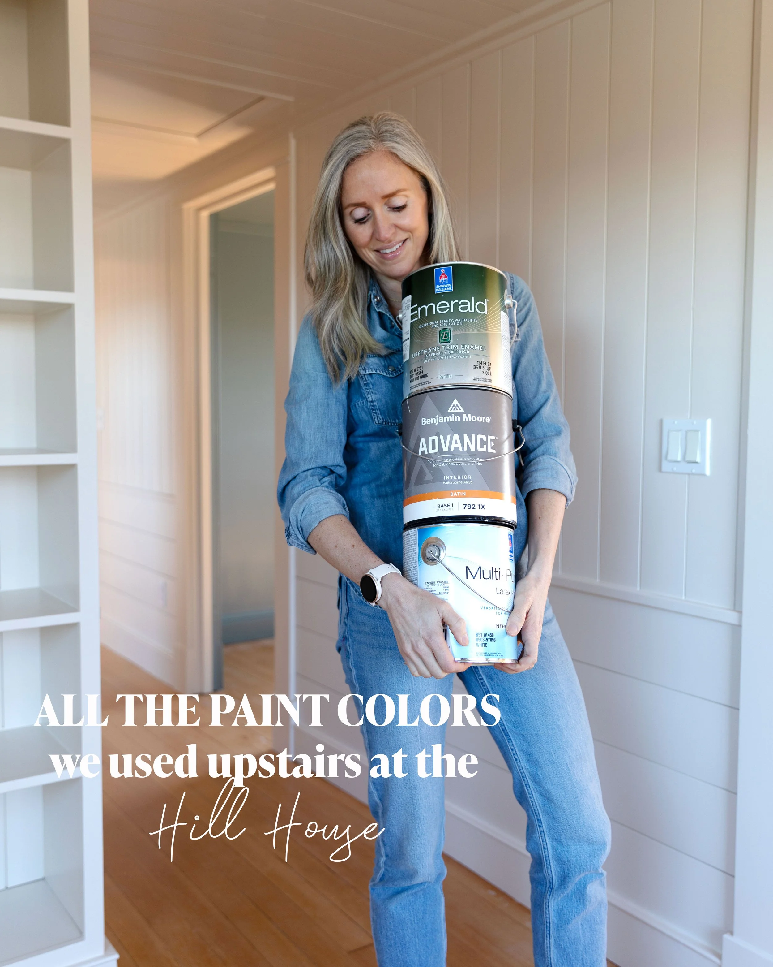
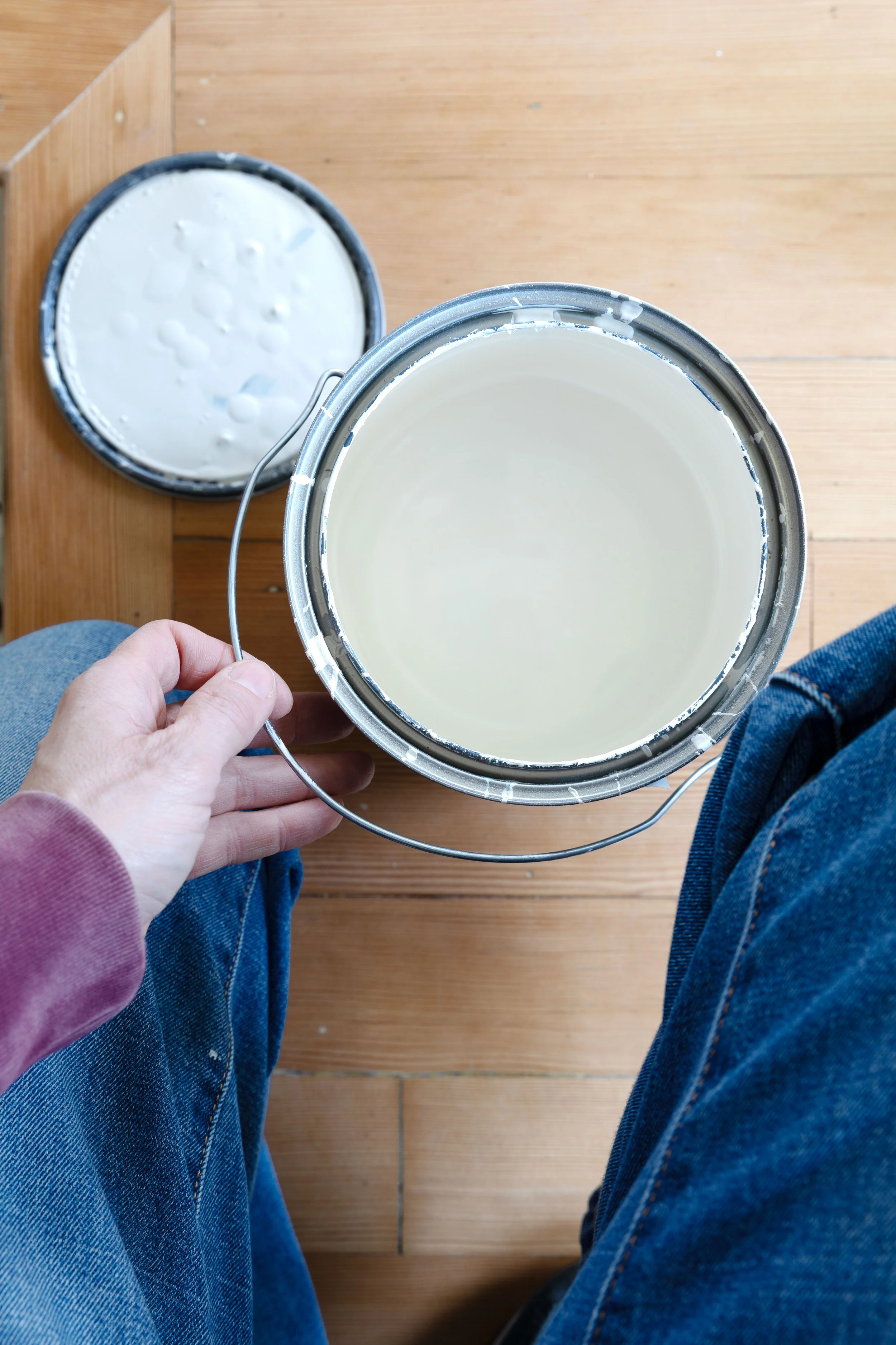
Sw’s Slipper Satin Formula
Yes, I took a photo of the SW lid with the formula because so many of you have asked. Technically Sherwin-Williams already has this one on file, but if it makes you more comfortable to bring this image to them, then great! And if you take it to Benjamin Moore or Behr I make no promises what you’ll get but I suspect it’ll still be pretty (see section above).
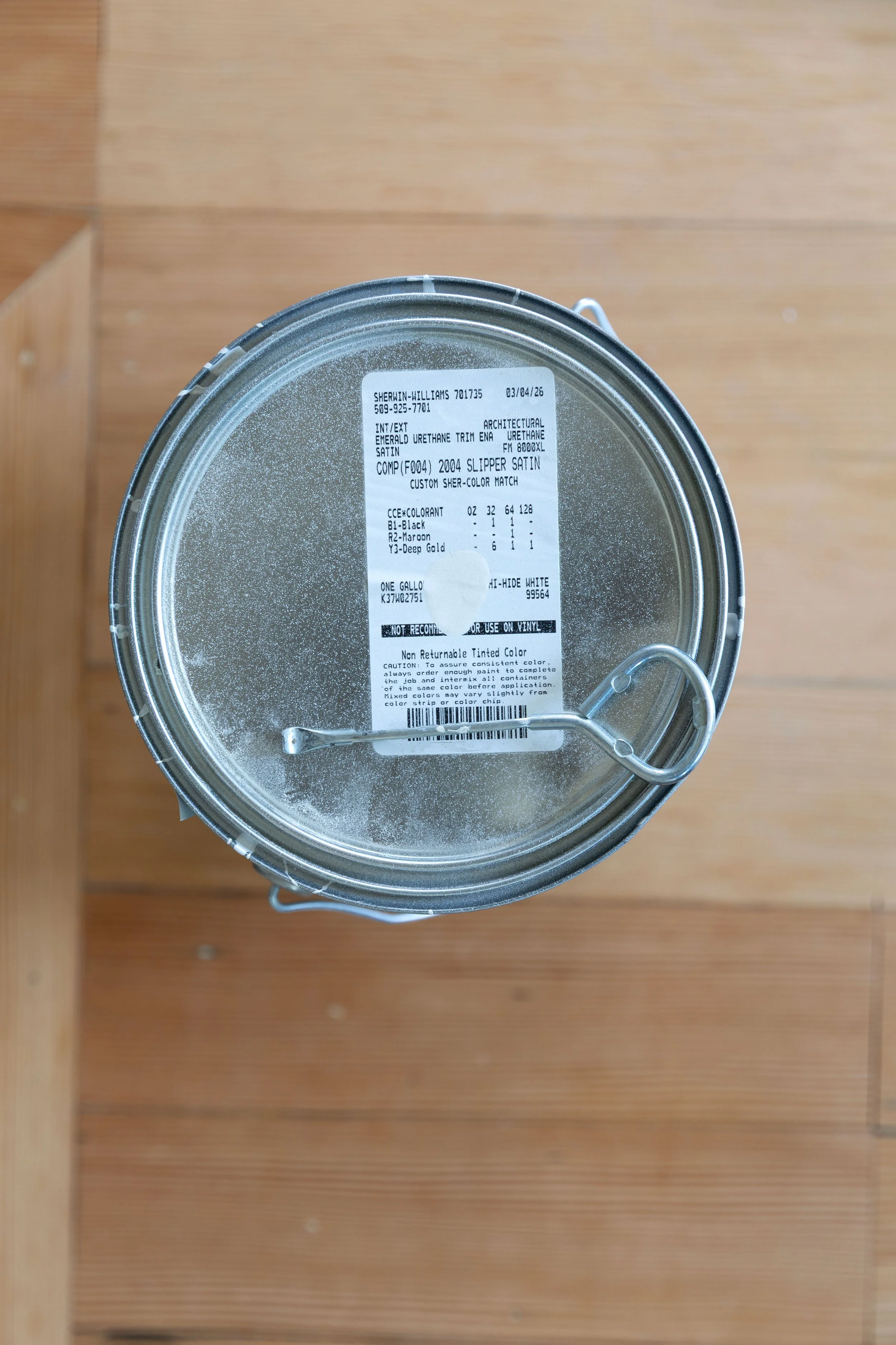
SW Formula of F&B Slipper Satin
What Paint to Use
Life’s too short to buy cheap paint. (I should get a bumper sticker with that ;) For the paneling at the Hill House we used Emerald Urethane Trim Enamel (interior/exterior) in Satin. It’s their nicest paint and 100% worth it.
Satin is the sheen I like best for basically everything (yes, including bathrooms and kitchens) with ceilings being the exception. Ceilings are best left flat. Walls can also be eggshell if that’s an option.
If we had shopped at Benjamin Moore for these same paneled walls, I would have sprung for their Advance paint. Anything less is simply not worth the time and effort your paint project will take, IMO.
Why Slipper Satin Works So Well in Old Homes
I have a theory on old houses and it goes like this: they crave depth. That means nuanced, welcoming colors, that are interesting (not necessarily flashy) are the ticket. And Farrow and Ball does that so well. I have honestly never disliked one of their colors and the limited selection they offer really helps narrow it down. Slipper satin is so dang lovely and it pairs well with all the old house things: chunky molding, refinished hardwoods, brass, natural light. It softens everything just enough without feeling dull. It will also look great with most other colors.
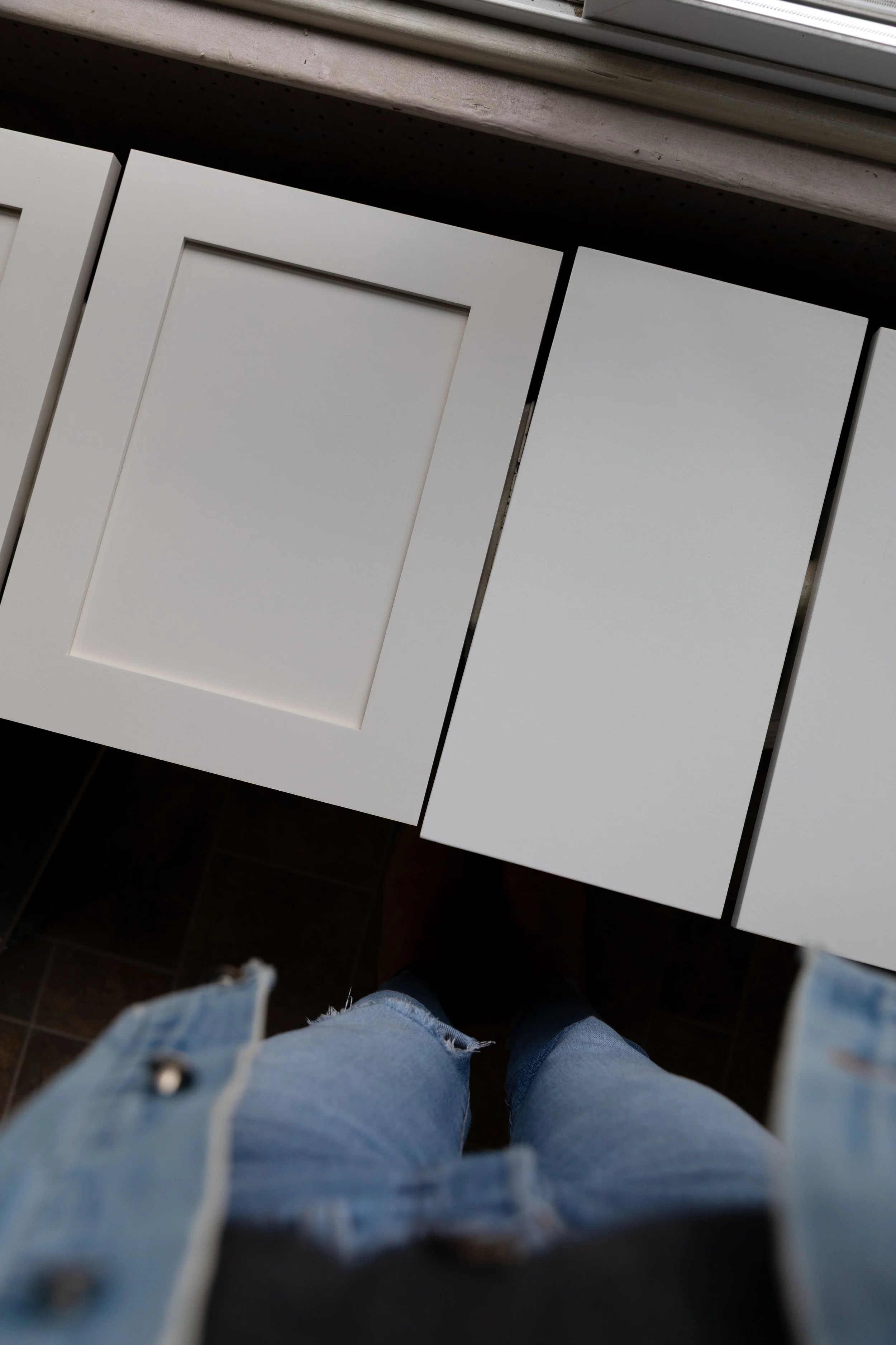
FB Slipper Satin on the left (matched by SW), BMSwiss Coffee on the right
Final Thoughts
Picking a white paint color sounds simple, but it rarely is. Slipper Satin has been a standout for us and a great spot to start if you’re looking for a new white! It’s warm, soft, and easy to live with. Slightly creamy but not yellow. White but not white white. Exactly what this old house needed!
xx
ps we may receive a small affiliate commission if you purchase something through our links, at no cost to you. Thank you for supporting the Grit and Polish!