
How We Made Simple Bathroom Tile Feel Special in the Ensuite Bathroom
THE HILL HOUSE
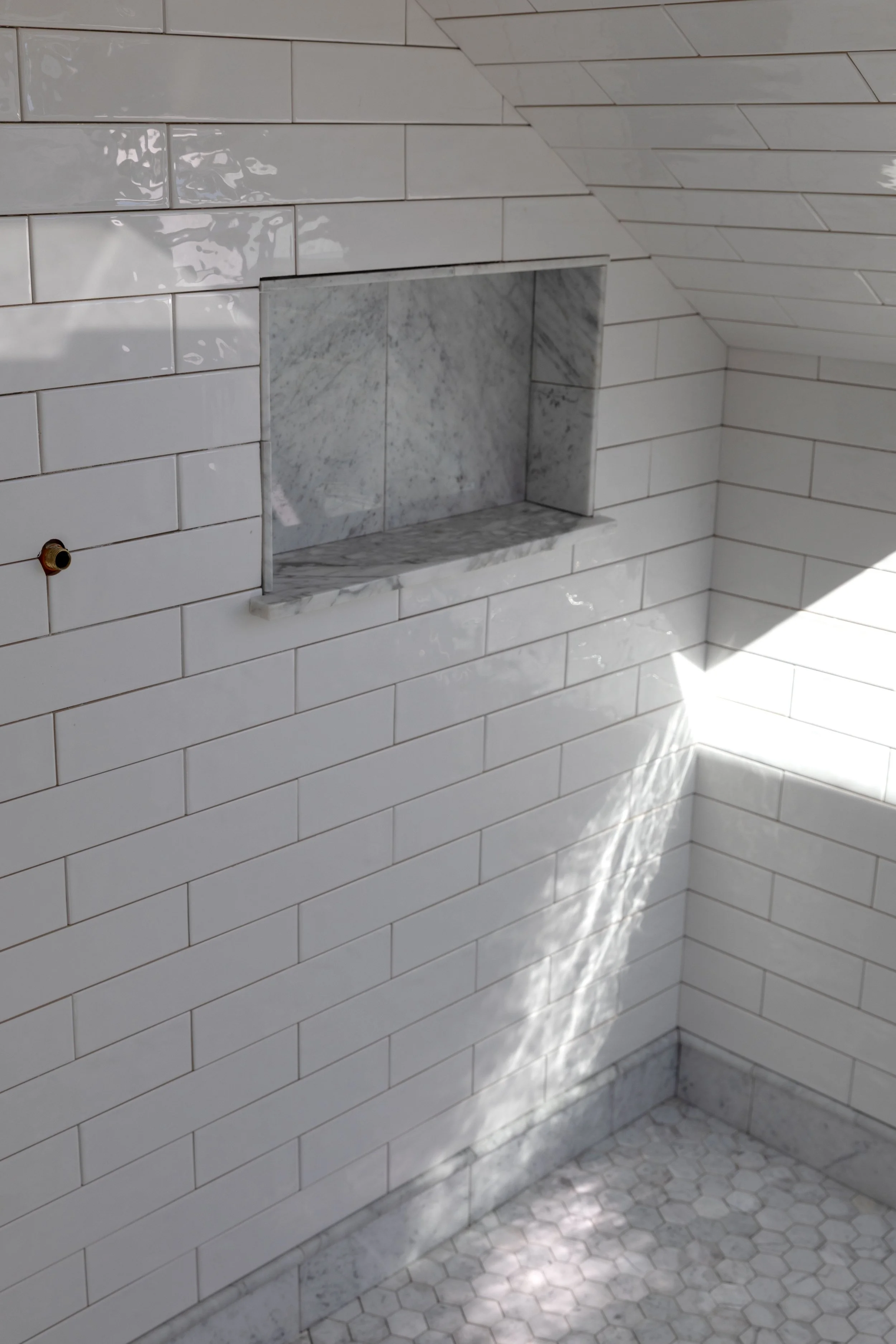
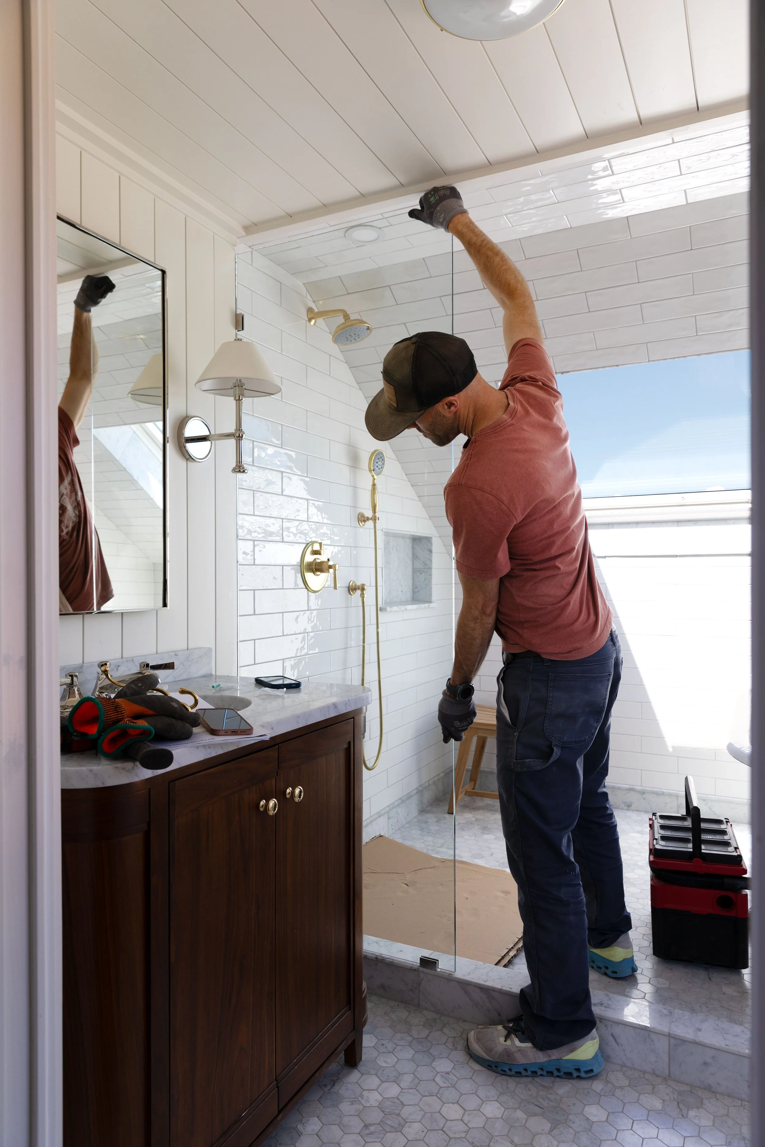
One of my favorite things about the tile in our Hill House ensuite bathroom is that it’s simple - white subway walls, honed marble hex floors, and a few thoughtful marble details. Nothing trendy or particularly flashy, but together they make this brand new bathroom feel a little old, a lot classic, and a bit luxurious, too. Today I’m sharing the exact tile we used, how we designed it for family flexibility, why simple tile is my jam, and all the details we used to elevate this simple tile. Let’s get into it…
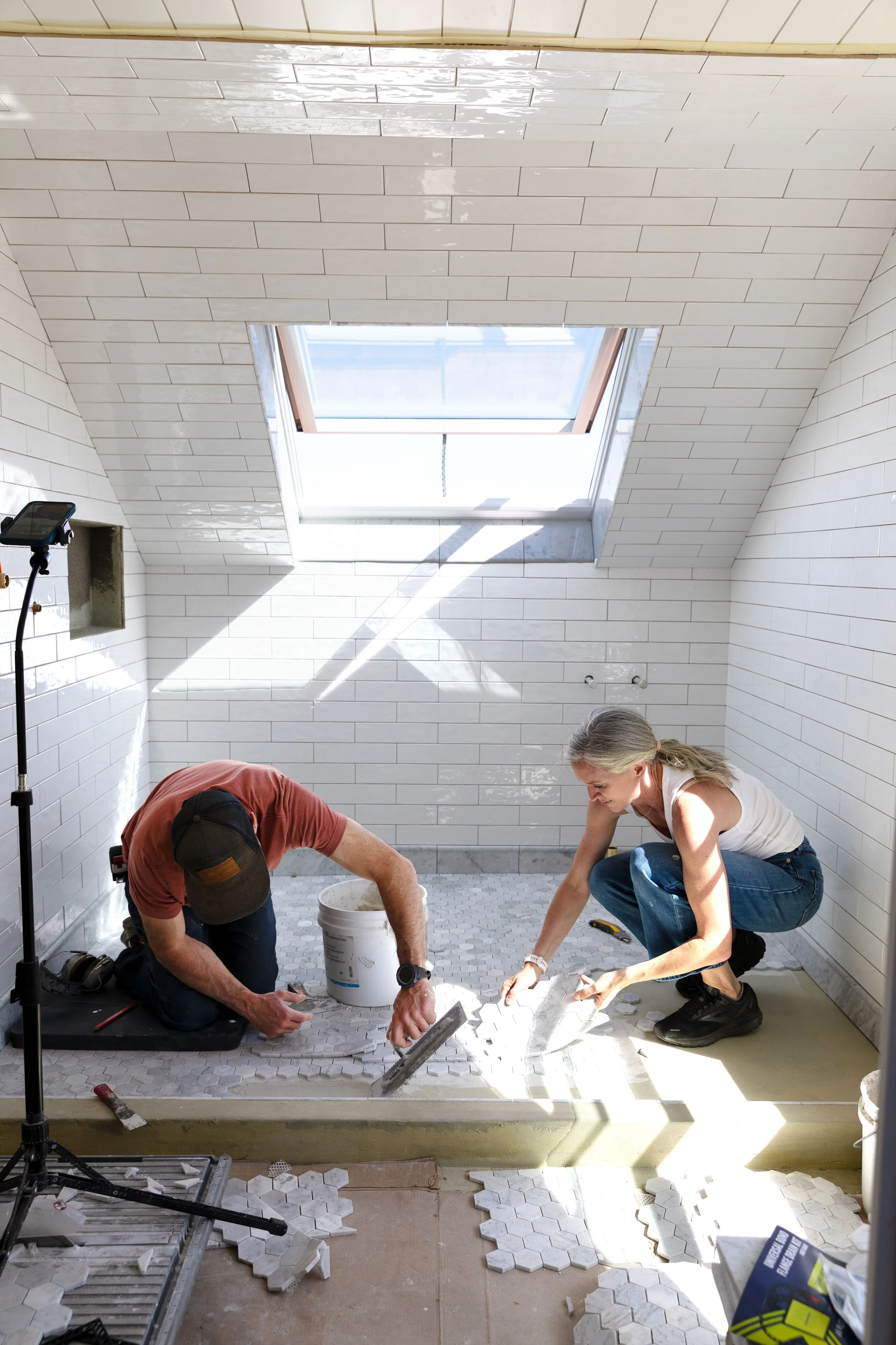
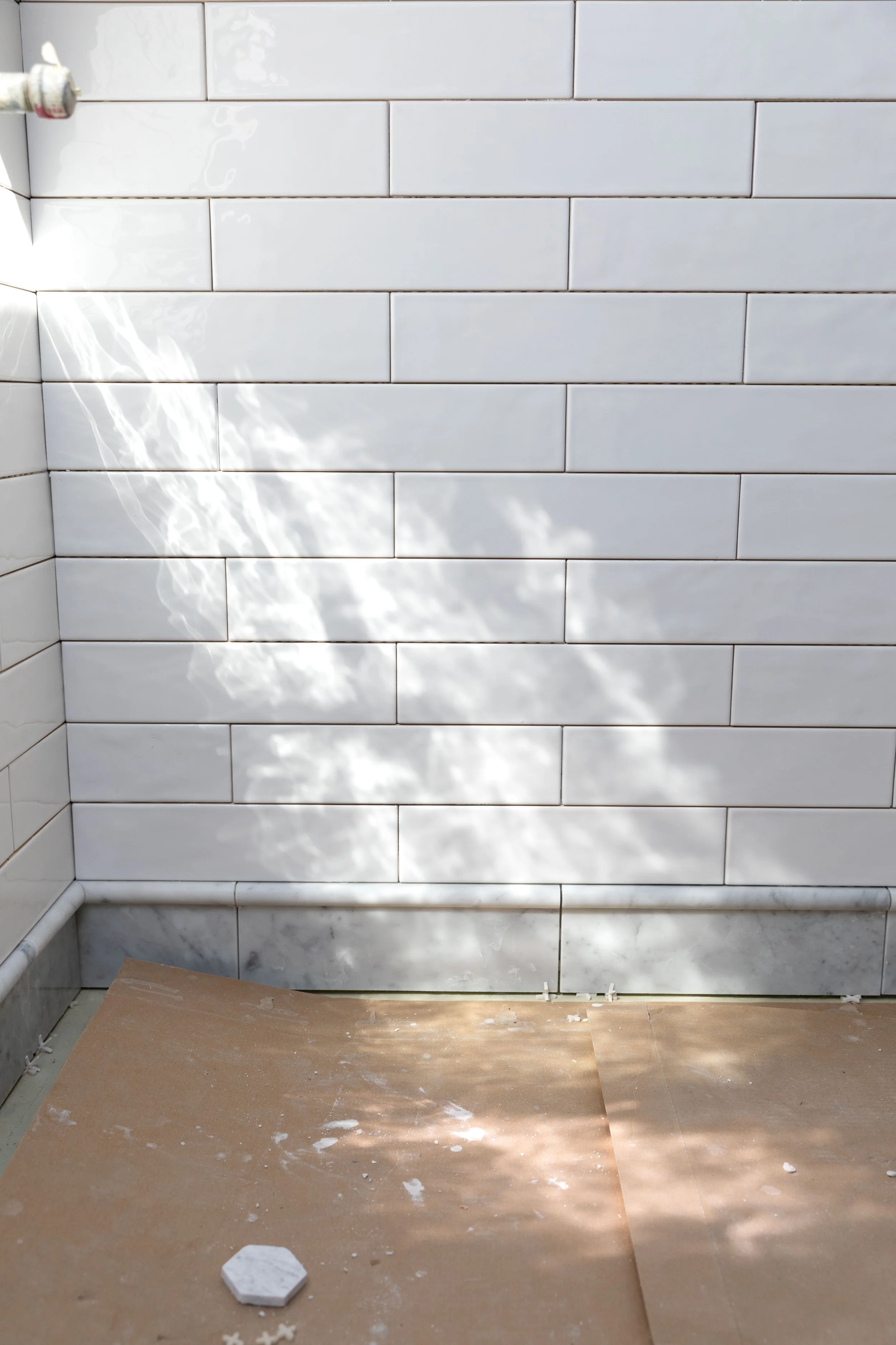
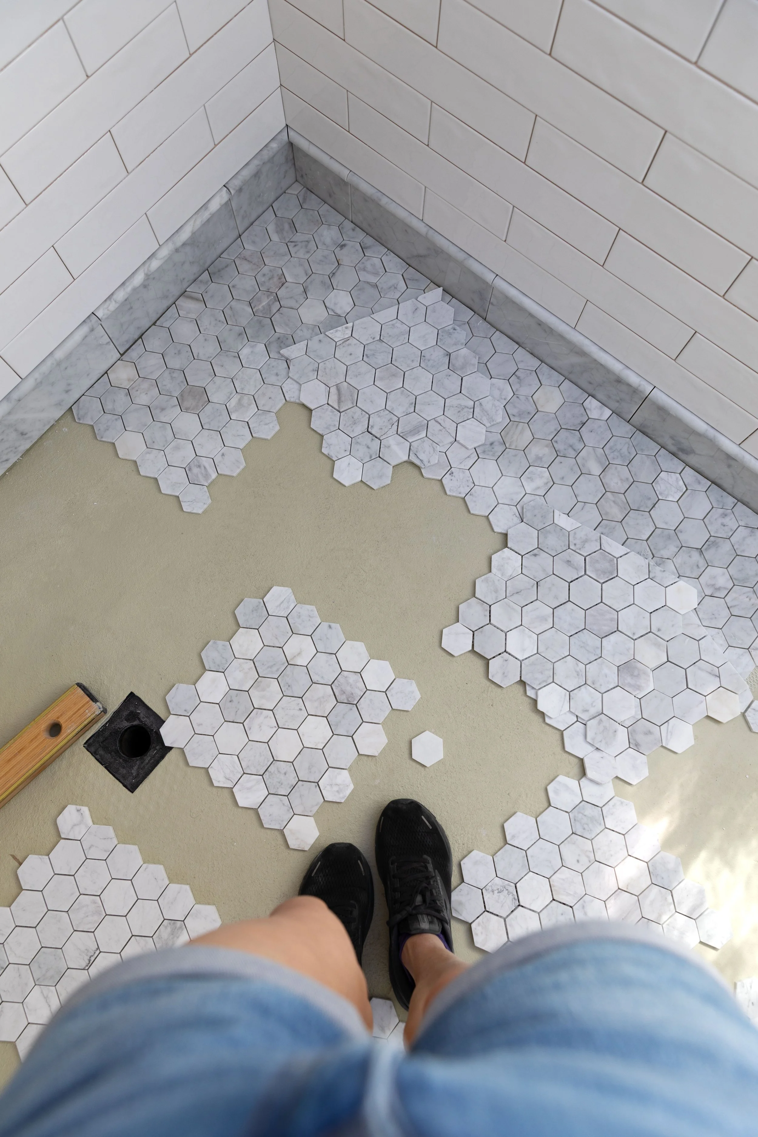
skylight, other sources below
Truth be told, I considered Delft-inspired tile for this bathroom and looked at bolder options, but ultimately this room is small-ish (7’ x 10’) and already has a lot going on - unusual geometry, sloped ceilings, a skylight, a large window, and a generous wet room tucked under the eaves. Simple felt right. Plus I love that the glossy white wall tile reflects light around this short-ceilinged, north-facing space making it feel more spacious and bright than it deserves.
Plus a classic was important to me. We don’t want someone walking in here 10 years from now and knowing immediately the year we constructed it. I care less about whether a material feels current and more about whether it feels classic and right for the house.
The bathroom tile we used
All of the tile we used came from Home Depot, mostly from DalTile, which makes this an accessible combination. We gave it a custom feel by adding some well-placed marble details. Here are all the tiles we used in this bathroom…
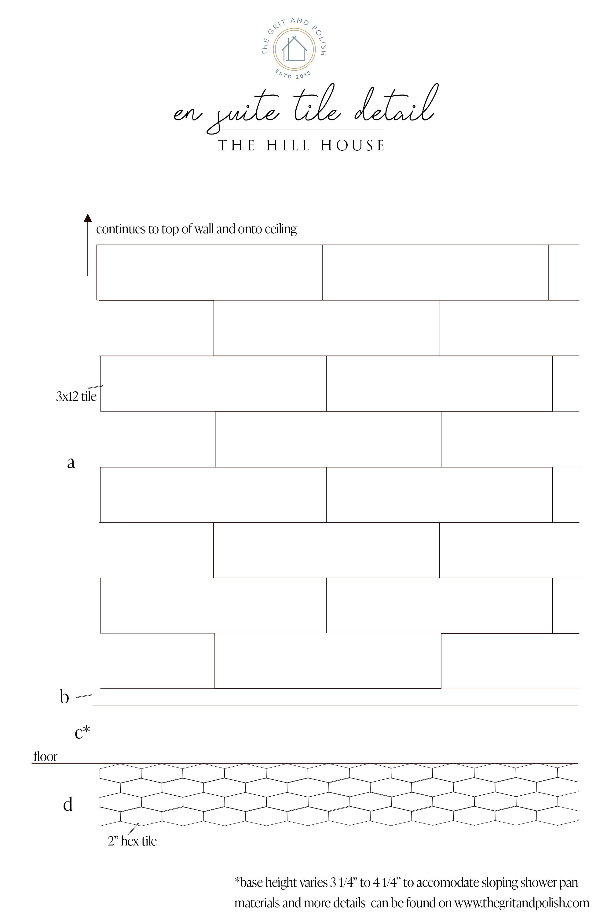
a Wall and ceiling tile in 3x12, white, $3.99/sf
b Marble pencil tile in honed Carrara, $9.97/lf
c Marble base in 12x12 Carrara, cut to size and taken to floor, also used on threshold and shower niche, $12.95/sf
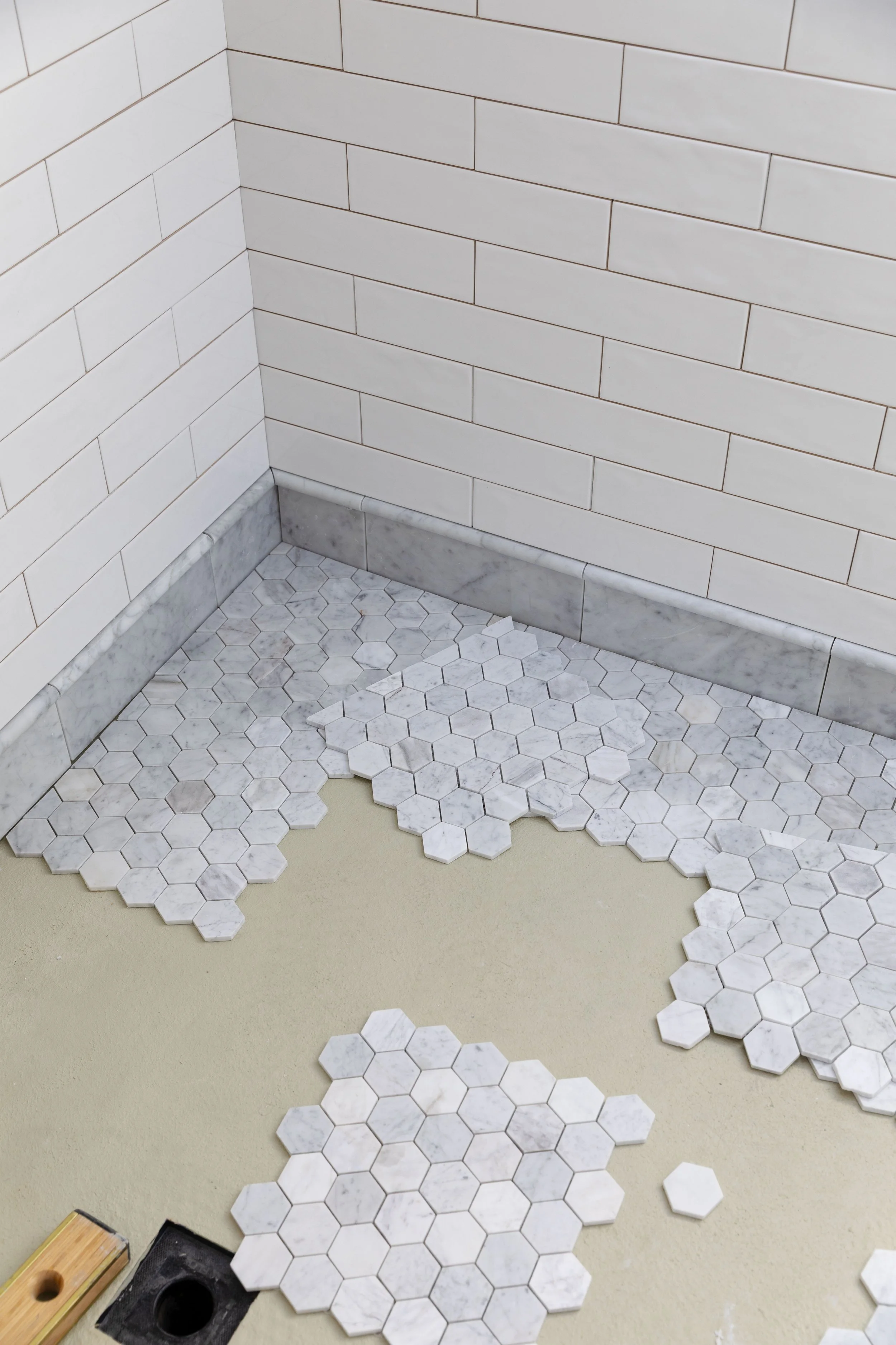
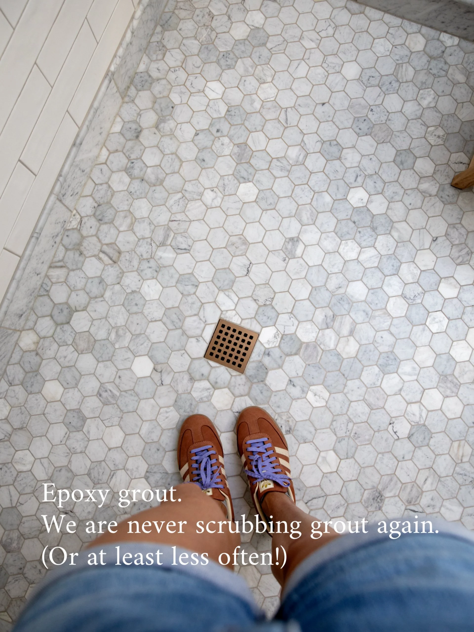
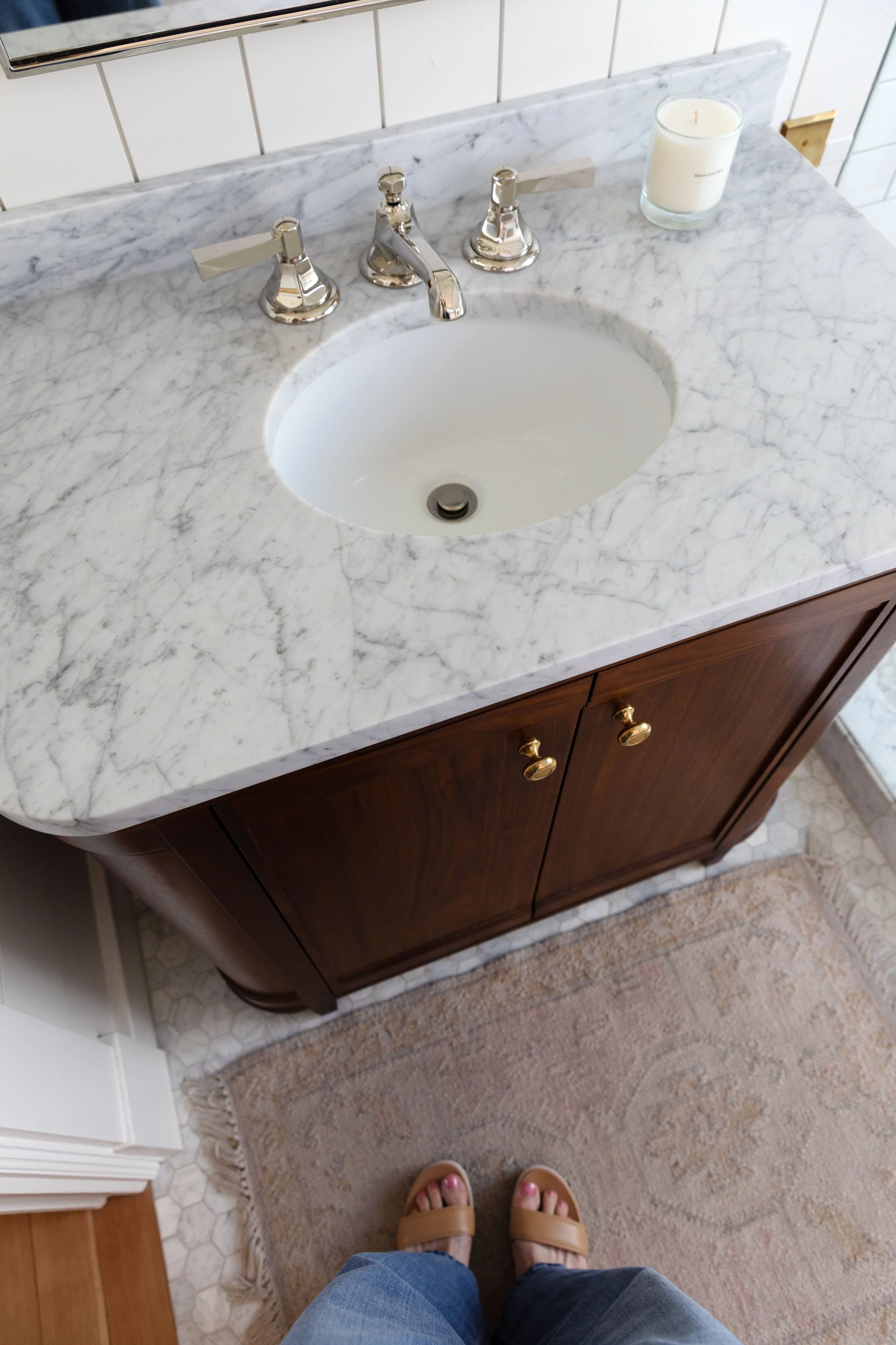
d Marble hexagon floor tile in honed mist and laid up to base (installed after the walls) $13.99/sf
I love this combo! I should also mention that Daltile is one of our long-time partners and while they didn’t sponsor this project, they did kindly gift the wall and floor tile when we mentioned we’d be using it.
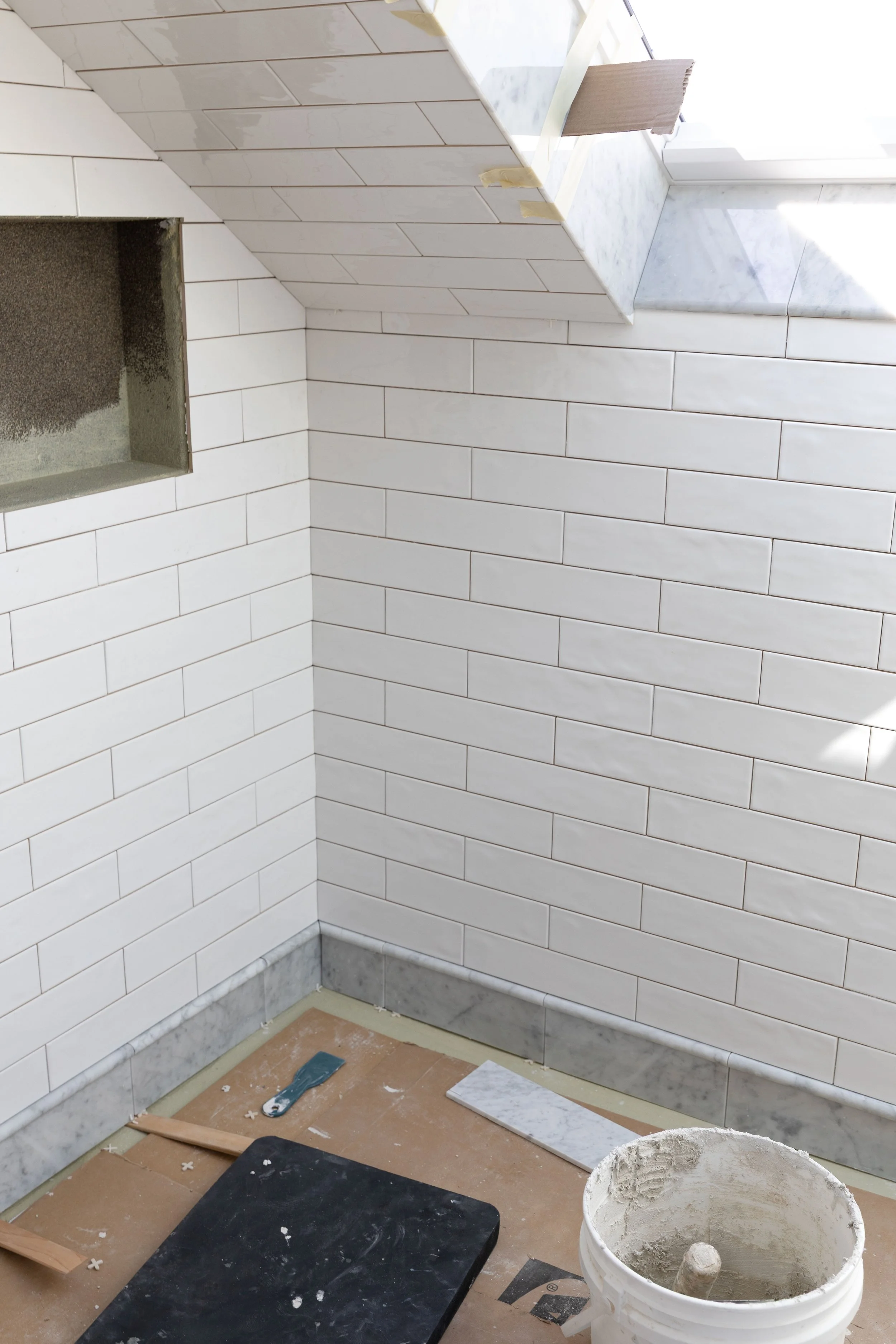
Before nailing down the exact layout, we tried some mockups for the base. We considered a few options (shown below) but ended up using some 12x12 marble tiles we had on hand and cut them down to 3 1/4”-4 1/4” height (due to the sloping shower pan) and paired them with a rounded pencil detail over top. The combo references the trim profile we have at the bottom of the paneling upstairs and you know how I love repetition in design.
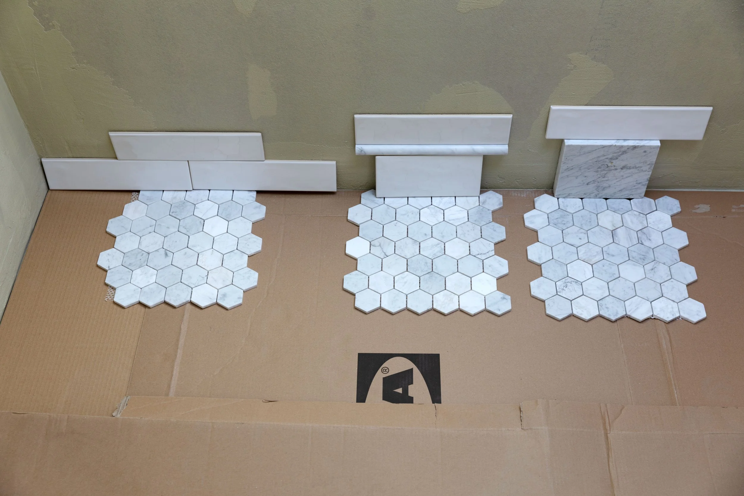
In the end, I love where we ended up. And can I just say, that every bit of time spent planning and mocking things up was worth it. Every single time!
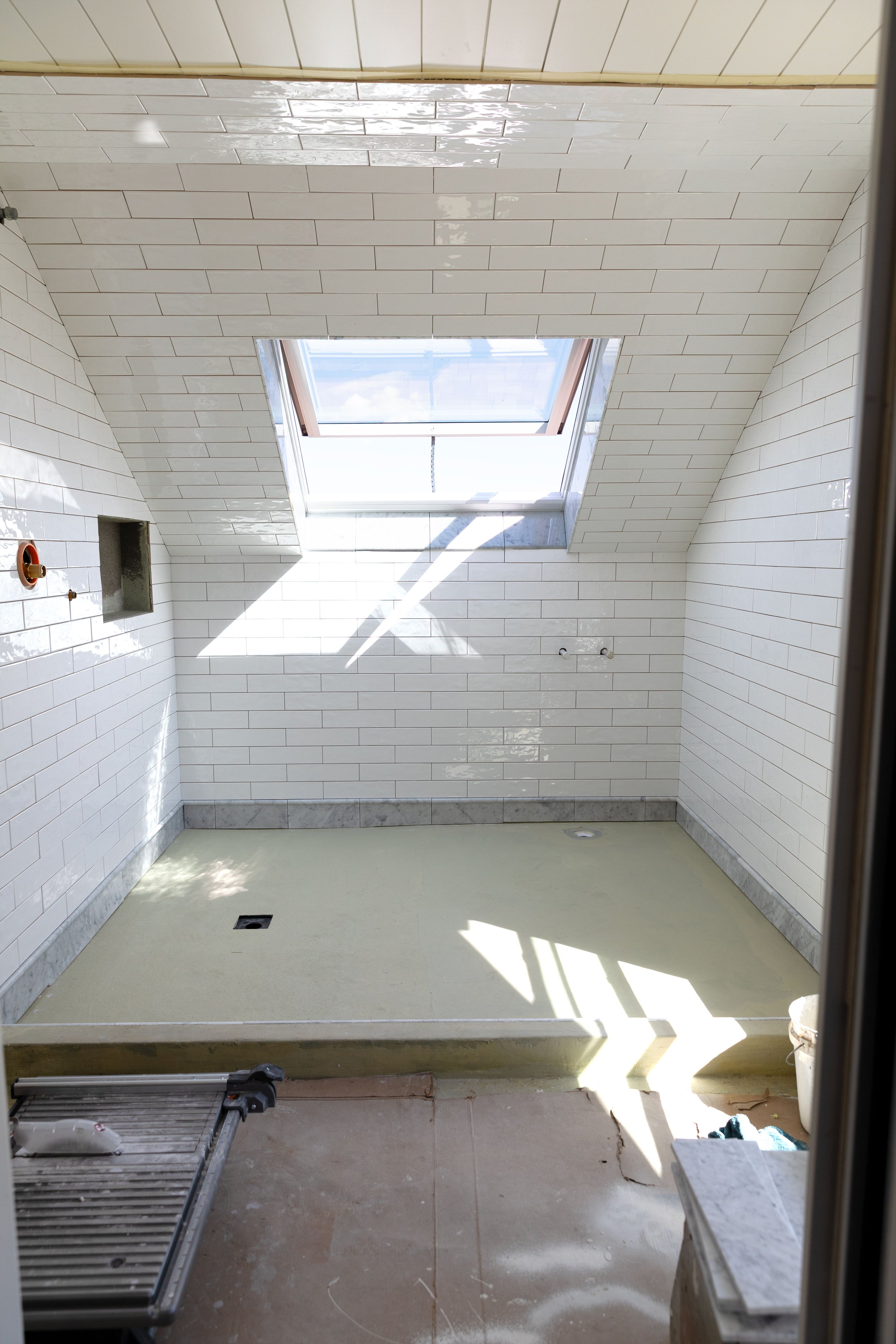
How to make inexpensive bathroom tile look custom
Looking at this room, a few design choices made the biggest difference.
Choose permanent materials for longevity
Tile should be able to outlast changes in paint, hardware, lighting, textiles, and whoever happens to use the room next. I think “basic” tile gets a bad rap. But it can be so pretty and classic when used right. A simple tile used thoughtfully can feel far more elevated than a louder material trying to carry the entire room. And bonus, basic usually comes with a reasonable price tag.
Think about scale
We varied the scale in here - the longer subway tile keeps the walls calm, while the smaller marble hex gives the floor texture and an older-house feeling. Bonus, this size of subway lays much faster than the classic 3x6 size.
Repeat a material from elsewhere in the house
I love repetition in a house! The white wall tile is the same 3-by-12 ceramic tile we used in blue in the Hill House hall bathroom, just in a different colorway. Rooms do not need to match, but repeating a tile shape, finish, color family, or material helps a home feel pulled together and, in my opinion, more elevated.
Mix finishes instead of adding more patterns
You don’t need patterned tile to make a space interesting. Glossy ceramic and honed marble create depth in here while keeping the palette quiet. It’s like a great pair of Levis with a white shirt - you just can’t go wrong.
Concentrate the splurge
Rather than using expensive tile everywhere, we saved the marble craftsmanship for the floor, base, threshold, and niche. The majority of the tile was just $4/sf (the white subway tile). Overall, this was a really reasonably priced tile job and we didn’t sacrifice on design.
Consider the grout lines
For a geometric tile like this, the grout lines really show up. Since the marble tile we used for the base came in the same length as our subway tile, we offset it to match the brick lay pattern we used. It’s a small detail but one you would notice if it’s wrong.
Let installation details do some of the design work
Thoughtful layouts, tidy cuts, finished edges, and well-planned transitions can make accessible tile feel far more custom. I’ll get into this more, but the niche, the base, and the beautiful curved tiles at the threshold elevate the space so much. I’ve said it before, and I’ll say it again, design is in the details. But…
Details matter… but don’t get bogged down in them
We ended up with polished 12x12 tiles for the base (I linked a honed option above) and we mixed them with honed floor and pencil tiles. I was pretty nervous about the two different finishes but Garrett assured me it wasn’t worth worrying over. He was right. You just don’t notice.
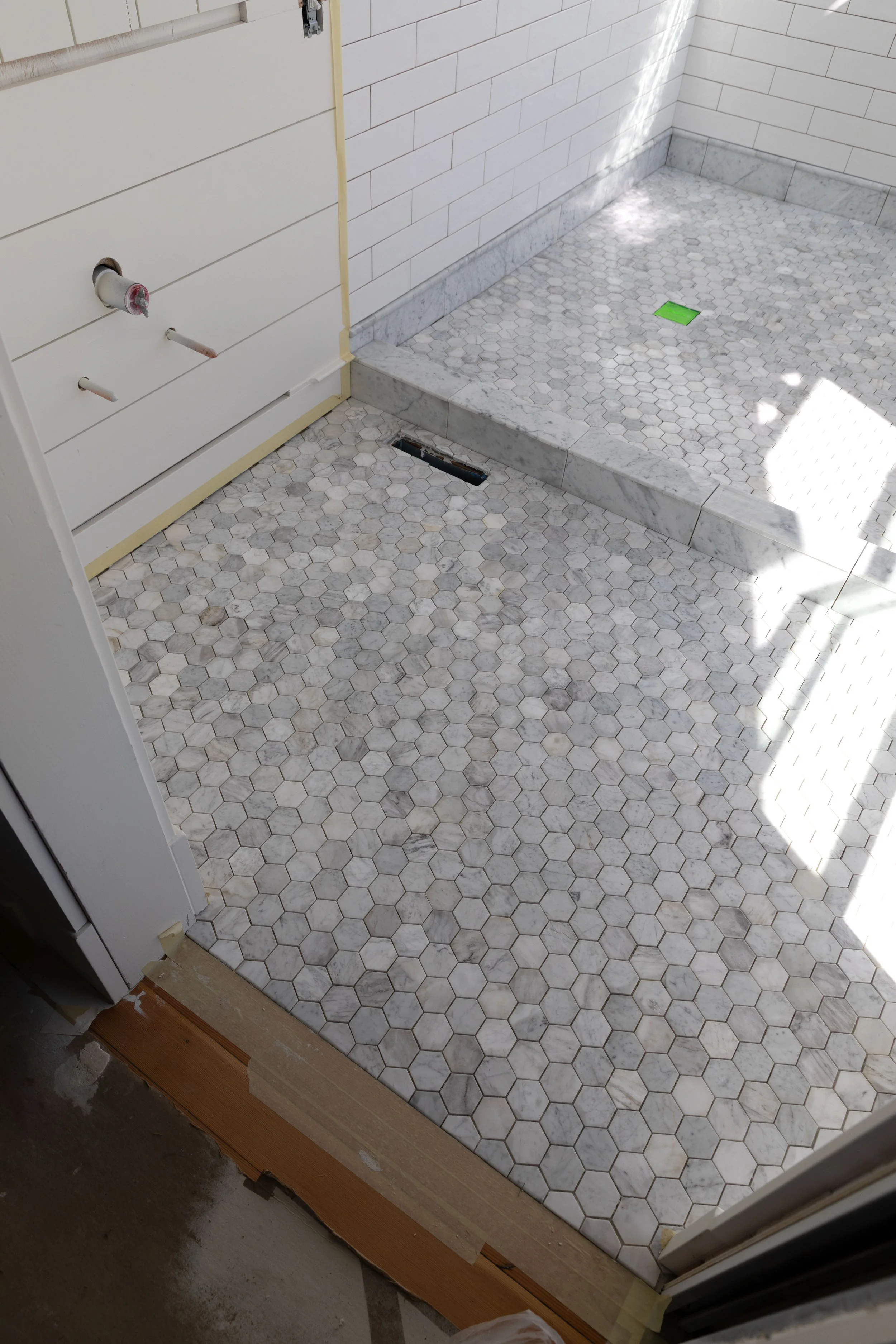
Install details
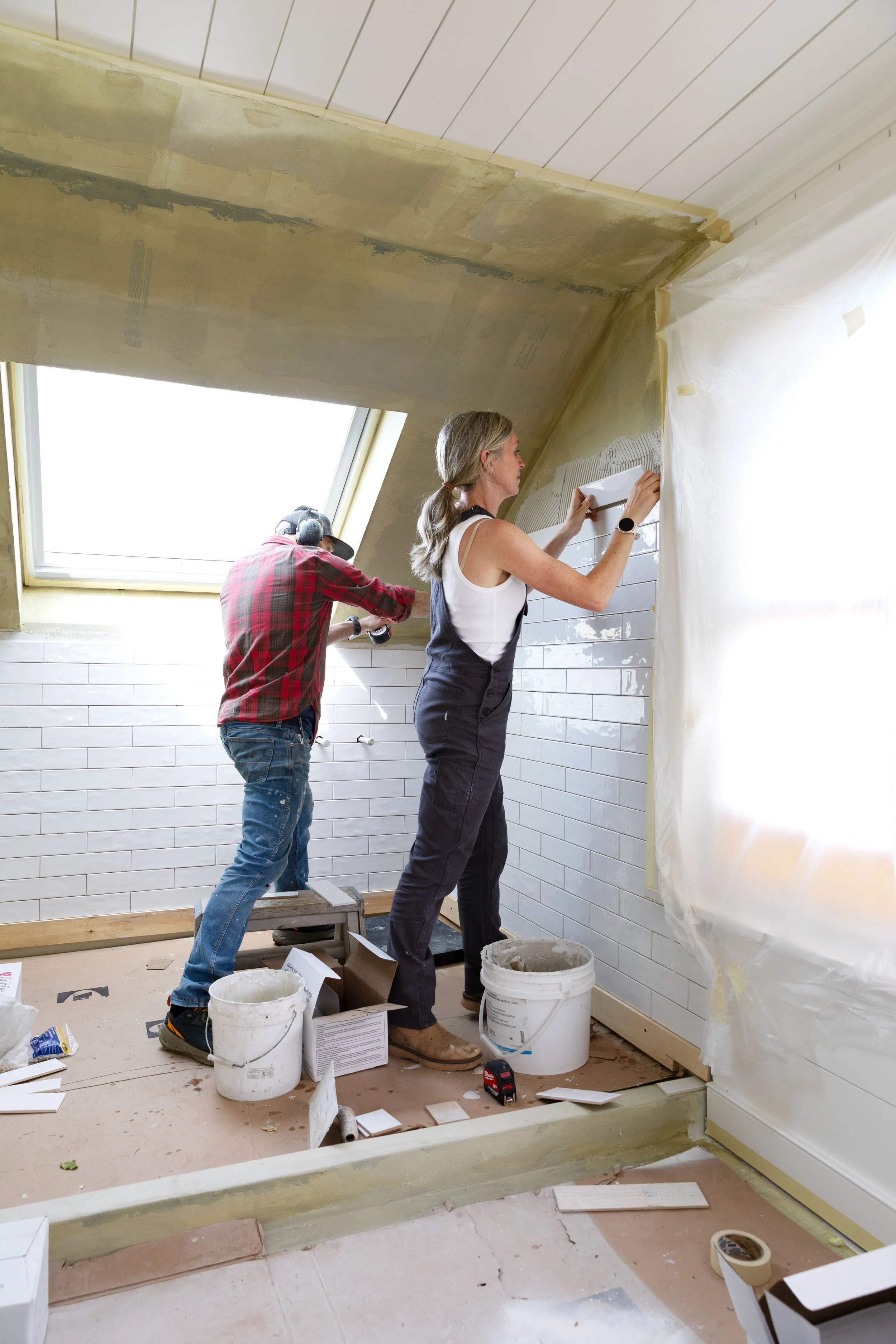
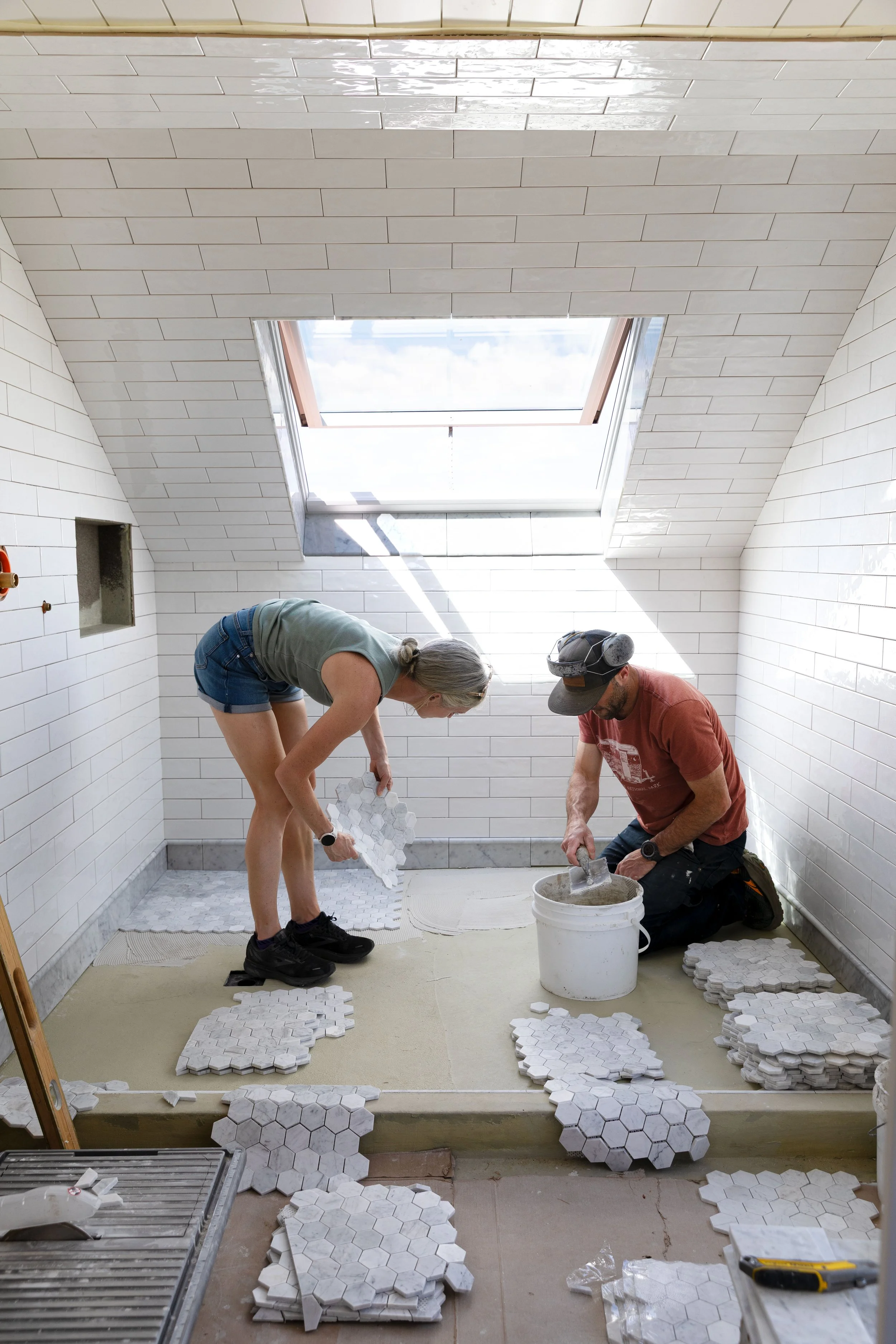
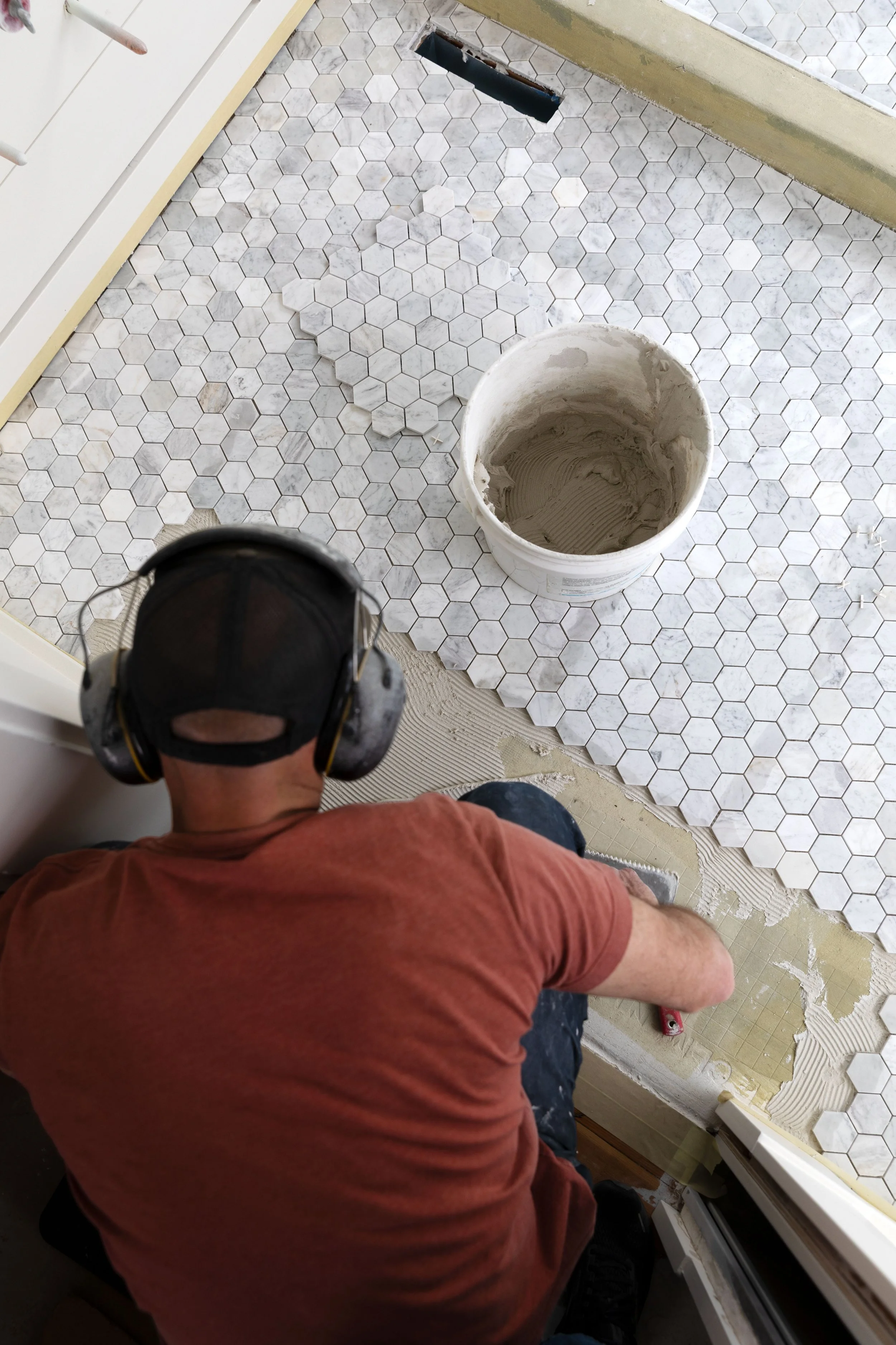
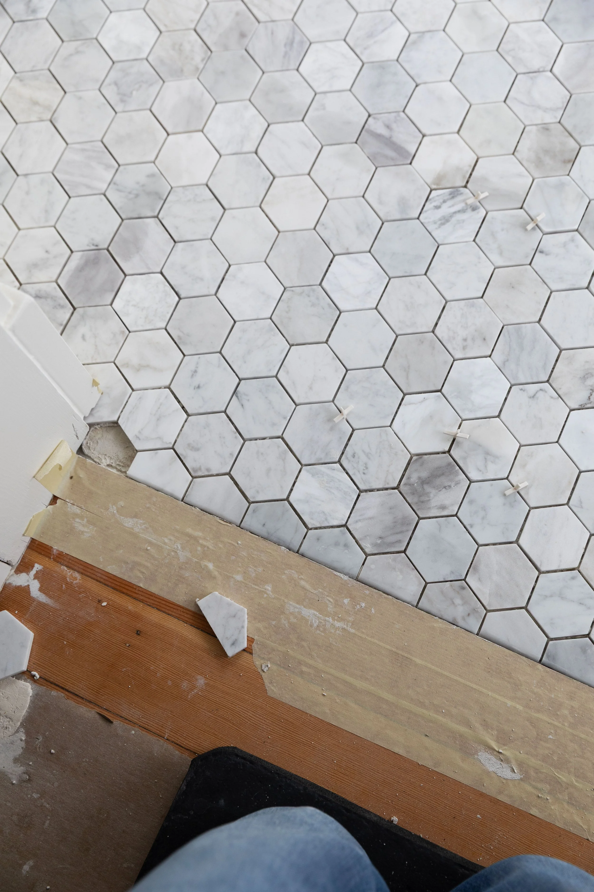
We have found that tiling a sloping shower pan is easiest when you start a little above the pan. We started this install by adding a perfectly-leveled ledger board at the height of the base and tiled upwards from there with subway tile. Then we came back and installed the base and pencil tiles, custom cutting each piece to account for the slope of the shower pan. Finally, we tiled the floor, butting it up to the base and leaving just enough space for a grout line.
A few other relevant products we used:
Waterproofing roll-on liquid membrane (we used ~ 2 1/2 gallons on walls and floors)
A few details that make the design a little extra special…
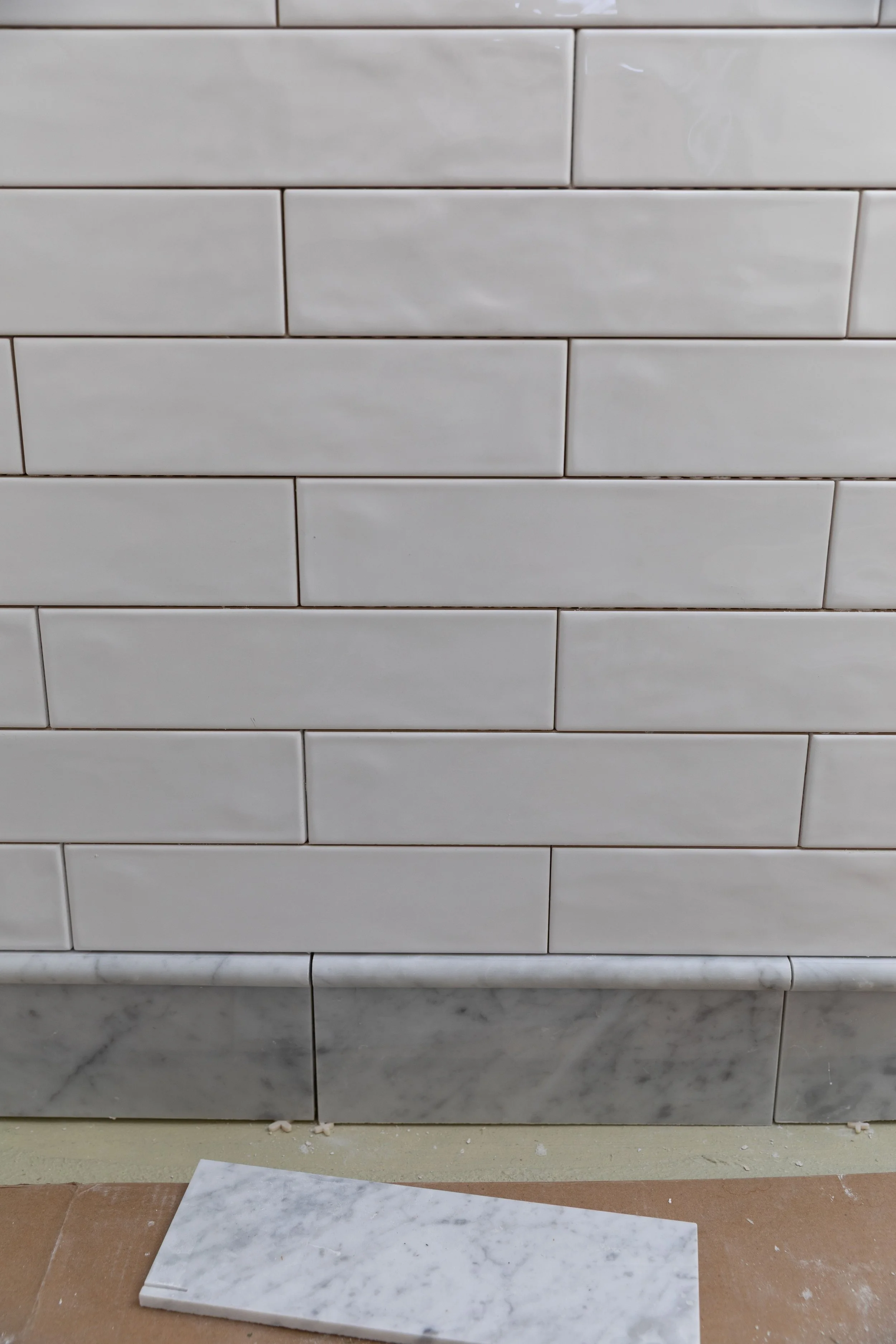
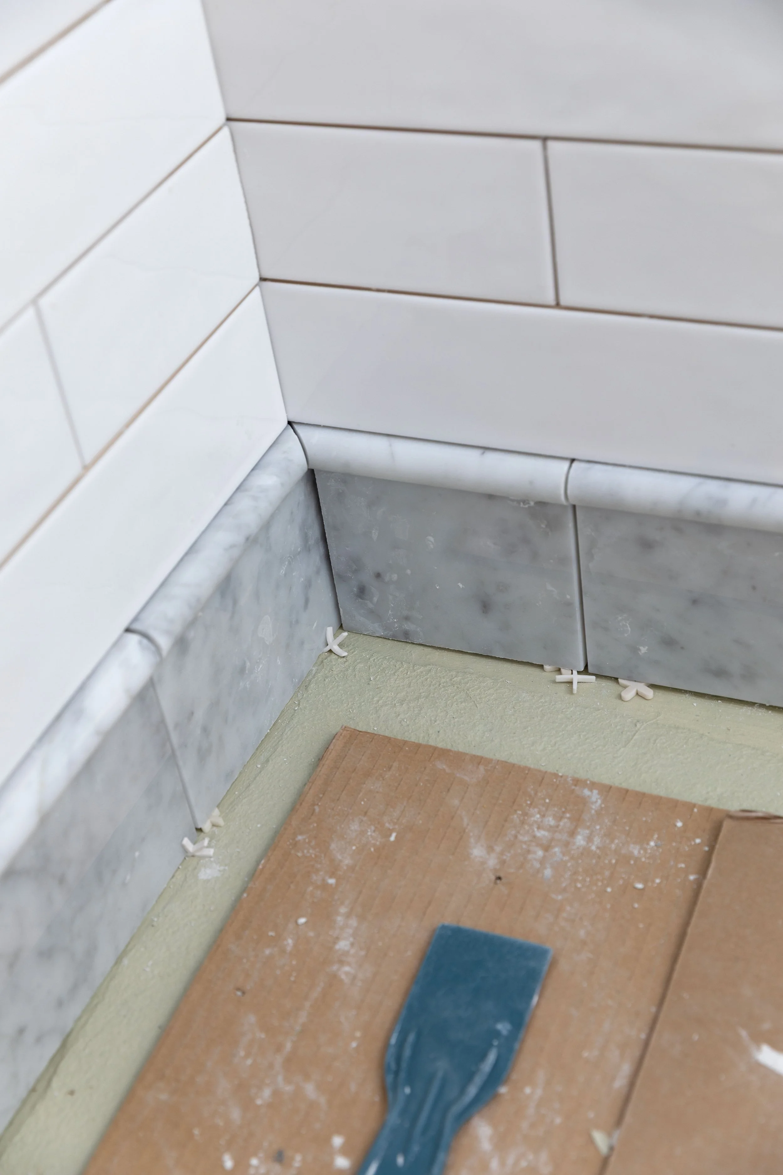
The marble base around the wet room
As much as I love the subway tile, the marble details are what make this bathroom feel especially thoughtful. The base is a combination of cut 12x12 tile and a curved pencil detail and it’s so pretty and elevates the tile work into something special. The base also references the moulding detail we have at the bottom of the walls throughout the upstairs, and you know how I love repetition.
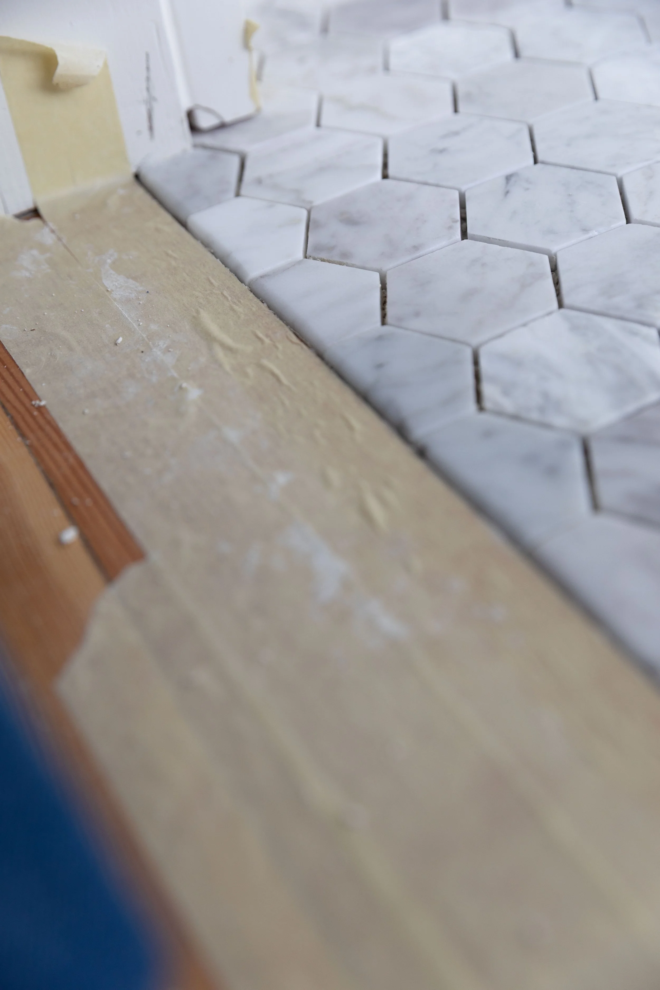
The curved marble threshold
The threshold at the bathroom door may be my favorite detail in the room. The bathroom floor sits about 1/4” above the original fir floor of the bedroom, so we needed a transition between the two. I dislike floor-height changes, especially when they involve sharp marble edges. And Garrett had a brilliant and elegant solution - gently bevel the edge of the marble tile with a wet polisher. It gives the marble a curved edge that feels crafted and a little old-fashioned. He’s SO good :)
The salvaged marble niche
About that marble niche. For the ensuite, we mimicked the niche in the hall bathroom, using the 12x12 marble for the walls and back, cut to size, and adding a small piece of 2cm countertop for the bottom. The countertop marble had actually been sitting outside in our boneyard for years and was stained and weathered enough that I questioned whether it was still usable. But we cleaned it with our marble poultice recipe, and it came back beautifully. Now it gets a second life in one of the prettiest rooms in the house.
Is marble hex tile practical in a bathroom?
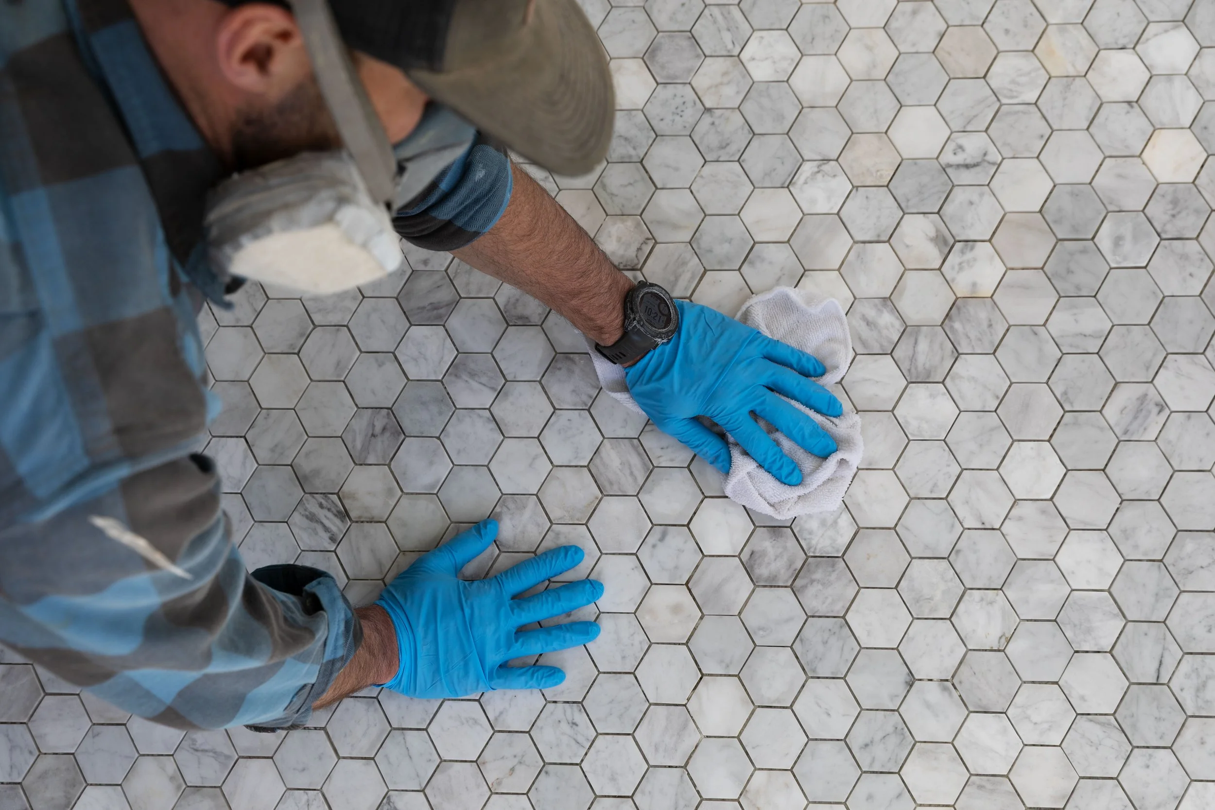
This is a question I’ve gotten a fair bit and the truth is, marble does require more care than porcelain. It can etch, stain, and generally change over time. We were comfortable with that because we like natural materials that age and because the honed finish already has a softer, less perfect look. We’re ‘patina people’. We did seal the marble before grouting and will continue to care for it appropriately.
For someone who wants a completely uniform, low-maintenance floor, porcelain may be the better choice. For us, the character and softness of real marble were worth the added care.
Designing a bathroom that can change with our family
It is tempting to design every room around exactly who is using it today. But in a family house, rooms change as the family changes. This bathroom is going to be Daphne’s but before she gets it, Garrett and I will be using it first. And who knows will get it after her. Children grow and sometimes want to swap bedrooms. Guests come and go. Families change.
We wanted this bathroom to have enough personality to feel memorable, but enough flexibility to work for almost anyone. The tile does not lean particularly feminine or masculine, and it is not tied too closely to one age, trend, or season of our family. It’s a flexible bathroom that should work for our family for years to come, whatever and whoever we throw at it.
This is a brand-new bathroom carved out of an awkward old closet and part of the original hall bathroom, but I wanted it to feel like it belonged here. Not like a reproduction of a 1910 bathroom. And not like a bathroom that screams 2026. Just a charming, useful room that feels like it can evolve with the house over time. We love it!
More soon.
xx
ps this post contains affiliate links, meaning we may earn a small commission if you purchase through our links, at no additional cost to you. Thank you for supporting The Grit and Polish!


links and musings from the week…