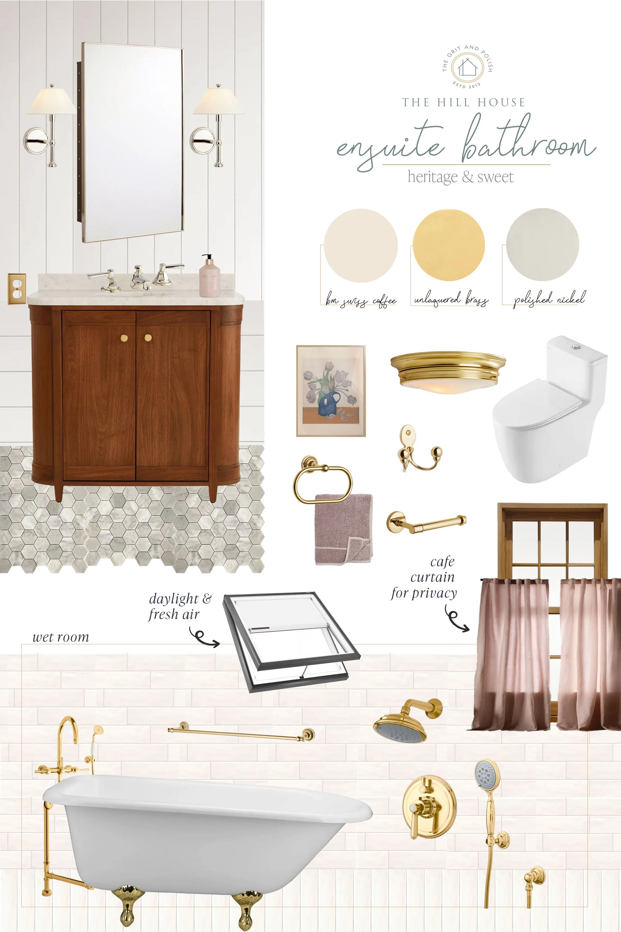
The Excellent Advice from Rita Konig that Helped Me Pick a Paint Color
THE POPLAR COTTAGE
Picking paint colors is always a tricky endeavor, but at the Poplar Cottage it’s something else entirely. This little cottage has stumped me time and again and no paint looks quite as I expect it to (who remembers the kitchen cabinet fiasco?!). So when it came time to pick a new color for the bathroom, I turned to the expert advice of designer Rita Konig. It worked like a charm!

F&B Lime White, F&B Old White, SW Accessible Beige, BM Revere Pewter | Sneakers, Jeans
Rita’s article on paint in House and Garden is a must read for anyone who has ever struggled to pick a paint color. She’s brilliant (!!!), both at design and at making the whole process feel attainable. Here are 3 pieces of advice that resonated with me and helped me pick a color for the Poplar Cottage bathroom…
1 // Colors will look stronger on the wall than on the paint chip
It’s hard to guess how a color will feel in a room from looking at a tiny paint chip, but Rita warns us that it will look stronger. “Colours often look quite different from the colour chart. They mostly look stronger because they are on all four walls.” That makes sense! And knowing this, I opted to sample colors that were a little lighter and softer than I initially thought I wanted.
2 // Paint Your samples on Paper instead of the wall
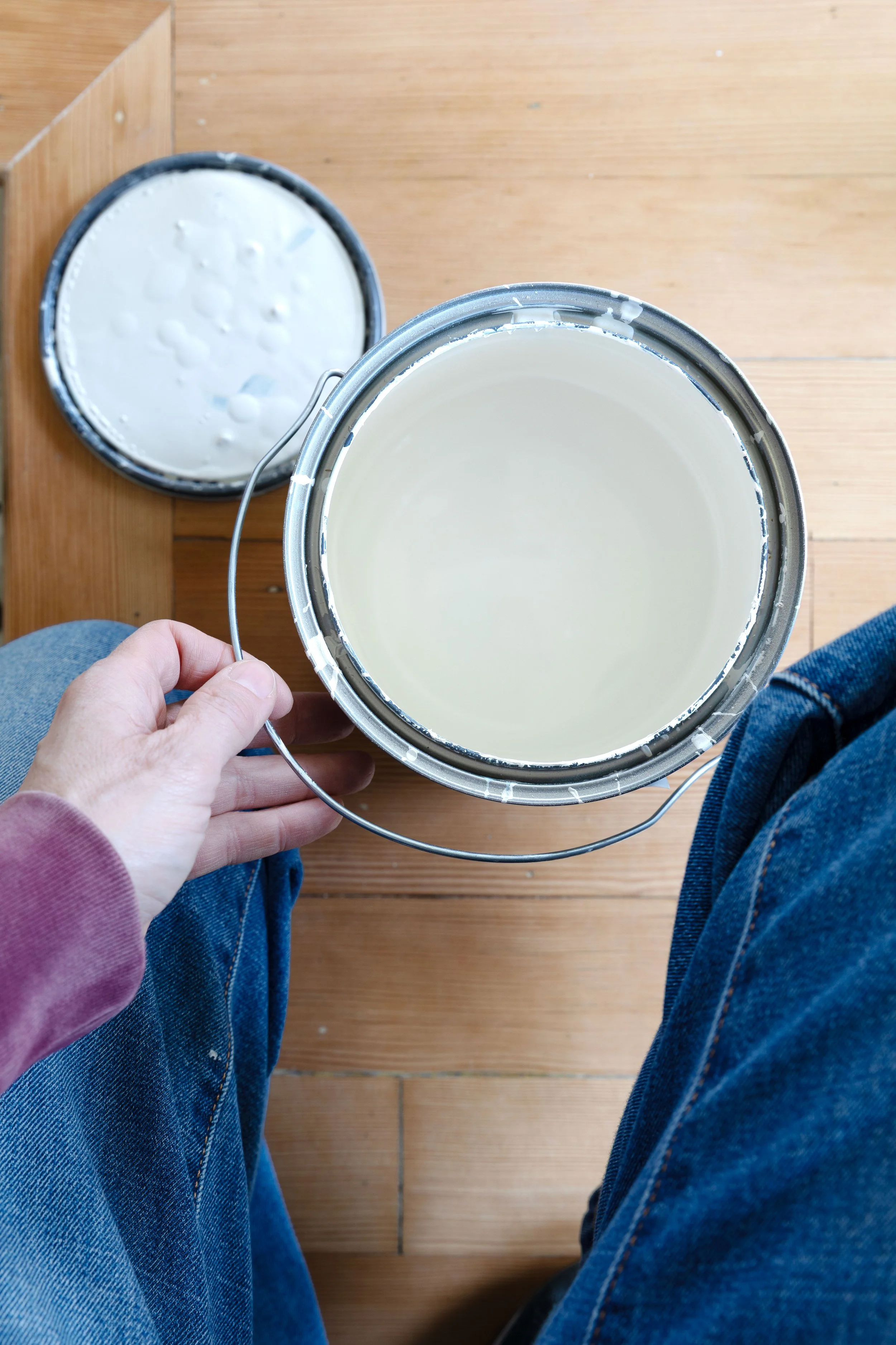
As Rita says, “The trouble with testing colours on the wall is that they react to one another and to the existing colour of the wall itself. Whites go green, browns look pink and greys turn lavender.” Eek! that’s no good. So this time around, I picked up a pad of 18x24 watercolor paper at our local art supply store and painted each with a different paint color. The samples were nice and large, making it easy to get a feel for the color, and bonus, I could move the samples around the house to test them in different rooms and different light.
3 // “Too much choice is a burden”
This is surely true for many things in life, but especially when it comes to picking a paint color. “I have been in so many rooms with the walls covered in 1,001 shades of the same colour and a confused friend or client standing in the middle of it,” writes Rita. I can relate! Too many options tends to overwhelm me rather than assist in a decision. So I this time around I mostly kept to the color options from Farrow and Ball (who offers a very chic but limited color palette). I then painted only a few samples on paper in the living room and took my 2 favorites to test in the bathroom. From there, the decision was easy.


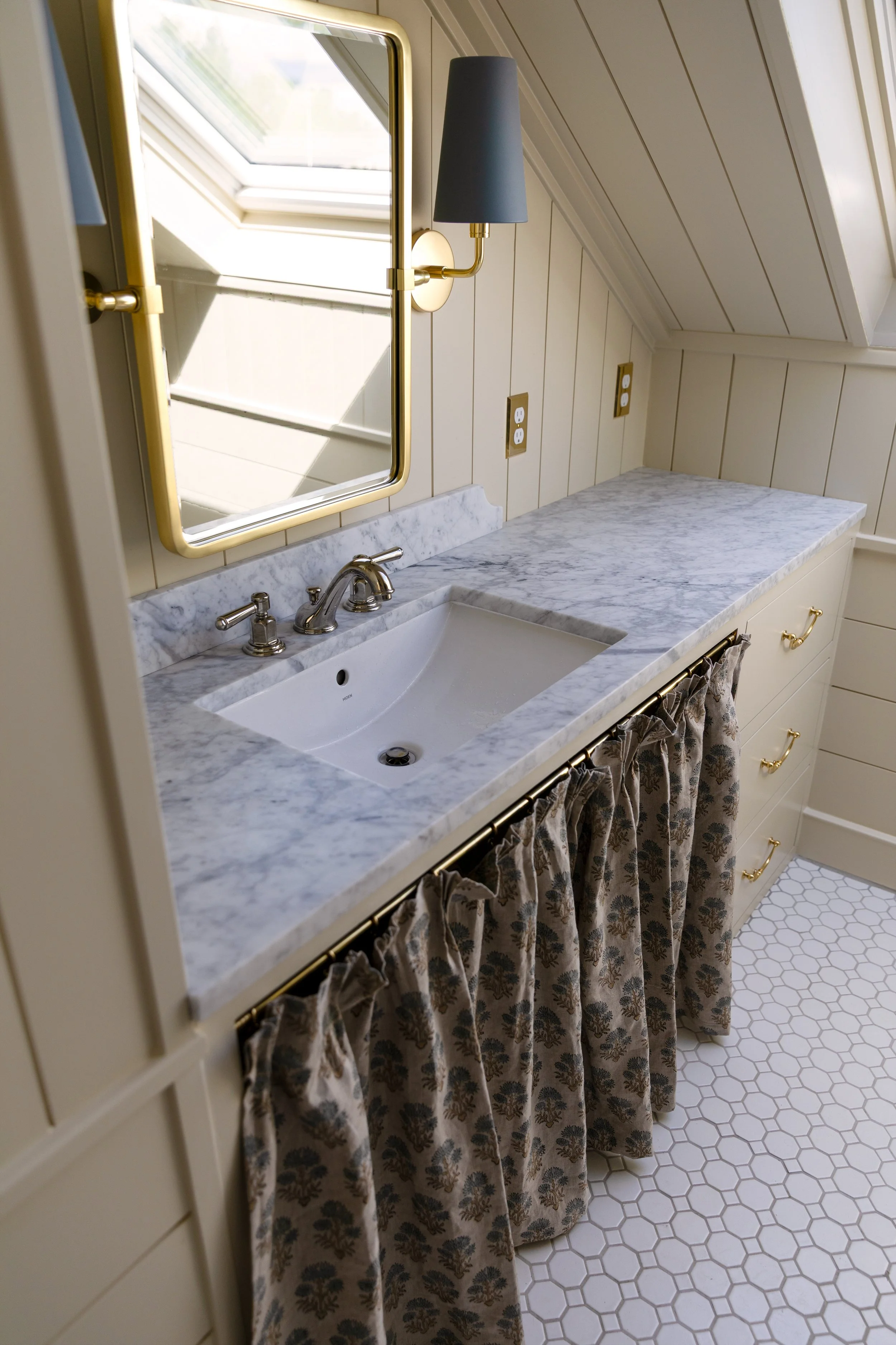
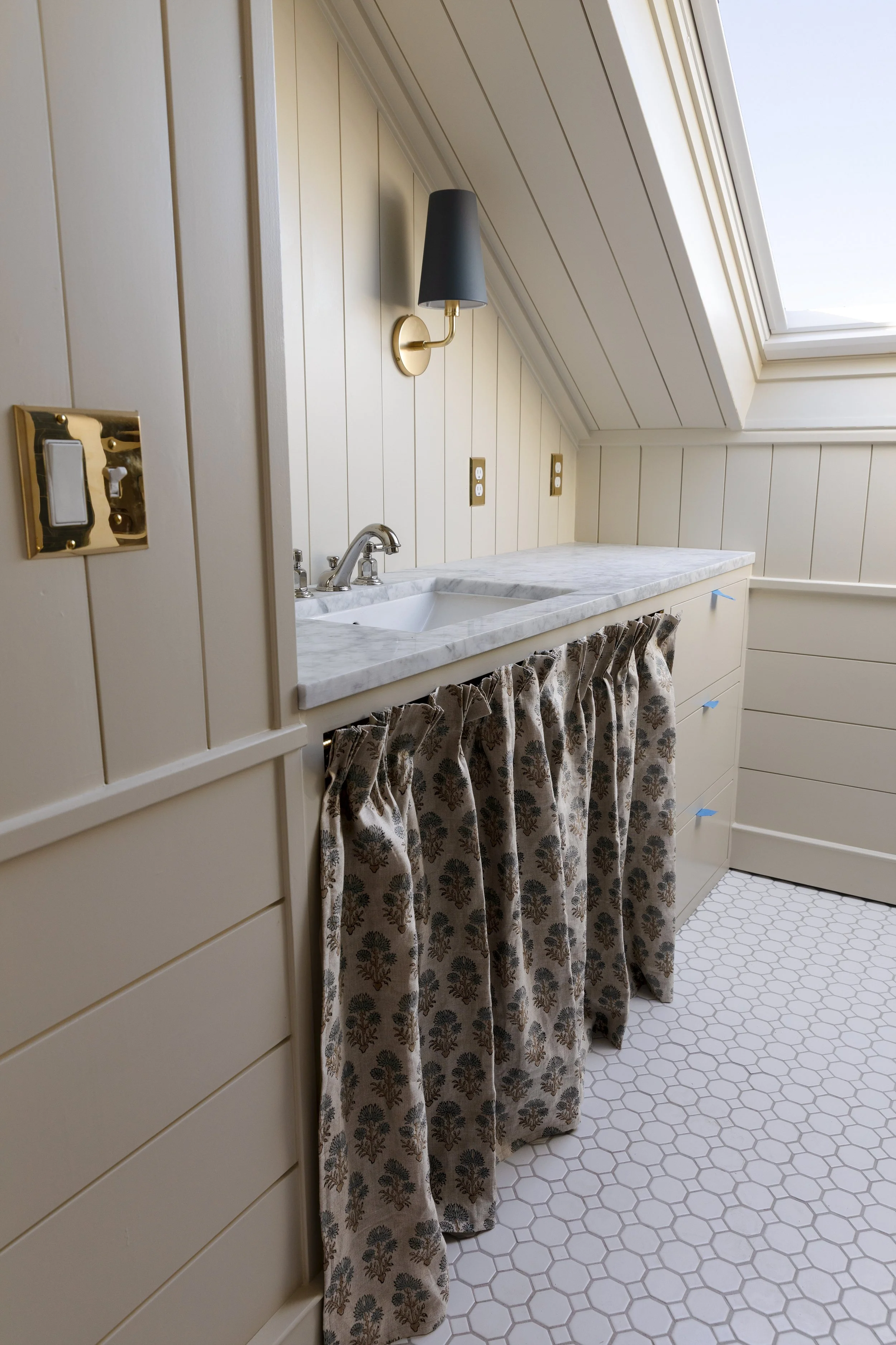
samples from left to right: F&B Off White, F&B Lime White, F&B Old White, SW Accessible Beige, BM Revere Pewter (wall is painted in BM Swiss Coffee)


samples: F&B Lime White, F&B Off White | wallpaper

F&B Off White (top), F&B Lime White (bottom) | tiles, medicine cabinet


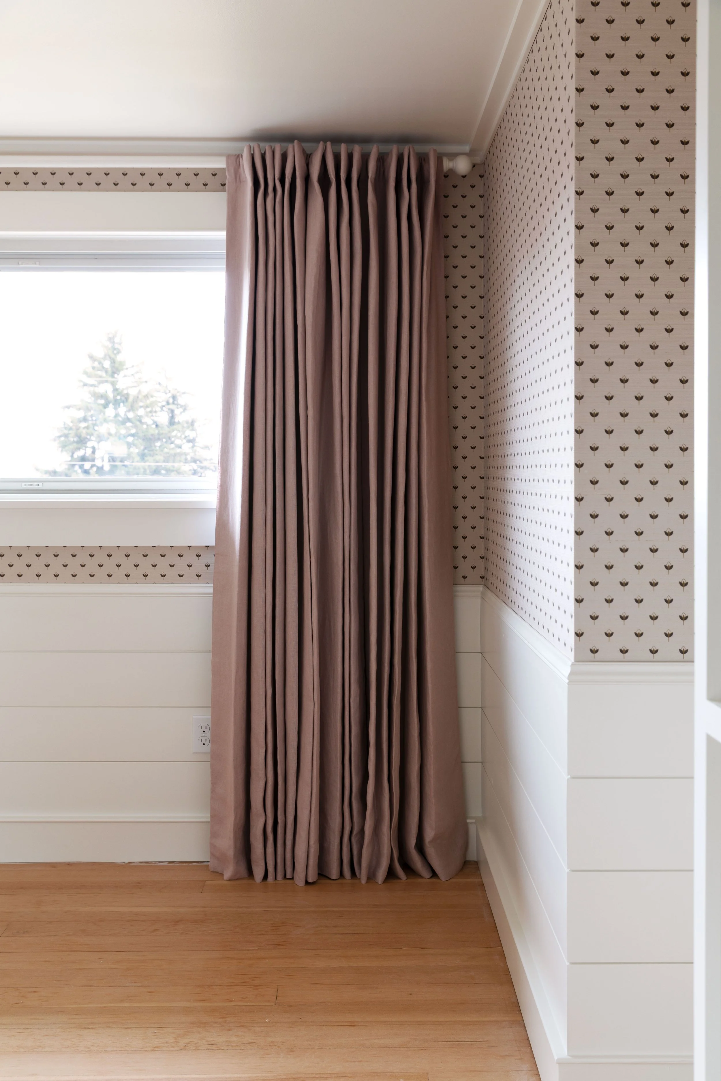
The color I picked
In the end, I picked F&B Lime White, the lightest of the samples. Remembering Rita’s advice, I felt like this light-ish neutral would feel like plenty for me (who likes things light and bright), especially when all the walls and trim were painted. I’m only one coat in, but so far, I think it’s going to be just what I was hoping for.

And a bit more advice from Rita’s article in House and Garden to keep us on track…
“Once the color is going up, keep your nerve.”
“After a few days you get used to (the colour).“
“I am not saying that no one ever got a colour wrong, but it doesn't happen as often as the panic“
We’ve got this!
xx